Published on
September 21, 2026

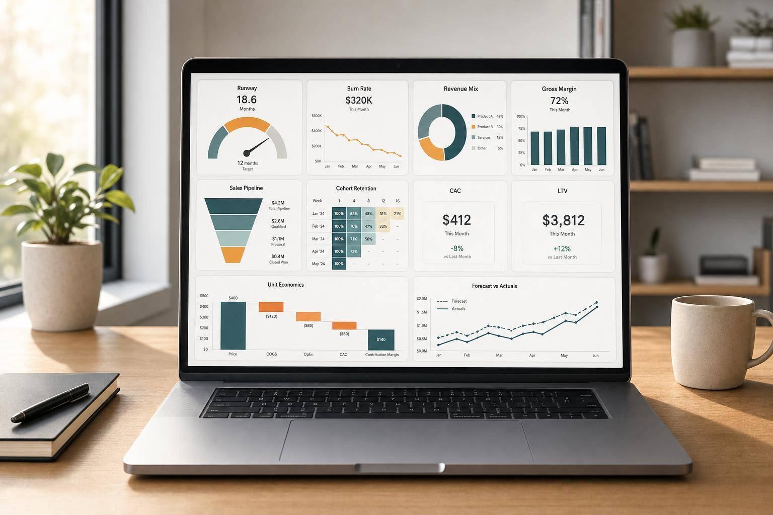
If I had to cut this article down to one point, it’s this: growth-stage firms should track 10 core charts that answer 10 direct money questions. Those charts cover cash runway, burn, revenue mix, margin, spending, budget gaps, pipeline, retention, unit economics, and a weekly KPI view.
If you want a finance dashboard that helps you act fast, I’d focus on charts that show:
The article’s main message is simple: each chart should track one metric, use the right time frame, and tie to a clear decision. For example, a runway chart can shape hiring, while a pipeline chart can show whether sales targets are still in reach.
The 10 charts covered are:
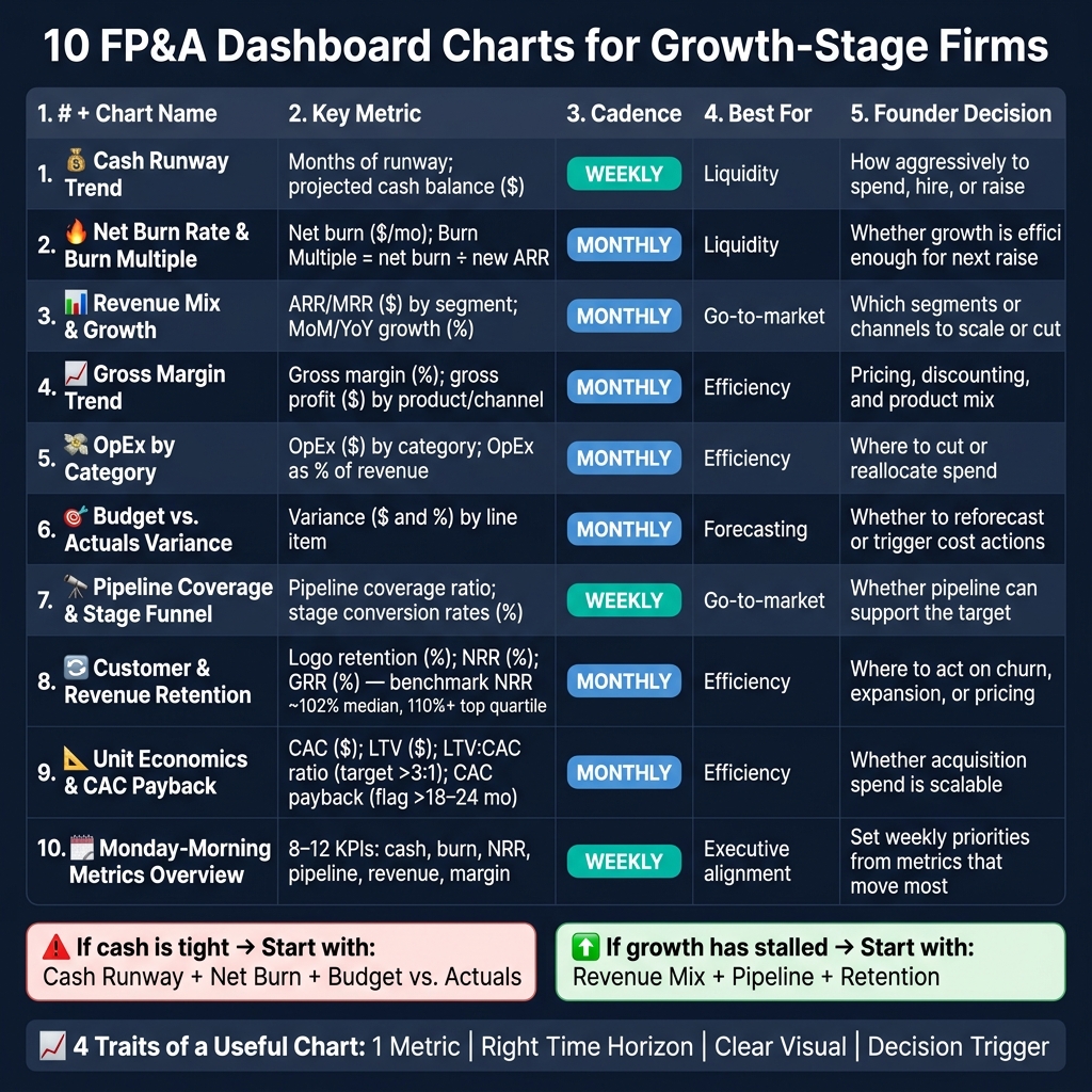
10 FP&A Dashboard Charts for Growth-Stage Firms: Quick Reference Guide
| Chart | Main question it answers | Common cadence | Main founder use |
|---|---|---|---|
| Cash runway trend | How many months of cash do we have left? | Weekly | Hiring pace, spending, funding timing |
| Net burn + burn multiple | Is cash turning into ARR at a good rate? | Monthly | Growth efficiency review |
| Revenue mix + growth | Which segments drive growth? | Monthly | Segment focus, resource shifts |
| Gross margin trend | Is growth keeping margin healthy? | Monthly | Pricing, mix, cost control |
| OpEx by category | Where is money going? | Monthly | Spend control, headcount review |
| Budget vs. actuals | Did results match plan? | Monthly | Reforecasting, cost actions |
| Pipeline coverage + funnel | Can pipeline support the target? | Weekly | Sales pace, quota, demand gaps |
| Retention | Is the customer base holding up? | Monthly | Churn, expansion, CS focus |
| Unit economics + CAC payback | Is customer acquisition worth the spend? | Monthly | Channel spend, growth pacing |
| Monday-morning overview | What needs attention this week? | Weekly | Team alignment |
I’d read this article as a guide for choosing the first few charts to build, not as a push to build everything at once. If cash is tight, start with runway, burn, and budget variance. If growth is slowing, start with revenue mix, pipeline, and retention.
Polished charts don’t always lead to better decisions. The charts that help most tend to share four traits: one metric, the right time horizon, a clear visual, and a decision trigger. Use those four filters before you pick any chart.
A useful chart answers one specific question in seconds:
"How many months of cash runway do we have?"
"What is our gross margin trend over the last 12 months?"
"Which department is over budget?"
If one chart tries to answer several questions at once, it usually doesn’t answer any of them well.
That’s why it helps to avoid mixed visuals that stack revenue, headcount, and margin into the same view. Give each metric its own chart and its own decision context.
The time frame should fit the choice in front of you.
A chart can be accurate and still be the wrong tool if the time horizon doesn’t match the pace of the decision.
Some chart types are simply better for certain jobs.
Line charts work best for trends over time, like cash runway, net burn, recurring revenue, or gross margin percentage. They make direction and turning points easy to spot.
Bar charts are better for comparing categories at one moment in time, such as operating expenses by department or revenue by product line.
Waterfall charts show how a planned number turned into the actual result.
Funnel charts show where deals drop off across sales stages.
Put simply: use line charts for trends, bar charts for category comparisons, waterfall charts for budget gaps, and funnel charts for conversion drop-off.
Every chart should lead to a decision, not just report a number.
For example, a cash runway chart might include a rule like this: if runway drops below 12 months, start investor outreach and pause non-essential hiring. A budget variance chart might trigger a department review when any line item moves beyond ±10%.[2][3][4]
This is where many dashboards fall flat. They look polished, but no one knows what action the numbers are supposed to trigger.
Embedding chart reviews into weekly or monthly meetings keeps the dashboard from turning passive. When a number moves the wrong way, the right conversation should surface right away.
These rules keep each chart focused, useful, and easy to read. The 10 charts that follow use these filters. Start with the chart that answers the most urgent question: cash.
When cash is the constraint, runway is usually the first FP&A number to watch. This is the chart to use when cash limits hiring, spending, or fundraising.
Cash runway = current cash balance ÷ monthly net burn. Net burn means cash going out after customer receipts come in. To smooth one-off swings, many teams use a trailing 3- to 6-month average burn.
Use this chart 6 to 18 months before a raise, right after funding, and during downturns or pivots. These are the moments when founders need to pressure-test whether hiring plans and operating spend still leave enough runway.
That’s why this often becomes the first chart reviewed in a weekly finance meeting.
This chart helps founders decide:
A threshold line also helps flag risk early, before cash becomes a fire drill.
A line chart is the best fit here. Plot runway over time with 6 months of actuals and 12 to 24 months of forecast. Then add scenario lines for base, upside, and downside cases so leadership can see how each choice changes the cash horizon.
Phoenix Strategy Group builds these runway models with dynamic data pipelines that sync bank feeds, payroll, and forecast assumptions, so the dashboard stays current.
Runway tells you when cash runs out; burn rate explains why.
Runway tells you how much time you have. Burn multiple tells you how well your cash is turning into ARR.
That’s the point of this chart. It doesn’t just show spending. It shows whether that spending is doing its job.
Net burn rate is monthly cash outflow after operating and investing activity, excluding financing inflows. Put simply, it shows how much cash the business actually used during the period. For example, if cash dropped from $2,000,000 to $1,650,000, net burn was $350,000.
Burn multiple measures efficiency. It shows how many dollars of net cash burn it takes to produce one dollar of new ARR. The formula is simple: net burn ÷ new ARR for the same period. If a company burns $1,200,000 in a quarter and adds $400,000 in new ARR, the burn multiple is 3.0x. Lower burn multiples mean cash is working better. Once you get above 3.0x, it usually deserves a closer look. [6][7][9]
This chart is most useful after Series A and Series B, especially when a company is still below $10 million in ARR. That’s the stage where leadership teams and boards are trying to judge whether growth is efficient enough to support the fundraising process. [8][5]
In other words, this is a board-level gut check: are you buying growth at a price that still makes sense?
Use this chart to answer a few hard questions:
If burn multiple improves over a few quarters, founders have a much stronger efficiency story in fundraising conversations. This is the chart that shows whether growth is worth the cash it consumes.
Use a combo chart. Plot monthly net burn as a line or area chart, then show burn multiple as a quarterly bar or secondary line on the right axis.
A few details make the chart far more useful:
That last part matters more than people think. A small table makes it easy to reconcile the chart with board decks and check that the math ties out. [10][11]
Next comes where growth is coming from.
After burn, the next thing to check is where growth is coming from. This chart shows which segments bring in revenue and how that mix shifts over time.
This chart tracks three things:
One helpful supporting metric is share of new growth. That means the change in one segment’s revenue divided by the change in total revenue. It helps separate the segments that are actually pushing growth from the ones that are just moving along with the business. [13]
Use this chart to see whether growth is spread across the business or tied to just a few segments. That makes it useful for board updates and for moments right before big go-to-market calls, like:
This chart supports resource allocation. In plain English: it helps founders decide where to hire, where to spend, and where to push harder.
If enterprise subscriptions are growing at 80% YoY and make up 40% of revenue, that’s a strong signal to put more weight behind enterprise hires and product roadmap work. On the flip side, it also shows concentration risk. If one product line accounts for 65% of revenue and its growth is slowing, that’s not something to brush off. That discussion should happen early, before it turns into a fire drill. [12][13]
Use a stacked column chart by month or quarter, with each color tied to a segment. Put $ on the y-axis and overlay a line for total revenue growth rate.
Keep the chart to four to six segments max. If smaller segments clutter the view, roll them into "Other." Add notes for inflection points, like a pricing change or the launch of a new enterprise motion.
This view also helps you spot which segments deserve a closer look on margin next.
After you know which segments are driving growth, the next step is simple: is that growth making money? Revenue growth only matters if margin stays healthy. If it slips while the company scales, growth can look good on paper and still hurt the business. That’s why gross margin is the next chart to check.
The main metric here is gross margin percentage: (Revenue − COGS) ÷ Revenue. Pair that with gross profit dollars so founders can see both the margin rate and the dollar amount behind it.
It also helps to track gross margin by segment. A blended margin can smooth everything out and hide big gaps across products, customer types, channels, or pricing plans. One segment might look great while another quietly drags the whole business down.
Keep the COGS definition consistent. If the definition shifts, margin changes can reflect accounting changes instead of business performance. Targets also depend on the business model. Higher-margin software and lower-margin services shouldn’t be judged by the same standard.
Use this chart every month, and review it again after pricing, product, or go-to-market changes.
This chart helps founders set pricing, adjust product mix, and manage cost structure. For example, if a newer add-on module runs at 85% gross margin versus 60% for the core product, that should shape both the roadmap and the sales motion. [15][16]
Use:
Keep segment count to four to six categories so the chart stays easy to read. Add a dashed reference line for your internal target, such as 70% for a SaaS business. Use the same colors across the dashboard so readers don’t have to relearn the visuals each time.
The trend line helps you spot drift. The segment bars help you find what’s behind it.
If margin is weakening, the next question is whether costs are rising faster than revenue.
When gross margin starts to slip, this chart helps you see where the money is going. It breaks monthly OpEx into Payroll & Benefits, S&M, R&D, and G&A, so founders can spot what's pushing burn.
The main metric here is operating expenses (OpEx) by category, shown as monthly totals in USD over a rolling 12–18 month window. It helps to track both total dollars and each category's share of revenue, since that's often where drift shows up first.
This chart matters most when burn is climbing, the plan is changing, or the company has just raised capital. It's especially useful during reforecasts, when small budget misses can turn into bigger problems if no one catches them early.
This chart helps with decisions around headcount, vendor spend, and budget shifts. If payroll is taking up most of OpEx, a founder may slow hiring in lower-priority teams. If S&M is running above target, they might pause paid acquisition, review agency or software costs, or move dollars somewhere else.
Once spending is clear, the next step is checking whether actuals lined up with plan.
Use a stacked column chart with four to six categories. Each column should represent one month, with color-coded segments for each expense group. To keep the view clean, group smaller items into Other.
Add a companion table that shows each category as a percentage of revenue. Also include reference lines for internal targets. For example, if the target range for S&M is 40%–45% and the current figure is 52%, the gap should stand out right away.[17][18][19][20]
This chart answers a simple question: did spending line up with the plan? It puts your approved budget next to actual results for the same period, so it’s easy to spot gaps across revenue, payroll, marketing, and other major lines. When actuals move away from plan, your forecast and cash runway move with them. In plain terms, this chart turns monthly close data into something you can act on. If variance tells you what changed, the pipeline chart helps you see whether future revenue can make up the difference.[24][29][30]
The chart shows both dollar variance and percentage variance for each major line item, including revenue, payroll, marketing, product/engineering, and G&A. The math is simple: Variance = Actual − Budget and Variance % = (Actual − Budget) ÷ Budget × 100%. Stick to one sign convention so no one has to guess what “good” means: revenue above budget is favorable, and expenses below budget are favorable. Show all figures in $000s.[21][23][27][29]
This chart works best right after a monthly close, during board prep, and anytime cash runway feels tight. In practice, founders should review it every month to guide operating calls.[25][26]
When revenue comes in below plan while marketing or payroll runs above it, this chart helps founders make direct calls, such as:
It can also show when it makes sense to shift expense dollars or renegotiate vendor spend if one line keeps coming in above budget. That leads to the next practical question: will the pipeline cover the gap?[22][27][28]
Use a format that makes favorable and unfavorable gaps obvious right away. A clustered bar chart works well, with Budget and Actual bars shown side by side for each line item. Add variance markers too: green for favorable and red for unfavorable. Keep the view to 8–10 lines so the chart doesn’t get messy, and apply a threshold so the team focuses on variances that matter, such as anything above 10% or above a set dollar amount.[21][26]
Add a short three-line note under the chart:
That small note often does the heavy lifting, because it turns a chart from a reporting artifact into a decision tool.[27][28]
When actuals come in below plan, this chart helps answer the next question fast: can the current pipeline make up the gap? It puts qualified pipeline value right next to the bookings target for the same period, so you can see whether enough deals are in motion to hit the number.
The main metric here is pipeline coverage ratio: total qualified pipeline value divided by your bookings target for that same period. If you have $3,000,000 in qualified pipeline against a $1,000,000 new ARR target for Q4, your coverage is 3.0x.[32][33][34]
That ratio tells you if the pipeline looks big enough. The funnel tells you where things start to fall apart. Put it side by side with a stage funnel that shows pipeline value at each step, such as Qualification, Discovery, Proposal, Negotiation, and Closed Won, plus the conversion rate from one stage to the next. For example, a $100,000 opportunity with a 30% win probability adds $30,000 to probability-weighted pipeline, which is the safer figure to track against target.[31][35]
Use this chart for quarterly planning, board reporting, and fundraising or lender conversations. It fits best when forecast risk matters more than closed revenue.
Pipeline coverage helps with sales hiring, quota setting, marketing allocation, and forecast risk assessment.
If coverage stays below 2x, the message is often pretty clear: you likely need more demand generation, not more reps. If coverage is high and conversion rates look healthy, adding sales headcount can make sense because there’s enough demand to work.
The shape of the funnel matters just as much as the ratio. A wide top and thin middle usually points to weak qualification. A pileup in Proposal with weak conversion to Closed Won can hint at pricing friction or an approval bottleneck. In that case, founders may need clearer discount rules, faster deal templates, or simpler approval workflows.
Put both views into one dashboard tile. Use a grouped bar chart for pipeline coverage, with total pipeline and weighted pipeline by quarter, then add a horizontal line for the bookings target. Below that, use a vertical funnel chart with each segment labeled in standard U.S. dollar format and marked with stage-to-stage conversion rates.[36][37]
A side-by-side view of this quarter versus last quarter also makes shifts in funnel shape much easier to spot.
After pipeline, the next question is simple: is the customer base holding up? At this stage, founders need to see if the base is staying flat, growing, or slipping.
Track logo retention, GRR, and NRR.
Median NDR across 342 B2B SaaS companies is about 102%, and top-quartile growth-stage companies in the $5M–$20M ARR range reach 110%+.[42][44] When NRR is above 100%, the current customer base is growing even before new logos show up. When it drops below 100%, growth leans much more on new bookings to make up for churn and contraction.
Use this chart to diagnose the issue, not just report the number. It helps split churn from expansion.
Strong logo retention with weak NRR usually points to downgrades or weak expansion. Healthy NRR can also mask rising logo churn if expansion is making up for the losses. In other words, strong logos with weak NRR can point to hidden contraction.[45][46]
Use 12–24 months of acquisition cohorts in USD.
This chart helps answer a core call: fix retention or scale acquisition.
If NRR is below benchmark, founders may need to improve onboarding, tighten customer success, or rethink pricing and packaging before putting more money into top-of-funnel spend. Retention costs less than acquisition and has an outsized impact on profit.[41][43]
If NRR is strong and moving up, founders can push sales and marketing with more confidence, because the economics of the current customer base can support faster growth. That’s what tells you whether to fix retention first or press harder on acquisition.
Once the decision is clear, show it in two views.
A clean line chart with NRR and GRR across the trailing 12–24 months works well. Add a horizontal benchmark line at your NRR target. Then place logo churn on the same timeline as either a line or bar, so the board can see whether revenue retention and customer retention are moving together.
For a closer read, a cohort heatmap is the clearest choice: rows show acquisition months, columns show months since acquisition, and colors show retention.[38][39][40] Color bands make the pattern easy to scan in a board meeting.
Once retention is clear, the next question is simple: does customer acquisition leave enough margin to make the spend worth it? That’s why this chart acts as a gate before scaling acquisition.
The main metrics here are CAC, contribution margin per customer, CAC payback period, and LTV:CAC ratio.[47][48][49][50][52][53]
Start by defining the unit: customer, account, or seat. Then keep that same unit across every metric. If the base changes from one metric to another, the math gets messy fast.[49][50][53][55]
CAC payback is:
CAC ÷ monthly contribution margin per customer
Use contribution margin in the denominator, not revenue.[14][56][55]
For subscription businesses, an LTV:CAC ratio above 3:1 is often used as a healthy benchmark. Many teams also flag payback periods longer than 18–24 months for review.[51][56]
This chart matters most when a company is:
Review it monthly. During marketing or pricing tests, review it weekly. That gives the team a steady check on whether growth is efficient enough to scale.
Segmented views add another layer. They show which channels or customer groups can support more spend and which ones probably can’t.
This chart supports four decisions: how much to invest in growth, which channels to push, whether pricing or packaging needs to change, and when to pull back marketing spend.[54][55][56]
A simple example helps. If payback drops from 18 months to 10 months, that can support a bigger marketing budget or more sales hires. But if CAC keeps climbing while ARPA stays flat, it may be time to look again at pricing tiers, discounting, or upsell motions before leaning harder into acquisition.
Segment-level views are especially useful here. They show where LTV:CAC is strongest, so founders can put more money behind the right customers and cut spend from channels with weak payback.
The best dashboard usually puts two views side by side. One is a 12–24 month line chart that tracks CAC, CAC payback, and LTV:CAC over time. The other is a bar chart that compares those same metrics by channel or customer segment.
Conditional formatting helps the board read it at a glance. Use red for payback above 18 months and green for payback below 12 months. Add notes for major changes, like a pricing update or a shift in channel mix, so the trend is easier to read.
Think of this chart as your weekly operating view. It pulls 8–12 KPIs from the other nine charts into one place, so the team can scan the business in 5–15 minutes every Monday. Instead of bouncing between dashboards, you get a single weekly check.[57][1][62][63][66]
This overview brings together 8–12 KPIs from the other charts, including cash balance and runway, net burn, burn multiple, MRR/ARR, revenue mix, gross margin, pipeline coverage, GRR, NRR, CAC payback, and budget vs. actuals variance for the current reporting period.[57][1][65][67]
Each tile shows:
A small sparkline covering the last 8–12 weeks sits next to each tile, which makes the trend easy to spot at a glance.[1][62][63]
This chart fits three recurring moments: the Monday 9:00 AM leadership meeting, the weekly founder–CFO check-in, and the opening slide in a board or investor update.[62][63][59]
It works best when the team has already agreed on thresholds. For example, runway below 12 months might show up in red, while pipeline coverage below 3.0x could land in yellow.[65][61] That way, the dashboard doesn’t just report numbers. It points to where attention is needed.
The overview is grouped into four decision areas - Cash, Growth, Efficiency, and Risk - so a founder can scan by topic instead of reading every number one by one.[60][67]
That matters in practice. If runway looks weak and pipeline coverage is also low, that combination should push an immediate pause on hiring and trigger a sales pipeline review. One number can be noise. Two weak signals lining up is a different story.
The next section compares all 10 charts side by side.
The layout follows a top-to-bottom priority order: cash and runway tiles on the top row, revenue and retention in the middle, and efficiency and pipeline at the bottom. Link each tile to its detailed chart so the team can move from signal to action fast.[58][1][64]
Automated data pipelines keep the dashboard reconciled to the books without manual spreadsheet work.
Use this table to choose the first chart to build based on the decision in front of you. The best dashboard isn't the one with the most charts. It's the one that helps with the next call you need to make.
| Chart | Key Metric | Refresh Cadence | Best For | Founder Decision |
|---|---|---|---|---|
| Cash Runway Trend | Months of runway; projected cash balance ($) | Weekly | Liquidity | How aggressively to spend, hire, or raise - and by when |
| Net Burn Rate and Burn Multiple | Net burn ($/month); Burn Multiple (net burn ÷ net new ARR) | Monthly | Liquidity | Whether growth is efficient enough for the next raise |
| Revenue Mix and Growth | ARR/MRR ($) by segment; MoM/YoY growth (%) | Monthly | Go-to-market | Which segments or channels to scale or cut |
| Gross Margin Trend and Margin by Segment | Gross margin (%); gross profit ($) by product or channel | Monthly | Efficiency | Pricing, discounting, and product mix to protect margins |
| Operating Expense by Category | OpEx ($) by category; OpEx as % of revenue | Monthly | Efficiency | Where to cut or reallocate spend |
| Budget vs. Actuals Variance | Variance ($ and %) by line item | Monthly | Forecasting | Whether to reforecast or trigger forecast resets |
| Sales Pipeline Coverage and Stage Funnel | Pipeline coverage ratio; stage conversion rates (%) | Weekly | Go-to-market | Whether pipeline can support the target |
| Customer and Revenue Retention | Logo retention (%); NRR (%); GRR (%) | Monthly | Efficiency | Where to act on churn, expansion, or pricing |
| Unit Economics and CAC Payback | CAC ($); LTV ($); LTV:CAC ratio; CAC payback (months) | Monthly | Efficiency | Whether acquisition spend is scalable |
| Integrated Monday-Morning Metrics Overview | Cash runway, net burn, NRR, pipeline coverage, revenue movement | Weekly | Executive alignment | Set weekly priorities from the metrics that move most |
Refresh cadence should follow the speed of the decision. Cash needs a weekly view. Close-based metrics usually fit a monthly rhythm. Pipeline should also be checked weekly, because sales can change fast.
If cash is tight, start with runway, burn, and budget variance. Those three charts tell you where the pressure is and how long you have to act.
If growth has stalled, you'll usually get faster direction from revenue mix, pipeline, and retention. That's where you spot weak channels, shaky demand, or churn that's dragging growth down.
Later-stage companies usually need more depth in margin and unit economics. At that point, the job isn't just growth. It's making sure growth pays off.
In most cases, the mix starts with cash, then adds margin, pipeline, and retention as the company grows up.
The best FP&A dashboard isn't the one with the most charts. It's the one that helps you make the next decision on cash, growth, or capital efficiency.
That same filter from the start of this article still applies: one metric, the right time horizon, a clear visual, and a decision trigger. Use it to decide which charts deserve a spot on the dashboard and which ones don't.
Build the dashboard around the decision in front of you now, not the metrics you might need later.
If runway is the constraint, start with:
If the focus has shifted to scaling with discipline, bring in revenue mix, gross margin, pipeline coverage, and unit economics. If a financing event is getting closer, move charts that show forecast reliability to the front - retention cohorts, margin trends, and integrated overviews.
Review the chart set every quarter. Drop any chart that no longer changes a decision. Phoenix Strategy Group helps growth-stage firms build dashboards tied to real operating decisions. If a chart does not change a decision, remove it.
Start with 5 to 7 core KPIs that give a fast read on financial health:
For SaaS businesses, add net revenue retention and burn multiple.
Skip heavy tables if the goal is a quick read. Quick-scan KPI tiles work better. A simple three-band layout usually does the job well:
That setup makes the page easy to scan without burying the numbers that matter.
Update each chart based on how fast that metric shapes decisions.
Set updates to match your business rhythm. Then check data quality before founder reviews.
For growth-stage firms, the metrics that matter most usually fall into three buckets: liquidity, unit economics, and growth efficiency.
The goal isn't to track everything under the sun. Founders should zero in on 5 to 7 KPIs so they can make fast, clear decisions without getting buried in dashboards.
Here are the main areas to watch:
That mix gives leadership a tight read on cash, sales momentum, and how well the business turns spend into revenue.