Published on
July 30, 2026

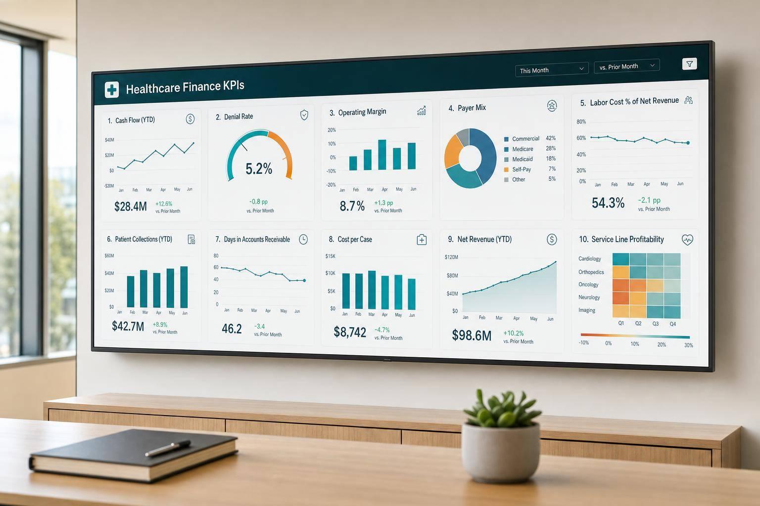
If I had to boil this down to one point, it’s this: healthcare finance teams track 10 KPIs to spot cash problems early, protect margin, and see where billing, staffing, and payer shifts are hurting results.
I’d focus on these numbers first:
Here’s the short version: when denials go up, Days in A/R often follows. When payer mix shifts toward lower-paying plans, margin can tighten even if visits hold steady. And when labor cost climbs faster than volume, profit gets squeezed.
A few benchmark points stand out:
| KPI | What I’d watch for | Simple benchmark or context |
|---|---|---|
| Days in A/R | Slower collections | 30 to 40 days or less |
| Denial Rate | More rejected claims | Below 5% |
| Cash on Hand | Cash runway | Trend over time |
| Payer Mix | Shift to lower-paying payers | Varies by business |
| Labor Cost | Staff spend outpacing output | Check against visits/revenue |
| Visit Volume | Demand and provider use | Track weekly or biweekly |
| Net Collection Rate | Revenue leakage | 95%+ |
| EBITDA | Core profit trend | Best viewed over rolling periods |
| Service Line Margin | Which lines win or lose money | Compare by site/specialty |
| Close Cycle | Delay in finance reporting | Shorter close = more current data |
The big takeaway: I wouldn’t read these KPIs one by one. I’d read them as a connected system, because that’s how finance teams find the source of pressure before it turns into a cash or margin problem.
A healthcare finance dashboard does its job best when it brings cash flow, reimbursement performance, profitability, and operating efficiency into one clear view. That setup helps finance leaders see how one shift affects another. And that's what makes KPI tracking worth using in the first place.
When these four areas sit next to each other, patterns are much easier to catch. A drop in net collection rate may show up at the same time as an increase in days in A/R. A jump in labor costs might line up with visit volume data. Instead of flipping between separate reports and trying to piece the story together, finance teams can see the connection right on the dashboard.
Top-line totals can hide what's going on underneath. A payer filter might show that one insurer is behind most denials. The same idea applies to location, service line, provider group, and time-period filters. That kind of segmentation helps teams spot where performance is starting to slip, instead of treating the whole business like it's moving in one direction.
One month of data can tell the wrong story. A weak month may be seasonal. A strong month may hide a slow drop that's been building for a while. That's why monthly, trailing 3-month (T3M), and trailing 12-month (T12M) views matter. They give finance teams the context needed to read the numbers with more confidence.
Trend lines also make it easier to see whether changes in billing or staffing led to better results over time. In plain terms, they turn dashboard data from a static snapshot into something teams can actually use.
Growth-stage healthcare organizations often need help checking data and building KPI reporting they can trust. Phoenix Strategy Group supports that work with bookkeeping, fractional CFO, FP&A, and data engineering services.
With that structure in place, the next step is choosing the KPIs that matter most.
Days in Accounts Receivable (A/R) shows the average number of days a healthcare organization takes to collect payment after care has been delivered. Lower is better. It means cash is coming in faster. That’s why teams watch this metric on dashboards to catch collection slowdowns early.
By itself, though, the number only tells part of the story. A healthy benchmark is usually under 30 to 40 days [7]. If Days in A/R starts to climb, it can point to aging claims, payer delays, or slow follow-up and resubmissions. Looking at this KPI weekly or monthly helps finance teams spot a slowdown before it turns into a cash flow issue [5][7]. One snapshot won’t show that trend, but regular review will.
It also helps to pair Days in A/R with aging buckets:
Here’s the simple way to think about it: the overall average shows how fast money is being collected, while the aging buckets show where that money is getting stuck. Balances over 60 days usually need immediate follow-up [7]. And once balances land in the 90+ day range, the risk of never collecting them goes up sharply [5].
That split gives finance teams a clearer read on the problem. Is cash coming in late because of timing in collections? Or is it tied to claim rejection? That question leads straight into the next KPI: denial rate.
If A/R starts aging faster than it should, denial rate is usually the next metric to check. It shows the share of submitted claims that payers deny. When that number climbs, it usually points to revenue cycle problems tied to coding, authorization, eligibility, or documentation errors [7].
The target is pretty simple:
A good dashboard helps a lot here. It should break denials out by payer and reason code so teams can spot the biggest causes fast [7]. That matters because denials rarely stay contained. They often show up later as pressure on cash on hand.
Cash on hand shows how long your current cash balance can cover operating expenses.
When collections come in faster, cash on hand goes up. When receivables start aging, it goes down. For finance teams, that makes it a fast way to check both collection speed and spending discipline.
Payer mix shows how your revenue or visits are split across insurance types: Medicare, Medicaid, commercial, and self-pay. It’s smart to track both revenue and visits. Visits tell you about volume. Revenue shows the effect on reimbursement. [5][2]
This matters because not all payers reimburse at the same level. Commercial payers often pay more than public payers like Medicare and Medicaid. Self-pay brings the highest risk of nonpayment. So if your mix shifts toward lower-paying payers, margin can get squeezed even when visit volume doesn’t move. [5] In plain English: payer mix isn’t just a reporting detail. It directly affects margin.
A big change in payment per visit often points to a shift in payer mix, visit type, or efficiency. [5] That’s why this metric is worth watching closely over time, not just at one moment.
Dashboard filters can help you spot where pressure is building. Look at payer mix by:
That makes it easier to see where lower-reimbursing payers are clustered and which parts of the business are feeling margin pressure. [2][5] It also helps to read this KPI next to margin and collection metrics so you can tell whether mix changes are starting to hit cash flow and profit.
Labor cost shows how much you spend on staff compared with revenue, such as cost per patient visit [6]. It helps you see where profit pressure is building. A smart move is to track labor for clinical teams and billing teams on separate lines, so you can tell which side is driving the problem.
A few metrics help add context here:
If labor cost goes up while output stays flat, that's a red flag for inefficiency. And if labor cost climbs faster than volume, the next thing to check is whether staffing is matching demand. That’s why visit volume is the next KPI to read right next to labor cost.
After labor cost, visit volume tells you if your staffing is producing enough patient encounters to support revenue. It refers to the total number of encounters in a set period, including in-person visits, telehealth, and other billable encounters [5][8].
On its own, volume only tells part of the story. It makes more sense when you read it alongside revenue and capacity. For example, you can divide total reimbursements by total encounters to get average reimbursement per encounter. That gives you a fast read on whether undercoding may be cutting into revenue [8].
Visit volume also helps you find your break-even point: how many visits each provider needs per week to cover operating costs [5]. That number matters because a busy schedule doesn't always mean the practice is bringing in enough money.
A closer breakdown can show what's driving the numbers:
Provider utilization is worth close attention. A common target range is 70% to 85%. Once utilization goes above 90%, the risk of burnout and errors starts to climb [8].
Review visit volume weekly or every other week [5]. What matters most, though, is whether those visits turn into collected revenue, which is why net collection rate comes next.
Once you’ve billed for patient care, the next thing that matters is simple: how much of that allowed revenue do you actually collect? That’s what net collection rate (NCR) tells you. It measures the share of allowable revenue collected after contractual adjustments, so it gives you a clear view of how well billed revenue turns into cash [5][7].
A healthy target is 95% or higher. If NCR drops below that line, it often points to missed point-of-service payments, payer underpayments, or trouble somewhere in the revenue cycle [5][7]. If it falls below 92%, it’s time to check coding, eligibility, and documentation for front-end revenue cycle problems [7]. And when low NCR shows up alongside high write-offs, that can signal adjustment leakage, where money slips away through improper or excessive adjustments [7].
NCR makes more sense when you read it next to denial rate and Days in A/R. Rising denials usually suggest front-end mistakes. Rising A/R often means follow-up is weak. Put together, NCR can act as an early read on EBITDA by showing whether better collections are turning into stronger profit.
EBITDA stands for Earnings Before Interest, Taxes, Depreciation, and Amortization. It shows core operating performance before financing and accounting items enter the picture. Put simply, it helps show how well the organization turns day-to-day operations into profit.
In healthcare, EBITDA tends to move with reimbursement, labor, visit volume, and service line mix. So it reflects both revenue quality and cost control [4][6]. If reimbursement shifts or staffing changes from one month to the next, the number can bounce around. That’s why the trend matters more than any single month.
One month alone can be noisy. A better view is to show monthly EBITDA next to a rolling 12-month trend. That side-by-side view makes it easier to spot actual movement and filter out seasonal noise [4][6].
Next, service line margin shows where EBITDA is strongest or weakest by line of business.
If EBITDA tells you how the business is doing overall, service line margin shows where the money is made or lost. It points to the departments that pull their weight and the ones that drag results down.
Service line margin compares revenue per visit with expense per visit for each department [6]. When expense is higher than revenue, that service line is losing money.
Put simply, service line margin shows how much profit each line keeps after direct costs.
It helps to break margin down by location and specialty. That’s where weak spots start to show. A service line can look profitable in the total view but still struggle at one site because staffing ratios are too high or payer mix is weaker there.
You should also track WRVUs or encounter counts by specialty to check whether staffing matches demand [6].
That’s why close cycle comes next: faster reporting makes margin problems show up sooner.
The close cycle is the number of days it takes to close the books after month-end. On a dashboard, that tells you if leaders are getting the numbers in time to do something with them.
If the close drags, leaders end up looking at stale numbers and reacting after the fact [5].
This usually doesn't happen in isolation. Upstream revenue cycle problems often spill into month-end. Denials and slow collections can build backlogs, which then hold up reconciliation. Put simply, close speed depends on clean reconciliations.
Two other levers matter here: automation and workflow discipline. Real-time dashboards and automated reporting cut down month-end manual work. Clear KPI owners also help keep reporting on schedule.
A faster close makes every KPI on the dashboard more current and more useful. That's why close cycle belongs next to the other KPIs in the comparison table.
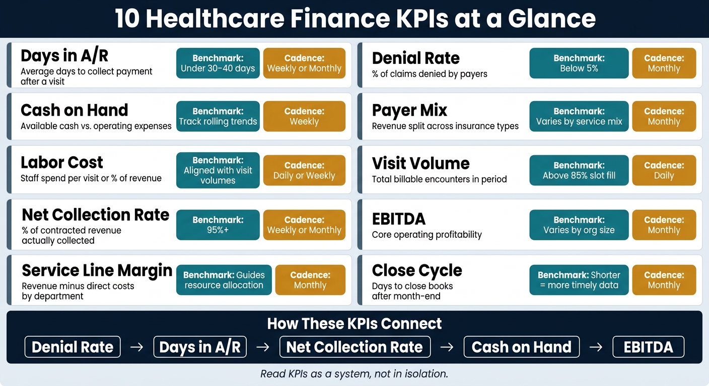
10 Healthcare Dashboard KPIs: Benchmarks & Review Cadence
Each KPI in this article shows a different piece of the financial picture. Looking at them side by side makes it much easier to see what needs attention first and how often your team should review each one.
| KPI | What it measures | Why it matters | Review cadence | Benchmark context |
|---|---|---|---|---|
| Days in A/R | Average days to receive payment after a visit | Shows cash flow health and billing performance | Weekly or monthly | 30–40 days [2] |
| Denial Rate | % of claims denied by payers | Points to coding, documentation, or authorization gaps | Monthly | Below 5% [7] |
| Cash on Hand | Available cash and liquid funds | Shows how long current cash can cover operating expenses | Weekly | Track trends over rolling periods |
| Payer Mix | Revenue distribution across insurance types | Shows reimbursement concentration and margin pressure | Monthly | Varies by service mix |
| Labor Cost | Labor spend per visit or as a share of revenue | Helps balance workload and avoid burnout or overstaffing | Daily or weekly | Aligned with peak visit volumes |
| Visit Volume | Total encounters in the period | Drives revenue and reflects practice growth | Daily | Above 85% slot fill [9] |
| Net Collection Rate | Percent of contracted amount actually collected after adjustments and write-offs | Shows hidden revenue leakage and billing issues | Weekly or monthly | Above 95% [5][9] |
| EBITDA | Operating profitability before non-cash items | Shows whether operations are producing enough profit to absorb labor and reimbursement pressure | Monthly | Varies by service mix and organization size |
| Service Line Margin | Revenue minus direct costs by service line | Helps finance teams decide where to put resources | Monthly | Guides resource allocation decisions |
| Close Cycle | Time to close the books after month-end | Keeps KPI reporting current | Monthly | Shorter cycles support more timely reporting |
A single KPI can tell you something useful. But the bigger clue comes from the pattern across all of them. When you read these numbers together, you can start to see which metrics are pushing the others.
Finance teams don't read these KPIs as separate numbers on a screen. They read them as a chain of cause and effect. One metric shifts, then another follows. That's how a dashboard starts to make sense.
Denials often move first. When more claims get denied, claims sit longer, Days in A/R goes up, and net collection rate drops as more revenue gets delayed or never comes in. That's why finance teams usually check denial trends before they look at A/R aging and collections.
A move toward lower-reimbursing payers can squeeze margin even if visit volume stays flat. Service line margin shows where that squeeze lands, whether it's by location, specialty, or provider group. In plain terms, payer mix is the early signal, and margin is the money outcome.
Labor cost and visit volume help show whether staffing is paying off. If labor costs go up without a similar lift in visits, efficiency is slipping [3]. Put together, these metrics show whether staffing is bringing in enough revenue to support the cost.
Cash on hand is a lagging metric. If cash is low while volume stays steady, that often points to slower collections or spending that's moving faster than cash comes in. When teams watch it next to Days in A/R, they can tell whether the strain is tied to reimbursement delays or weak spending control.
If the books close too slowly, the team ends up making decisions with stale data. That makes every other KPI less useful. A shorter close cycle keeps the dashboard current enough to act on.
These relationships are easier to compare side by side in the table below.
Put the KPI table and metric pairings together, and the message is pretty simple: these numbers only make sense when you read them as a system.
Denials shape A/R and collections. Payer mix shapes margin. Labor cost needs to line up with volume. Close cycle shapes how fresh the data is. That’s what makes the dashboard useful in day-to-day finance work.
The best dashboards surface problems early, show where they sit, and make the next move clear for the team. When finance teams read these 10 KPIs together, they can spot pressure before it turns into a cash or margin problem.
Start with near-real-time revenue cycle KPIs that help you stay in control of daily operations. Focus on metrics like denial rates, charge lag, and claims status so you can spot bottlenecks early - before they start to hit cash flow.
Then move to core financial KPIs like days in accounts receivable and net collection rate. Back those up with operational and clinical metrics such as provider utilization and patient no-show rates to get a clearer picture of what’s driving performance across the business.
Review healthcare dashboard KPIs on a set, steady schedule so teams can stay on track with financial goals and spot operational issues early.
Many key metrics, such as accounts receivable aging, provider utilization, booking pace, and labor-to-revenue ratios, often need a weekly review. Some data should be tracked daily for near real-time visibility, while monthly audits help confirm compliance and check broader financial performance.
Finance teams spot problems fastest when they track operational and financial KPIs together, not in separate silos.
That means pairing revenue cycle metrics like charge lag, denial rates, and first-pass resolution with operating numbers like provider use, no-show rates, and booking pace.
Here’s why that matters: a rise in denials can point to front-end coding mistakes or eligibility problems. And when you look at labor-to-revenue ratios alongside visit volume, you can see whether staffing lines up with patient demand.