Published on
September 12, 2026


If I only look at total MRR, I can miss churn problems until they hit cash, hiring, and next quarter’s forecast. Cohort analysis fixes that by showing how each customer group performs after its first paid month.
Here’s the plain-English takeaway:
This matters most for SaaS teams in the $1 million to $10 million ARR range, where a blended 103% NRR can still hide weak new cohorts. A cohort view helps me see whether older customers are holding up results while newer ones start to slip.
A clean monthly process matters too. I need one dataset, one cohort rule, and one monthly refresh tied back to finance reports. If the cohort totals are off by more than 1% to 2%, I should stop and fix the data before using it for budgets or board reporting.
In short, I use MRR cohorts to answer a few hard questions with actual revenue behavior instead of top-line guesses:
That’s the shift: I stop treating MRR as one big number and start looking at how durable that revenue is.
Cohort analysis is only as reliable as the dataset behind it. If the data is messy, the output will be messy too. So the goal is simple: build a clean, consistent dataset that your finance team can reproduce every month.
The starting point is the cohort anchor and the monthly buckets that make the table usable.
Use the first month a customer recognizes billed MRR, not the lead signup date or contract date. That choice ties the cohort directly to revenue and cash timing in the general ledger.
So if a customer’s first invoice lands in January 2026, that customer belongs to the Jan 2026 cohort. From there, index each month starting at Month 0 so you can compare cohorts with different ages side by side. Pull the first paid date from your billing system and use that same rule across every analysis. If you change the anchor from one report to the next, the cohort view starts to drift.
With the anchor in place, you can define the fields that track revenue movement month by month.
Each customer should have one row for every active month. At a minimum, include:
That last field, MRR delta, is the change from the prior month, whether positive or negative.
This is also where many teams slip up: movement type. Every customer-month should be tagged as new, expansion, contraction, or churn based on three things: whether it is Month 0, the direction of the delta, and whether MRR dropped to zero.
Those tags do more than label activity. They separate new revenue from retention and expansion, which is what makes the forecast usable instead of just interesting on paper.
Once those movements are tagged, clean the dataset before it goes anywhere near a forecast.
Run a data hygiene check before every monthly refresh. The biggest issues to catch are pretty familiar:
Then aggregate cohort MRR by month and compare it with ending MRR or ARR in the FP&A dashboard and board package. Any variance above 1%–2% should be investigated before the dataset is used in a budget or board package.
It also helps to keep a reconciliation log signed by fractional CFO services or internal FP&A and accounting teams. That way, cohort-based forecasts can stand up in board and audit review.
After reconciliation, the cohort table is ready for retention metrics and forecasting.
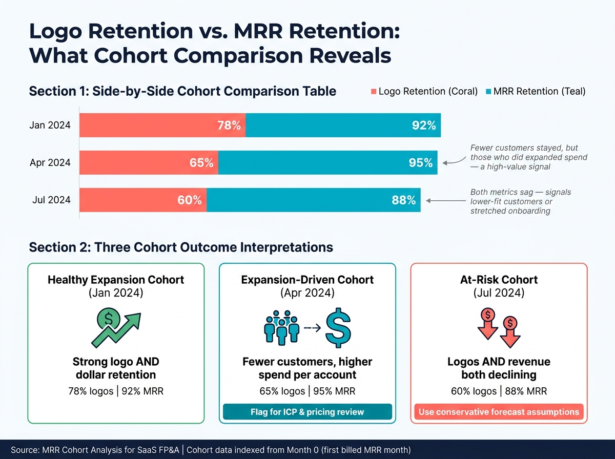
MRR Cohort Analysis: Logo Retention vs. MRR Retention by Cohort
Once you’ve reconciled the dataset, the next step is to turn that history into patterns you can actually use. In practice, two tables do most of the heavy lifting: a logo retention table and an MRR retention table.
Both tables follow the same basic structure. The rows show cohort start months. The columns show Month 0, Month 1, Month 2, and so on. What changes is the metric inside each cell.
The logo retention table shows the share of original customers from each cohort that are still active at each month index. The math is simple: divide active customers at Month N by the starting customer count at Month 0, then multiply by 100. The MRR retention table uses that same layout, but swaps customer counts for dollars. It compares remaining MRR in each later month against Month 0 MRR and expresses it as a percentage of the opening balance. [6][2][4][5]
For monthly reviews, keep the table tight. In most cases, 6 to 12 columns is enough. Add darker shading for higher-retention cohorts so people can scan the table fast instead of hunting row by row. [4][11][5]
Cohorts rarely start at the same size, so looking at raw MRR side by side can send you in the wrong direction. A big cohort will almost always look better in dollar terms, even if it retains worse. That’s why normalizing each cohort to 100% at Month 0 matters. [4][5][12]
Take each month’s value and divide it by that cohort’s own Month 0 baseline. Now every cohort starts from the same point. From there, you can plot the curves on one chart and see, at a glance, whether newer cohorts are doing better or slipping.
Say a post-change cohort hits 95% MRR retention at Month 6 while earlier cohorts were at 88%. That’s the kind of signal teams want. It points to a pricing or onboarding change that may have worked. [4][5][12]
Finance teams usually keep both views in play:
That split helps because one view shows trend direction, while the other shows what lands in the bank account. [6][2][4][5]
Looking at logo retention alone can hide what’s happening inside retained accounts. Looking at MRR alone can hide customer loss. Put them next to each other, and the picture gets much sharper.
This Month 12 snapshot shows three different cohort outcomes:
| Cohort (Start Month) | Logo Retention at Month 12 | MRR Retention at Month 12 |
|---|---|---|
| Jan 2024 | 78% | 92% |
| Apr 2024 | 65% | 95% |
| Jul 2024 | 60% | 88% |
The Apr 2024 cohort is a good example. It loses more customers than Jan 2024, yet its MRR retention is higher. That usually means the customers who stayed expanded their spend. For FP&A, that’s a cohort worth flagging. It also gives you something concrete to test: pricing, ICP, and onboarding changes. [9][10][13][14][16]
The Jul 2024 cohort tells a different story. Logo retention is weaker, and MRR retention is weaker too. That often points to a sales push into lower-fit segments, or an onboarding team that got stretched too thin at the time. When both lines sag, it’s usually a sign to use a more conservative forecast and dig into what changed. [2][3][13][15]
These curves don’t just sit in a dashboard. They become the working assumptions behind revenue forecasts, hiring plans, and cash planning.
Use cohort curves to shape budgets, forecasts, hiring plans, and cash planning. Start with the cohort forecast, then turn that into budget, headcount, and cash assumptions.
The starting point is a monthly MRR waterfall: Beginning MRR + New MRR + Expansion MRR − Contraction MRR − Churned MRR = Ending MRR[8][27][28]. Model each cohort on its own, then roll everything up into one forecast.
Use normalized retention curves as the base for each cohort. For existing cohorts, apply the historical curve to estimate how much MRR carries into future months. For future cohorts, add assumed new-customer cohorts based on pipeline conversion, average deal size, and sales capacity. That gives you a forecast tied to actual customer behavior instead of a flat growth-rate guess[23][24][28][5][29].
It also helps to split the revenue drivers apart. New MRR comes from sales and marketing. Expansion MRR comes from upsells or seat growth. Contraction comes from downgrades. Churn comes from cancellations. When finance models those pieces separately, it becomes much easier to see what’s holding revenue up and what’s starting to slip[8][25][27][28].
Once the base forecast is in place, run it through upside and downside cases.
After the cohort-based waterfall is built, run it three times with different assumptions. A practical place to start is:
This kind of driver-based planning helps boards test the operating levers that matter. In many cases, the downside case matters more than the upside case because it shows whether the business can handle slower growth or higher churn with its current cash balance and fixed cost base[17][20][22][26].
Small retention changes can snowball over the next 6 to 12 months. Better retention improves collections, pushes out the need for outside funding, and gives the company more room to invest. Weaker retention does the reverse. Burn picks up, and runway gets shorter.
Revenue timing from cohort forecasts should set the trigger points for hiring. Keep booked revenue timing separate from cash collection timing, because ARR and cash can drift apart in a big way. If the forecast shows strong retained MRR and growing gross profit, finance has a solid case for adding headcount earlier because future revenue looks more predictable. If newer cohorts are missing the mark, it usually makes sense to slow hiring - especially in sales and customer success - until productivity improves[18][21][22][27].
The table below shows how scenario assumptions flow into operating decisions:
| Scenario | Revenue assumption | Hiring timing | Monthly burn | Runway |
|---|---|---|---|---|
| Upside | Stronger retention and faster expansion | Earlier hiring | Higher than base | Longer than base |
| Base | Current cohort curve and normal sales productivity | Planned timing | Baseline | Planned target |
| Downside | Weaker retention, slower conversion, or higher contraction | Slow or pause hiring | Lower than planned | Shorter than target |
Runway follows a simple formula: Current Cash Balance / Monthly Burn Rate. Growth-stage SaaS companies often target 18 to 24 months of runway after a Series A round[27]. So if the downside case drops runway below that band, it needs attention right away.
The day-to-day discipline is simple: tie each hiring decision to a clear threshold, like booked ARR, net revenue retention, or cohort payback. That keeps headcount decisions grounded in numbers instead of hope. Put those thresholds into the monthly forecast package, and use them as core assumptions in monthly FP&A and board reporting.
Once cohort curves are driving the forecast, bring those same inputs into the board package. Boards usually want to see ARR, MRR, NRR, GRR, and cohort curves together because that mix shows how durable revenue is.[36][37][38]
A simple structure works best: what changed, why it changed, and what happens next.
If a cohort’s GRR falls over time, say so plainly. Then name the cause - product gaps, pricing friction, or customer success coverage - and attach a clear response with a timeline. Put logo retention, NRR, and GRR on the same slide so the board can tell whether growth is spread across the base or hiding churn underneath.[31][34][39] The cohort view also helps explain how future bookings, retention, and cash timing will shape the plan.
Don’t lean on blended averages. Break cohort data out by customer tier, such as:
Start each chart with a one-sentence takeaway. That gives the room the point before anyone starts debating the details. Useful benchmarks can also ground the discussion: NRR ≥ 110% is strong, while GRR below 85% signals risk.[33][7]
That same monthly cohort refresh should feed FP&A too, not sit in a board-only workflow.
A monthly process keeps cohort analysis from turning into a once-a-quarter scramble. Close the month’s books by the 10th, refresh cohort tables with the latest MRR movements, run variance analysis against plan, and then update the forecast using the latest cohort actuals.[30][32][35][1]
This rhythm helps finance teams spot churn risk early and make operating calls sooner.
Use the monthly refresh to update assumptions for:
The monthly FP&A review should focus on the few things that matter most: which cohorts moved off plan, whether the change looks like a one-month blip or a trend, and what response the business should take. Board revenue reporting should come straight out of the monthly close, not from a separate build every quarter.[35][38]
When the board package pulls from the same source of truth used in monthly FP&A, the numbers stay consistent, easy to reconcile, and much easier to defend during investor diligence.
Teams that want to put this process in place faster can bring in outside FP&A help. If you don’t have a dedicated FP&A function, Phoenix Strategy Group can help build the data pipeline, monthly close, rolling reforecast, and board reporting process.
With reporting and cadence in place, the last step is changing how FP&A decisions get made. MRR cohort analysis should move FP&A away from total MRR alone and toward revenue durability.
Total MRR can look healthy on the surface while weak retention quietly eats away at the base. Cohort curves make that drop visible early enough to act on it.
Build clean cohort inputs, compare logo retention with dollar retention, forecast from cohort curves, and connect the output to hiring and cash. Finance teams that bake this into their monthly cadence can adjust plans sooner when new cohorts underperform, shift resources toward stronger segments, and build models that hold up in board review.
Using the first billed month lines up the cohort start with your billing cadence and revenue recognition. In plain English, it makes the model much easier to compare with actual cash flow and billing cycles.
It also gives you a steady baseline for retention curves. That helps you spot the highest churn-risk window - usually the first 3 to 6 months - without the distortion that can come from blended, flat-rate churn metrics.
Logo retention shows how many customers you lose. MRR retention shows how much recurring revenue you lose.
Those two numbers don’t always move together. If a bunch of small accounts churn, customer count can drop without much impact on ARR. But one big downgrade can cut revenue in a meaningful way while barely changing the number of customers.
That’s why finance teams look at both. One metric points to weakness in customer volume. The other shows weakness in revenue value.
SaaS teams should review cohort performance and update forecasts monthly or quarterly. For most models, a monthly refresh is the best place to start.
Each month, swap forecasted numbers for actuals and run a variance analysis. If results are off from projections by 5% to 15%, dig into why and update your assumptions. Then, once a quarter, do a deeper reset of your longer-term assumptions.