Published on
July 25, 2026


If you run a services firm, I’d track 10 dashboard types: cash flow, revenue, utilization, project margin, pipeline, AR aging, staffing, retention, forecast, and an executive summary. That set covers the main decisions most firms face: Do we have cash? Is revenue on plan? Can the team handle demand? Are clients staying? and What does the next quarter look like?
Here’s the short version:
A strong dashboard does one job well. It should stay under 10 KPIs, match the person using it, and refresh on the right schedule: daily/weekly for cash and AR, weekly for pipeline and staffing, and monthly/quarterly for forecast and leadership review.
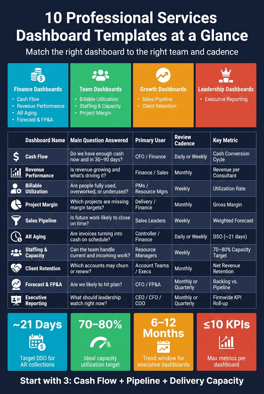
10 Professional Services Dashboard Templates: Quick Reference Guide
| Template | Main question it answers | Main user | Review pace |
|---|---|---|---|
| Cash Flow | Do we have enough cash now and over the next 30–90 days? | CFO / Finance | Daily or weekly |
| Revenue Performance | Is revenue growing, and what is driving it? | Finance / Sales leaders | Monthly |
| Billable Utilization | Are people fully used, overworked, or underused? | PMs / Resource managers | Weekly |
| Project Margin | Which projects are missing margin targets? | Delivery / Finance | Monthly |
| Sales Pipeline | Is future work likely to close on time? | Sales leaders | Weekly |
| AR Aging | Are invoices turning into cash on schedule? | Controller / Finance | Daily or weekly |
| Staffing & Capacity | Can the team handle current and incoming work? | Resource managers / Dept. heads | Weekly |
| Client Retention | Which accounts may churn or renew? | Account teams / Execs | Monthly |
| Forecast & FP&A | Are we likely to hit plan? | CFO / FP&A | Monthly or quarterly |
| Executive Reporting | What should leadership and the board watch right now? | CEO / CFO / COO | Monthly or quarterly |
A few numbers matter more than the rest:
If I had to start with only three, I’d pick cash flow, pipeline, and delivery capacity. Those three usually tell you where the biggest risk sits first.
Start with the decision the dashboard needs to support. The best dashboards don't cram in every data point. They keep the screen clean so teams can spot the numbers that matter and act on them. If a metric doesn't help someone make a decision, it shouldn't be there. A dashboard that shows everything usually hides the one thing people need to see.
Decision focus comes first. Every metric in a template should answer a clear question, not just take up space. A cash flow dashboard should help finance teams check liquidity at a glance. A utilization dashboard should help project managers see where staffing is uneven or where capacity is getting tight.
Role-based KPIs matter more than many firms think. Executives, project managers, and client teams do not need the same view. Executives need a picture of firmwide health. Finance teams need receivables, budget variance, and revenue per consultant. Project managers need delivery risk and staffing gaps. One dashboard rarely does all of that well.
In the U.S., billing terms and payroll-heavy staffing make cash timing and utilization central metrics. Net 30, net 45, and net 60 terms can create real cash flow gaps, and those gaps need to be easy to spot. In relationship-driven firms, pipeline and retention data should be split by relationship owner, not only by practice area.
Cadence matters too. Templates should fit the way the team actually works. That's why the templates below are grouped into finance, operations, and leadership views.
| Trait | What It Means in Practice |
|---|---|
| Decision focus | Every KPI answers a specific operational question |
| Role-based design | Executives, finance, PMs, and client teams each see relevant data |
| U.S. billing cycle awareness | Tracks net 30/45/60 gaps and their impact on liquidity |
| Payroll-heavy cost structure | Shows how utilization and billable hours support payroll coverage |
| Flexible cadence | Supports the reporting rhythm each team actually works in |
Use these criteria to pick the template below that matches the decision each team needs to make.
For professional services firms, cash keeps payroll moving, vendors paid, and client work on track. This template is built to answer a plain but high-stakes question: does the firm have enough cash today, and will it have enough over the next 30 to 90 days?
Track current ratio, quick ratio, working capital, cash conversion cycle, AR turnover, operating cash flow, cash burn, and average days past due. Put Cash Conversion Cycle at the center of the view because it shows how long cash is tied up before collection [3]. Add Collection Effectiveness Index to show whether collections are keeping up with invoicing [3].
If cash starts to get tight, the next place to look is AR aging. That’s usually where the story gets a lot clearer.
Use feeds from accounting, billing, banking, and payroll systems so the dashboard stays current instead of turning into a stale month-end snapshot.
| Source | What It Feeds Into The Dashboard |
|---|---|
| Accounting system (GL) | Balance sheet, P&L, operating cash flow - cash next |
| Billing & AR/AP modules | Invoice aging, outstanding balances, payable timing - cash next |
| Banking feeds | Cash on hand, beginning cash balance - cash now |
| Payroll & expense records | Monthly expenses, operating outflows - cash now |
This dashboard works best for CFOs, finance leaders, founders, and practice managers who need a live read on liquidity.
Once liquidity is clear, the next question is whether revenue is growing fast enough.
The next thing to check is simple: Is revenue growing, and what’s driving that growth? A revenue performance dashboard helps answer that by bringing actual revenue, booked revenue, and consultant output into one place.
This template shows whether revenue is on track, which service lines or regions are pushing growth, and where pricing or staffing may need to shift.
The dashboard should focus on monthly revenue vs. prior periods, year-to-date vs. budget, and year-over-year growth. It should also go past top-line numbers and track revenue by service line or region and revenue per consultant [1][4][5].
| Source | What It Contributes |
|---|---|
| CRM | Closed-won revenue and new-business revenue by source |
| ERP / Accounting | Revenue vs. budget, profit margins, and expense data |
| PSA Software | Revenue per consultant, billable utilization, and project performance |
| Billing / Invoicing | Outstanding invoices and average project revenue |
CFOs and finance managers lean on this dashboard during monthly reviews and for board-level reporting. Sales and marketing leaders use it to measure marketing ROI and sales results. Business analysts use it to look deeper into growth patterns and service line performance [5].
If revenue looks strong but margins stay thin, the next dashboard should make it clear how billable time is being used.
Strong revenue can mask a capacity problem. A team can look busy on paper while people are either stretched too thin or sitting idle. A billable utilization dashboard brings that into view before it turns into a delivery problem.
This dashboard helps leaders track delivery capacity so they can decide when to hire, shift work across the team, or put the brakes on new projects.
The dashboard should focus on billable vs. non-billable hours, utilization rate, and bench time. It should also include target vs. actual performance, project time allocation, and realization rate and billing rate.
That mix matters for a simple reason: it shows whether hours worked are turning into revenue, or just filling up timesheets.
Set red, yellow, and green thresholds for each KPI so weekly reviews are easier to scan and act on.
| Source | What It Contributes |
|---|---|
| Time-Tracking Software | Billable vs. non-billable hours by consultant and project |
| Project Management Workspaces | Project time allocation and average project duration |
| Financial Reporting Tools | Realization rate and billing rate |
| HR Records | Team availability and bench time |
Project managers use this dashboard to watch team efficiency and keep work moving. Finance teams use it to check billing accuracy and revenue recognition. Executive teams look at firm-wide utilization figures when making planning and capacity calls.
Review it weekly for staffing decisions and quarterly to spot trends.
If utilization looks healthy but profit is still weak, review project margin next.
A project margin dashboard helps teams see financial underperformance early, while there’s still time to fix it.
This dashboard helps leaders find projects that are missing margin targets. That gives them a chance to move resources, adjust pricing, or reset scope before margin slips further.
Once margin is out in the open, the next step is simple: check whether the pipeline is bringing in the right kind of work.
Track gross margin, earned revenue, project costs, and days outstanding. Add Earned Value Analysis (EVA) as a line graph that shows actual vs. scheduled effort over time to monitor project health [6].
It also helps to view the data by project, client, and service line. That makes it easier to spot which work drives profit and where margin leaks keep showing up.
| Source | What It Contributes |
|---|---|
| PSA / Project Management Systems | Task status, resource assignments, project deadlines |
| Time-Tracking Software | Actual hours worked, available hours, effort variance |
| Billing & Finance Systems | Earned revenue, project costs, operating expenses |
| Accounting / Payroll Systems | Days outstanding, accounts receivable |
Delivery leaders use this dashboard to catch margin leaks early. Operations managers use it to flag scope creep and delivery pressure. Finance leaders watch margin trends and receivable risk. Executives use the high-level view to guide pricing, scope, and go/no-go calls.
From here, sales teams should compare margin data against pipeline quality.
After margin, the next thing to check is whether the pipeline is filling up with work that actually pays off. A sales pipeline dashboard pulls deal activity into one current view of revenue in motion. It shows which deals are likely to close and when that revenue should land. That matters because pipeline quality shapes hiring plans, delivery schedules, and near-term cash flow.
This dashboard helps leaders decide if staffing levels make sense, which reps need coaching, and whether the current sales approach is turning into revenue.
Track win/loss deals, total pipeline value, weighted forecast, calls per rep, and stage progression. Use a pipeline kanban, rep leaderboards, opportunity records, and activity tracking to show where deals stall or pick up speed. Finance teams use committed, best-case, and weighted projections to get a better read on revenue timing [7].
This dashboard works best when it pulls straight from CRM data, so deal movement updates in real time. Activity logs - calls, emails, and meetings - add the missing context. They help explain why deals are moving forward or getting stuck.
| Role | Primary Focus | Key Decision |
|---|---|---|
| Executive/Founder | Big-picture strategy and progress toward annual goals | Strategic planning and annual growth targets |
| Sales Leader | Closed-won performance, total pipeline value, and win/loss analysis | Coaching priorities and resource allocation |
| Practice Leader | Calls per rep, pipeline kanban, and staffing needs | Staffing needs and delivery load |
| Finance Team | Committed vs. best-case projections | Cash flow accuracy and revenue timing |
| Sales Rep | Own prospects, exploratory call progress, proposal status, and personal targets | Daily task prioritization |
Use yellow and green status cues so reps and managers can spot trouble fast.
If the pipeline looks healthy but cash is still tight, AR aging can show whether slow collections are dragging the firm down.
After pipeline, AR aging tells you if booked revenue is turning into cash on schedule. This dashboard helps teams spot slow-paying accounts, focus collection work, and flag cash risk before invoices drift into the 90+ day bucket.
The main metric here is Days Sales Outstanding (DSO). For professional services firms, a common target is around 21 days [8].
Beyond DSO, the dashboard should also track:
That mix gives you both the big picture and the day-to-day warning signs. If DSO looks fine but the 61–90 or 90+ buckets start growing, that's usually a sign something needs attention.
Use these sources to keep aging data current.
| Data Source | Key Fields | Purpose |
|---|---|---|
| Invoicing System | Invoice #, date, due date, amount | Establishes the debt and aging timeline |
| Payment System | Payment date, amount, payment type | Clears balances and tracks cash-in trends |
| CRM | Account manager, company name, contact info | Shows collection contacts |
| Accounting/ERP | Open receivables balance, transaction log | Provides the source of truth for financial reporting |
Finance leaders and executives use this dashboard for a high-level view of cash flow. Controllers need a close-up look at aging details, plus year-over-year comparisons, to catch trends that are getting worse.
Project managers and client service leaders get a lot from the Top 5 Customers by Amount Due view. It gives them a clear way to bring up billing problems in client conversations without flying blind.
If AR is clean, the next step is staffing and capacity planning to check whether the team can take on more work.
Once collections are steady, the next bottleneck is simple: can the team handle the work already in the pipeline? A staffing and capacity planning dashboard helps you see who has room, who’s stretched thin, and where gaps are starting to show.
Use this template to balance weekly workload and make the case for hiring when demand goes past team capacity.
Track over- or under-capacity hours, assigned capacity vs. available capacity, and utilization. A good rule of thumb is to plan for 70% to 80% of working hours as project time. Meetings, admin work, and internal communication take up the rest [9].
If team members split time across different roles, track each role on its own. Treating all hours as if they can go to any task is a fast way to create chronic overcommitment [9].
| Data Source | What It Feeds |
|---|---|
| Time-Tracking Software | Actual vs. estimated hours per person and project |
| Team Roster | Baseline availability, FTE values, planned time off |
| Project Management Tool | Upcoming demand, project start/end dates |
Resource managers, project managers, IT directors, and department heads tend to rely on this dashboard the most. For remote teams, add time-zone buffers so schedules don’t look more open than they are.
If capacity is covered, the next question is whether clients are staying and expanding.
A client retention dashboard helps you spot renewal risk early, before churn shows up in revenue.
Use this dashboard to decide where to focus renewals, expansion opportunities, and at-risk accounts.
The main metrics fit into five groups: retention health, revenue impact, churn risk, renewals, and client value.
| KPI Category | Metrics to Track |
|---|---|
| Retention Health | Client Retention Rate, Account Retention Trend |
| Revenue Impact | Net Revenue Retention (NRR), Recurring Revenue Growth, Expansion/Contraction |
| Churn Risk | Churn Rate, Churn Reasons, Engagement Signals |
| Renewals | Renewal Rate, Expiration Dates, Days to Renewal |
| Client Value | Customer Lifetime Value (CLV), Account Concentration |
One metric deserves extra attention: silent churn. These are accounts with no contract activity for six months [10]. They usually don’t say they’re about to leave. That’s why it helps to track engagement signals next to expiration dates. In many cases, that gives you an earlier heads-up than watching renewal dates alone [10].
Pull contract dates and contract values from your contract management software. Then sync that data into your CRM and add billing, NPS, and support-ticket data to get one view of renewal risk [10][11].
Customer Success teams, RevOps, account managers, sales leaders, support leads, and fractional CFOs use this dashboard to manage renewals, forecast renewals, and flag churn risk [10][11].
It also helps to set automated alerts at the 90-, 60-, and 30-day marks before each contract expires. That way, account owners have enough time to step in and do something useful before the renewal slips away [10].
Once retention is visible, the next dashboard should show how renewals and expansion revenue feed into the forecast.
A forecast and FP&A dashboard shows where the business is headed so leaders can act before problems show up. The goal is simple: pull backlog, pipeline, retention, and collections into one view so you get a forward-looking read on the company. These are the same signals used in the earlier templates. Here, they come together in one planning view.
Use this dashboard to decide:
Start with committed revenue vs. weighted pipeline.
Committed revenue comes from existing contracts and backlog. Weighted pipeline takes open deals and adjusts them based on the chance that each deal will close. Put those side by side, and you can see what revenue is already lined up and what upside may still come in.
| KPI | What It Tells You |
|---|---|
| Forecasted Revenue | Committed revenue plus probability-weighted pipeline |
| Backlog | Total value of signed work not yet performed; the strongest short-term signal of financial stability and workload |
| Forecast Accuracy / Variance to Actual | How closely prior forecasts matched actual results; flags systematic over- or under-forecasting |
Don't look at these numbers one by one. If you forecast from pipeline alone, you're flying half-blind.
Pull data from ERP, CRM, PSA, billing, and budget-planning tools so forecast, backlog, and variance numbers stay in sync.
| Source | What It Contributes |
|---|---|
| ERP / Accounting | Actuals, budget vs. variance, operating expenses |
| CRM | Pipeline value, deal stage, probability weightings |
| PSA Software | Backlog, project revenue recognition, resource demand |
| Billing / Invoicing | Confirmed revenue, outstanding invoices |
| Budget-Planning Tools | Scenario models, headcount plans, forecast versions |
This dashboard is most useful for CFOs, FP&A teams, and firm leaders who own forecasting and planning. It also works as the input for the executive summary dashboard that comes next. From there, executives can turn the output into the summary they share with the board.
Use this view to turn your earlier operational dashboards into a board-ready summary.
The executive reporting dashboard pulls cash flow, utilization, pipeline, margin, retention, and forecast into one leadership view. It gives you a single roll-up of the firm’s core KPIs.
This dashboard supports weekly leadership meetings, monthly close reviews, and board updates. Leaders use it to answer three key questions fast: Is the firm on track financially? Where are the delivery risks? What does the pipeline say about commercial performance?
Use color tags - On Track, At Risk, Delayed - so issues stand out right away.
| Category | KPIs |
|---|---|
| Revenue | Total revenue, revenue per consultant, budget vs. actual revenue |
| Profitability | Project margin, profit margin, budget vs. actual |
| Cash Flow | Cash position, outstanding invoices, AR aging |
| Utilization | Billable vs. non-billable hours, consultant utilization rate |
| Pipeline | Pipeline value, conversion rate |
| Client Health | Retention rate, customer satisfaction, on-time delivery |
Feed this dashboard from your accounting system, CRM, project management software, and time-tracking tools. Each one covers a different part of the business: financials, sales, project delivery, and resource load.
This template is built for the CEO, fractional CFO services, COO, department heads, and board members who need a high-level view of firmwide decisions, not task-level monitoring.
A lot of executives still make big calls without real-time operational data. This dashboard helps shift the conversation from watching separate functions to steering the firm as one business.
Getting the right dashboard in front of the right person matters just as much as building it the right way. If a utilization report lands in the CFO's inbox instead of the resource manager's, things slow down. A dashboard only does its job when the right team sees it on the right schedule.
| Dashboard Template | Primary Owner | Recommended Refresh Cadence |
|---|---|---|
| Cash Flow | Finance / CFO | Daily or weekly |
| AR Aging | Finance / Controller | Daily or weekly |
| Sales Pipeline | Sales Leadership | Weekly |
| Billable Utilization | Operations / Resource Managers | Weekly |
| Staffing & Capacity | Operations / Resource Managers | Weekly |
| Project Margin | Finance / Delivery | Monthly |
| Client Retention | Executive Leadership | Monthly |
| Forecast & FP&A | Finance / CFO | Monthly or quarterly |
| Executive Reporting | CEO / CFO | Monthly or quarterly |
A simple way to assign ownership:
For boutique and solo consulting firms, monthly revenue and cash reviews may be enough. But if billable work changes from week to week, a weekly review makes more sense.
Also, keep each dashboard tight: 10 metrics or fewer.
Once ownership is set, standardize the numbers so every team reads the same dashboard the same way.
Use the same formatting across all dashboards. That makes templates easier to compare, share, and review. Every template below should follow the same rules.
Show all financial figures in USD ($) with commas for thousands and periods for decimals, like $1,250.00. Use mm/dd/yyyy dates, like 07/26/2026. Roll up data by month and quarter for MoM and YTD tracking [1].
For staffing and capacity, use hours and FTEs, such as 160 hours / 1.0 FTE. Show utilization, project margin, client retention, and pipeline win rates as percentages (%), not decimals [1].
| Metric Category | U.S. Convention | Example |
|---|---|---|
| Currency | USD ($) | $50,000.00 |
| Dates | mm/dd/yyyy | 07/26/2026 |
| Numbers | Commas for thousands, periods for decimals | 1,250.50 |
| Staffing | Hours and FTEs | 160 hours / 1.0 FTE |
| Rates | Percentage (%) | 85% Utilization |
| Reporting Cadence | Monthly / Quarterly | Q3 2026 |
Executive dashboards should show trend context, not just a snapshot. Include a 6- to 12-month view, concise KPI tiles, and variance indicators that compare actuals against budget or prior-year data [1][12]. Each dashboard should land on one main takeaway, with rounded figures for executive review.
Apply these standards the same way across finance, operations, and leadership so every template looks and reads the same.
No single dashboard tells a professional services firm everything it needs to know. Each template answers a different question, from short-term cash visibility to longer-term revenue planning. That’s why these templates work best as a stack. Finance, operations, and leadership each need their own view.
Start with the gap that creates the most risk: cash, delivery capacity, or pipeline. As David A. Fields, Founder of David A. Fields Consulting Group, puts it:
"Your consulting firm's three Vital Signs... are Cash Flow, Pipeline Health and Delivery Capacity." [2]
Smaller firms can begin with cash flow and revenue, then add utilization, pipeline, or retention when those calls become urgent.
Keep each dashboard tight. Focus on the few KPIs that drive action.
If your data isn’t connected, cash flow, utilization, and forecast dashboards lose much of their use. These tools only work when source systems stay connected and current. Phoenix Strategy Group can connect bookkeeping, FP&A, and data engineering so reporting updates automatically.
Once the data is connected, the next move is picking the few dashboards that matter most. Start with the ones tied to your biggest risks, then add more as decisions get harder.
Start by connecting your core systems - ERP, bank, and CRM - and make sure your metric logic ties back to source transactions.
Once your data is clean and connected, build a cash flow dashboard first. That gives you a fast read on liquidity and helps you catch anomalies early. Then zero in on 5 to 7 KPIs linked to your growth goals, like revenue trends, gross margins, and burn rate.
Update frequency should line up with how fast your team needs to act. If a number drives day-to-day decisions, review it more often. That’s why high-priority metrics like cash position, liquidity, and accounts receivable or payables are best tracked daily.
Other numbers don’t need that same pace. Project metrics, margins, and pipeline reviews are usually fine on a weekly rhythm. That gives teams enough time to spot shifts without getting buried in constant check-ins.
For big-picture reporting, a slower cadence makes more sense. Executive or board reporting usually happens monthly or quarterly, depending on the business and what leaders need to see. Automating data refreshes helps keep reports accurate and cuts the lag that comes with manual reporting.
For professional services firms, the KPIs that matter most usually sit at the intersection of financial stability and day-to-day efficiency.
Focus on metrics like:
You don’t need to track every number under the sun. In most cases, 5 to 7 KPIs is enough, as long as they match your firm’s current stage of growth.