Published on
July 30, 2026

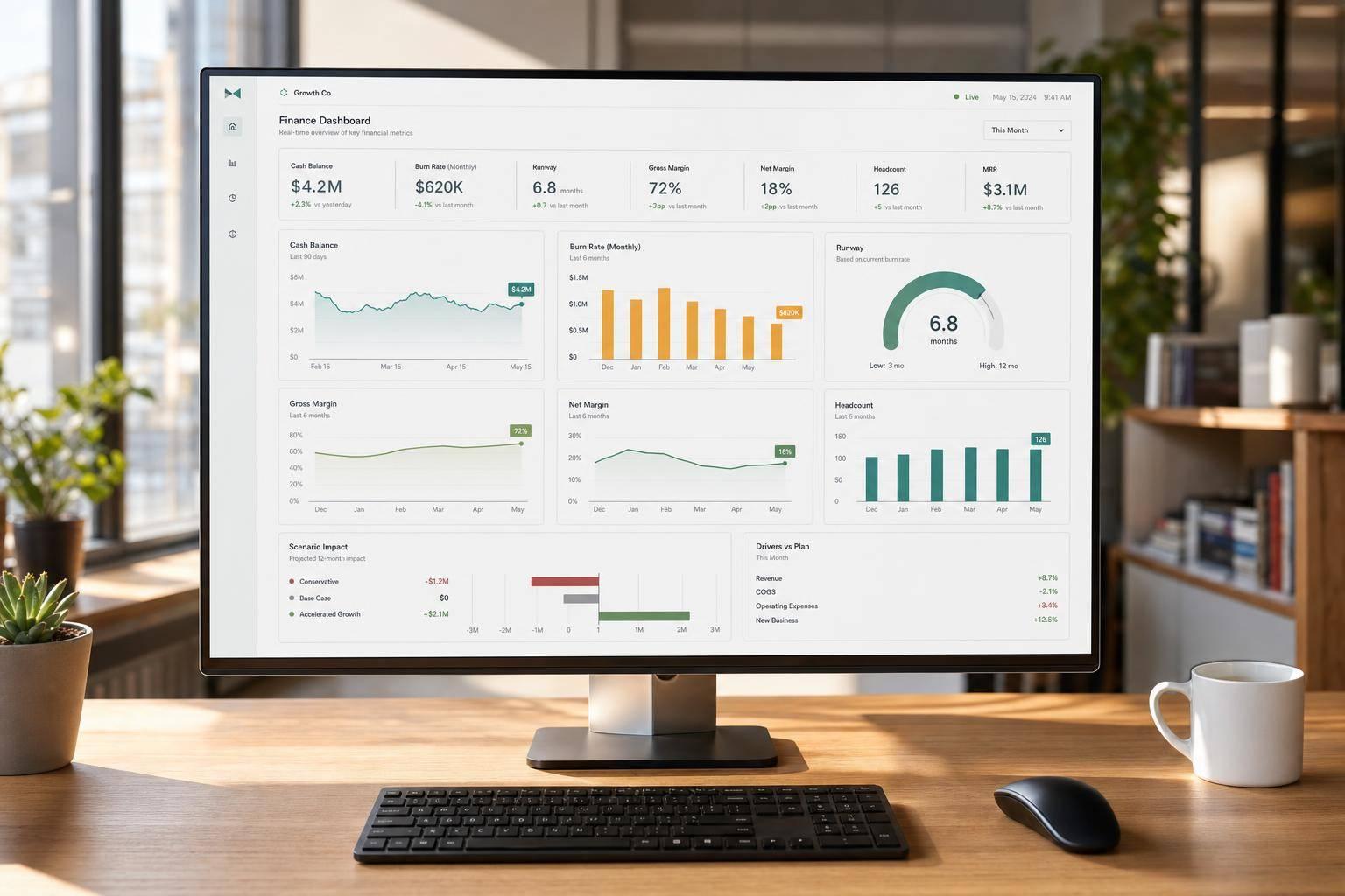
If I had to sum it up in one line: a real-time budget dashboard helps me spot spend problems, cash pressure, and margin drift before month-end.
Instead of waiting for a spreadsheet after the close, I can track budget vs. actuals, cash balance, gross and net burn, runway, headcount costs, and vendor spend in one place. That matters more as a company grows, because more hiring, more software, and more paid spend can push costs off plan fast.
Here’s the short version:
A good setup does not try to show everything. It shows the numbers I need to answer a few direct questions: Are we overspending? Is margin holding up? How many months of runway do we have left?
Quick Comparison
| View | What I use it for | Main numbers |
|---|---|---|
| Monthly budget review | Check plan vs. actual performance | Revenue, gross profit, OpEx, EBITDA, variance $ and % |
| Rolling forecast | Update the next 12–18 months based on new facts | Revenue, margins, burn, cash, runway, scenarios |
| Real-time dashboard | Monitor the business between meetings | Cash, burn, runway, headcount, vendor spend, top-line trends |
| Static report | Look back at a fixed period | Frozen past results only |
What stood out to me most is this: the dashboard is not just a finance report. It is a decision tool for founders, finance leads, and department heads who need a simple, current view of where money is going and what happens next.
A real-time budget dashboard should bring spend, cash, and margin into a small set of views that people can act on fast. The job isn't to show every number. It's to put the right financial, operating, and scenario views on one page so leaders can make calls without digging through reports.
At the center of a growth-stage dashboard is a profit-and-loss budget vs. actuals view. It should list revenue, COGS, gross profit, operating expenses, and EBITDA in that order. For each line, the dashboard should show Actual, Budget, Variance $, and Variance % across the current month, QTD, YTD, and a rolling 12-month window.
A line chart or stacked bar chart covering the last 12 months helps people spot seasonality and growth patterns fast. You don't want users squinting at rows of numbers and trying to guess the story.
Operating expenses are easier to read when they're grouped into functional buckets:
Each line should also have a green/red status. Green means favorable performance. Red means unfavorable performance. For example, revenue above budget is favorable, while expense above budget is unfavorable.
For EBITDA, don't stop at the dollar gap. Show both the dollar variance and the margin impact - in other words, EBITDA as a percentage of revenue. That margin view matters because it shows earnings power, not just the raw dollar figure.
The cash panel should sit at the top of the dashboard and use quick-scan KPI tiles, not heavy tables. The key tiles are current cash balance, gross burn, net burn, and runway in months, based on current cash and trailing net burn.[3][4][5]
A small spark line under each tile, showing the last 6–12 months, adds instant context. It gives the reader the direction of travel without forcing them into a second report. Color thresholds help here too. If runway drops below 9 months, mark it in red. If net burn is moving down, mark it in green.
Once cash and runway are visible, founders usually want margin context right beside them. Gross margin %, contribution margin %, and EBITDA margin should appear next to the cash metrics, each with a 12-month rolling trend. Putting these side by side makes it much easier to see how liquidity and unit economics move together.
Past the P&L and cash views, growth companies need operating controls that tie day-to-day choices to financial results. This is where budget variance stops being abstract and starts looking like hiring plans, software contracts, and monthly payroll.
The headcount view should show approved vs. actual headcount by department, split into full-time, part-time, and contractors. It should also include monthly payroll and benefits costs for each team. The useful part is the link to a scenario control. If a user changes hiring pace for one department, the dashboard should update projected net burn, EBITDA, and runway right away. That makes the trade-off between growth spending and cash preservation plain to see.
Vendor spend should work the same way. The dashboard should rank top vendors by annualized spend, assign each one to a category like Marketing, Technology, Operations, or Professional Services, and flag vendors that are above plan. Renewal alerts for upcoming contract dates help teams avoid last-minute surprises.
A simple scenario control - like cutting top vendors by 10% - should flow through to updated burn and margin projections. That gives finance and leadership a fast read on what a renegotiation might be worth.
These views only stay useful if the dashboard pulls from accounting, banking, payroll, billing, and CRM data without delay.
Growth companies need connected source systems, clean mappings, and clear refresh schedules.
Five source systems do most of the heavy lifting. Each one feeds a different part of the dashboard.
| Source System | Key Data Points | What It Powers |
|---|---|---|
| Accounting / GL | GL entries, account codes, department tags, vendor names, invoice dates, trial balance by period | Budget vs. actuals, gross profit, margin analysis, EBITDA |
| Banking / cards | Cleared transactions, available cash | Cash position, short-term liquidity |
| Payroll / HR | Gross and net pay, employer taxes, benefits, FTE counts, departments | Headcount cost, departmental spend, revenue per FTE |
| Billing | Invoice details, MRR/ARR, churn, discounts, payment status | Revenue recognition, recurring revenue margin |
| CRM | Pipeline stages, expected close dates, deal amounts, probability, bookings | Top-line forecasts, cash runway scenarios |
These feeds keep the cash, margin, runway, headcount, and revenue views up to date. Put simply, they map to the dashboard’s main views: spend, cash, headcount, revenue, and forecast scenarios.
Refresh timing should fit the type of data. Bank and card feeds may update several times a day. Payroll usually updates each pay run. Billing often updates daily. CRM can update close to real time. P&L data, on the other hand, stays preliminary until the close is done.
A dashboard also needs a plain-English freshness label on each view. That way, nobody has to guess how current the numbers are. For example:
"Cash as of prior business day end"
"P&L actuals through the last closed payroll period."
Data mapping matters just as much. Raw vendor names from bank feeds should roll up into GL expense categories. Payroll position codes should assign employees to the right departments on their own. If that mapping is messy, the dashboard turns into a junk drawer of miscellaneous line items. And then it gets much harder to see where the money is going.
Locked periods help too. Once a month is closed, no one should be able to change those figures. That keeps historical margin and expense data steady. Budget and forecast versions should also be labeled in a way people can read at a glance, such as FY26 Board-Approved Budget v1 or Q3 Rolling Forecast v3. Those versions should carry metadata like owner, approval date, and key assumptions, so the dashboard always shows which version is being compared with actuals.[6][7][8]
With current, mapped data in place, teams can use the dashboard for monthly budget reviews and rolling forecasts.
The standard flow is simple: source systems → warehouse → planning model → dashboards.
Source systems feed a warehouse. The warehouse feeds the planning model and the dashboards. That keeps actuals and forecasts in sync instead of drifting apart.
Integrated FP&A systems keep actuals, forecasts, and scenario views tied to the same data model. That’s what turns live data into a monthly planning tool instead of just another reporting screen.
Once the dashboard is live, monthly planning usually starts with a founder view that sets the tone for the meeting. It pulls cash, burn, runway, revenue vs. budget, gross margin, OpEx, and EBITDA into one page, so the team can see the business at a glance.
Color flags call out material variances and show where the discussion needs to go. The goal is simple: make the page easy to scan. In most cases, that means keeping it to about 15 metrics.
That same snapshot then becomes the starting point for department-level variance reviews.
After the founder review, each department leader walks through a spend vs. budget view. Teams look at spend vs. budget, line-item variances, and cost-per-output metrics tied to their targets.
When a material variance shows up, it should come with a short note: what changed, and what happens next. That keeps the review from turning into guesswork. The dashboard also flags unapproved overages, so exceptions come up during the meeting instead of getting buried later [9][10][11][12].
The two views do different jobs. One checks how the team performed against the plan. The other updates the plan based on what the business knows now.
| View Type | Primary Users | Key Metrics | Best For | Limitations |
|---|---|---|---|---|
| Monthly Budget Review | Founders, CFO/FP&A, Department Heads | Actual vs. budget for revenue, gross margin, OpEx, EBITDA; monthly and YTD variances | Accountability to annual/quarterly plan; identifying overspend or underspend | Backward-looking; can encourage "stick to plan" behavior when assumptions are outdated |
| Rolling Forecast | Founders, CFO/FP&A, Board, Finance Partners | Projected revenue, margins, OpEx, EBITDA, cash, and runway over 12–18 months; scenario comparisons | Adapting to new information; decisions on hiring, fundraising, and major investments | Requires reliable assumptions; can be misused without governance |
After each review, FP&A or a fractional CFO updates the rolling forecast with new headcount, spend, and pricing assumptions.
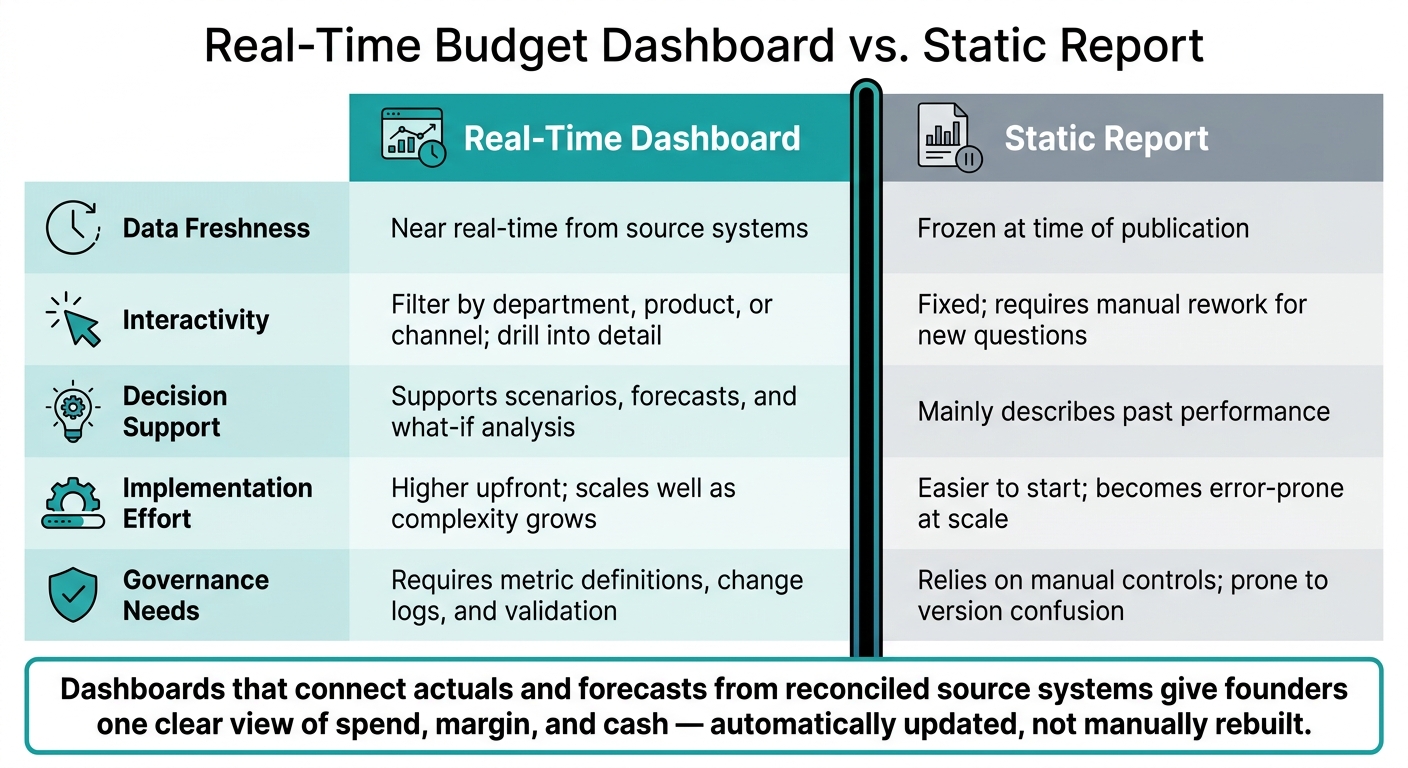
Real-Time Budget Dashboard vs. Static Reports: Key Differences at a Glance
Most dashboards get ignored for one simple reason: they try to do too much.
A tighter set of 5–10 core KPIs keeps the dashboard easy to scan and keeps meetings from drifting. In most cases, that means metrics like cash balance, runway, revenue, gross margin %, OpEx run rate, and EBITDA.[22][24]
A clean layout helps too. Use three bands:
That setup puts the big picture front and center, while still leaving room to dig deeper when needed.
Variance waterfalls and 6–12 month trend lines add the context people need.[2][21] They explain why a number changed, not just how much it changed. Filters by department, product, or channel let each team look at the same data from its own angle without asking for a separate report.
A simple rule works well here: if a founder can't tell what's happening in five seconds, the dashboard is too hard to read.[2][24]
Each KPI also needs a written definition. That means the formula, the data source, and any exclusions should live in a metric dictionary.[22][23][25] If a formula changes, log it in the next operating review. That's how teams keep the numbers consistent over time.
Once the layout is clean, the next step is making sure people use it on a steady rhythm.
The dashboard should help answer three recurring questions: Are we spending to plan? Is margin holding up? How much runway is left?
Weekly, finance and founders should do a short cash and burn review, usually 30–45 minutes. That check should cover cash balance, net burn over the last 4–8 weeks, runway in months, and any large upcoming cash items such as payroll or vendor payments.[15][17][18] Weekly reviews make shifts in burn easier to spot before they snowball. They also feed the month-end review and the quarterly reset.
Monthly, after close, use the dashboard for department budget-vs.-actuals reviews and updated rolling forecasts.[14][16][19]
Quarterly, reset the rolling forecast, hiring plan, and runway scenarios using the latest actuals.[13][15][20]
Fractional CFO and FP&A support can help keep the metrics, commentary, and forecasts aligned across each review.
That rhythm also makes the gap between live dashboards and static reports pretty clear.
The case for a real-time dashboard versus a static report comes down to what happens between meetings.
| Aspect | Real-Time Dashboard | Static Report |
|---|---|---|
| Data freshness | Near real-time from source systems | Frozen at time of publication |
| Interactivity | Filter by department, product, or channel; drill into detail | Fixed; requires manual rework for new questions |
| Decision support | Supports scenarios, forecasts, and what-if analysis | Mainly describes past performance |
| Implementation effort | Higher upfront; scales well as complexity grows | Easier to start; becomes error-prone at scale |
| Governance needs | Requires metric definitions, change logs, and validation | Relies on manual controls; prone to version confusion |
The dashboards that people keep using do a few things well. They connect actuals and forecasts, pull from reconciled source systems, and give founders one clear view of spend, margin, and cash. And they do it with automatic updates instead of a monthly rebuild.[22][1][26]
How often you update a dashboard comes down to one thing: how fast your business changes.
If cash position or liquidity can shift during the day, check those numbers daily. In some cases, even more often makes sense. For many B2B services or project-based businesses, a weekly review is usually enough. But high-volume businesses like e-commerce often get more use from daily updates because sales, refunds, and ad spend can move fast.
The main idea is simple: automate updates on a schedule that fits how you make decisions. That might mean every 15 minutes. It might mean once a day. There’s no point in pulling data faster than your team can act on it.
Also, show data freshness indicators and timestamps. People should be able to see, at a glance, how current the information is before they make a call based on it.
Founders should keep a close eye on the numbers tied most directly to staying alive and growing without losing control.
That usually starts with cash and a small set of performance KPIs, including:
The key is to track a small core set instead of drowning in dashboards. In practice, these metrics tend to work best when grouped into 5–7 primary KPIs with clear targets and alert thresholds. That way, founders can spot trouble early and act before a small issue turns into a cash problem.
Use budget reviews to keep a close eye on your current financial health. They show how the business is performing right now, what’s driving the numbers, and where actual results are drifting from the plan. When you hold them weekly or monthly, it’s much easier to keep day-to-day operations lined up with the baseline budget.
Use forecasting to look ahead and steer what happens next. Rolling forecasts update projections every month or quarter, usually across a 12- to 18-month window. Scenario planning adds another layer by helping teams get ready for risks, shifts in demand, or new opportunities.