Published on
August 6, 2026


If I had to boil this down to one point, it’s this: a SaaS investor dashboard should show growth, retention, cash use, and runway in one place, with numbers that match the books.
In 2026, I’d keep the dashboard focused on a short set of board-level metrics: ARR, MRR, net new ARR, NRR, GRR, CAC payback, gross margin, burn, runway, burn multiple, and Rule of 40. I’d also make sure each metric has one source system, one formula, and one owner. That’s what keeps board meetings focused on decisions instead of number checks.
Here’s the short version of what matters most:
A simple investor dashboard is not the same as a team dashboard. One helps investors see whether the business is growing in a sound way. The other helps teams run day-to-day work.
| Area | What I’d include |
|---|---|
| Core metrics | ARR, MRR, net new ARR, NRR, GRR, CAC payback, gross margin, burn, runway, burn multiple, Rule of 40 |
| Main data sources | Billing platform, CRM, general ledger, bank data, payroll/HRIS, product usage |
| Board layout | Growth first, then retention/unit economics, then cash and efficiency |
| Update timing | Monthly after close; investor update by day 7; board review quarterly |
| Control points | KPI owner, formula doc, source system, review trail, fractional CFO approval |
A few benchmark ranges stand out in the article and help frame performance:
If I were building or reviewing this dashboard, I’d judge it on one test: Can an investor look at it for 2 minutes and answer whether revenue is growing, customers are staying, acquisition is paying back, and cash lasts long enough?
That’s the standard the rest of the article lays out.
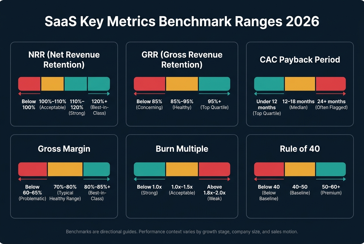
SaaS Investor Dashboard: Key Metrics & Benchmark Ranges 2026
If you want investor reporting people can trust, every metric needs a clear owner and one source of record. No gray area. No “it depends who pulled the report.”
Start by assigning each investor metric to a single source of record, then name the system behind it. Your billing and subscription platform - Stripe Billing, Chargebee, or a similar tool - should be the main source for MRR, ARR, expansions, contractions, and churn. Your CRM - Salesforce or HubSpot, for example - tracks pipeline, bookings, and new ARR. That data feeds net new ARR and CAC efficiency work.
The general ledger is where GAAP revenue, expense categories, and the accounting record live. It’s also the system that should reconcile the full reporting package. Your bank feed confirms cash actually moving in and out, which matters for net burn and runway. Payroll and HRIS data helps split compensation between COGS and operating expenses, which directly affects gross margin and burn. And product usage data - activation rates, active seats, and feature adoption - can surface churn risk before it shows up in billing.
Assign one source of record per metric.
Loose KPI definitions cause more trouble than most teams expect. If your ARR definition doesn’t match what investors think ARR means, board time gets eaten up by variance debates instead of strategy.
Here are the KPI definitions, formulas, and source systems that matter:
| KPI | Formula | Source Systems | Typical Range |
|---|---|---|---|
| MRR | Normalized recurring subscription revenue from active subscriptions, excluding one-time fees | Billing platform | - |
| ARR | MRR × 12 for active recurring contracts | Billing platform | - |
| Net New ARR | New ARR + Expansion ARR − Contraction ARR − Churned ARR | Billing + CRM | - |
| NRR | (Starting ARR + Expansion + Reactivation − Contraction − Churn) ÷ Starting ARR | Billing platform | 100–110% acceptable; 110–120% strong; >120% best-in-class [3][4][7][10] |
| GRR | (Starting ARR − Contraction − Churn) ÷ Starting ARR, capped at 100% | Billing platform | 95%+ top quartile; 85–95% healthy; <85% concerning [3][5][8][10] |
| Logo churn | Customers lost ÷ customers at start of period | CRM + Billing | - |
| Revenue churn | Lost MRR ÷ Starting MRR | Billing platform | - |
| CAC | Total sales & marketing spend ÷ new customers acquired | GL + CRM | - |
| LTV | (ARPA × Gross Margin %) ÷ Churn Rate | Billing + GL | - |
| CAC Payback | CAC ÷ (ARPA × Gross Margin %) | Billing + GL + CRM | <12 months top quartile; 12–18 months median; >24 months often flagged as inefficient [3][4][5][6][7] |
| Gross Margin | (Revenue − COGS) ÷ Revenue | GL | 80–85%+ best-in-class; 70–80% typical healthy range; <60–65% often problematic [3][4][10][13] |
| Net Burn Rate | Monthly cash outflows − cash inflows from operations | Bank + GL | - |
| Runway | Current cash balance ÷ net monthly burn | Bank + GL | - |
| Burn Multiple | Net cash burn ÷ net new ARR (trailing 12 months) | Bank + GL + Billing | <0.8–1.0x strong; 1.0–1.5x acceptable; >1.8–2.0x weak [3][4][6][7][18] |
| Rule of 40 | Revenue growth rate (%) + profit margin (%) | GL | ≥40 baseline; 50–60+ premium [3][6][9][10] |
One point is worth calling out: LTV:CAC and CAC payback are not the same thing. LTV:CAC compares lifetime value with acquisition cost. CAC payback shows how many months it takes to earn that cost back from gross profit - not from revenue. Investors often lean toward CAC payback because it’s simpler and depends less on far-out assumptions.
Use these benchmark ranges as directional guides, not hard cutoffs. A healthy number changes with growth stage, company size, and sales motion. The better comparison is usually your prior quarter, prior year, budget, and internal target.
Even clean KPI definitions can fall apart if the accounting treatment shifts from one period to the next. A few U.S.-specific rules can skew the dashboard - and shape investor reaction - if you don’t handle them with care.
Annual contracts create the biggest timing mismatch. Cash may come in upfront, but ARR is normalized, and GAAP revenue is recognized ratably under ASC 606 [12][16][17]. That means the dashboard needs to say, in plain English, whether a chart shows bookings, billings, recognized revenue, or ARR. Those figures are related, but they answer different questions.
Discounts and free months should be normalized out of ARR [16][17]. Payroll taxes, benefits, and stock-based compensation (SBC) need steady GL classification [11][14][15]. SBC, in particular, should be classified the same way every time. If it moves around, gross margin and burn can swing for reasons that have nothing to do with the business itself.
The dashboard should also draw a bright line between cash metrics and recognized revenue metrics, and it should spell out how non-cash items are handled.
With the sources and definitions locked down, the next step is laying out the metrics for board review.
A board and investor dashboard should be tight and built for decisions. The usual advice from board advisors is simple: keep the core investor view to 1–3 landscape pages, and push deeper operating detail into an appendix.[19][20][22][25][30]
The easiest way to structure it is in the same order most board conversations happen: growth, retention, efficiency, cash.
With the metrics already defined, the dashboard should feel a lot like a board agenda.
This is the first thing investors look for: is the company still growing at a rate that makes sense for its stage and prior guidance?
Start with an ARR and MRR trend shown as a 12–24 month line chart. Add a second line for the board-approved plan and a dotted line for the latest forecast. That setup gives the reader a fast read on actual performance, prior expectations, and where the business now looks headed.
Below that, include a net new ARR waterfall that splits the monthly number into new logos, expansion, contraction, and churn. This is where the story gets clearer. You can see whether growth is coming from new customer wins or from expanding the base you already have. You can also spot whether negative pressure is starting to build.
A small row of KPI tiles at the top helps anchor the section:
Color-code those tiles against board-approved thresholds, and add a short note for any material variance to plan.[19][21][22][25][28]
That gives the board a read on growth quality. The next section shows whether that growth has staying power.
Once investors see growth, they usually move straight to durability.
Put NRR and GRR together on a 12–24 month line chart, with horizontal reference lines for target ranges. Right next to that, use a stacked bar for logo churn and revenue churn by quarter. This helps the board compare customer count loss with dollar-weighted loss without having to dig through notes.
For unit economics, show CAC payback on a rolling 3–6 month basis and sales efficiency by quarter, using net new ARR divided by prior-period sales and marketing spend. What investors care about here changes by stage.[19][20][21][24][26][27][4][29][30]
| Metric | Early Stage ($1–10M ARR) | Mid-Stage ($10–50M ARR) | Late Stage ($50M+ ARR) |
|---|---|---|---|
| NRR | 100–110% acceptable | 110–120% expected | >120% best-in-class |
| GRR | 80–90% while product matures | 85–92% | >90–95% in stable verticals |
| CAC Payback | <24 months acceptable | 12–18 months | Sub-12 months preferred |
| Logo Churn (annualized) | 15–25% SMB; trending down | Single digits for enterprise mix | Single-digit annual churn expected |
Use this table to frame expectations by company stage. A $5M ARR business and a $75M ARR business should not be judged the same way, and this keeps that context front and center.
Once retention and unit economics look solid, the discussion usually turns to cash.
This last section should answer one blunt question: how long can the company fund the plan?
Start with gross margin trend over 12–24 months and show it against a target band. Be clear about what sits inside COGS. If cloud hosting, customer support, and implementation labor are treated differently under U.S. GAAP, the margin line can tell a very different story, so labeling matters.
Next, pair net burn - net cash outflow - with the burn multiple on the same chart. Smooth both on a trailing 3-month basis so one noisy month doesn’t distort the picture. Show the burn multiple against the board target so the gap is easy to read.
Then add a dual-axis chart with cash balance in USD on one axis and runway in months on the other. Show actuals for the last 12 months and forecast for the next 12–18 months. For most boards, this is the chart they remember, because it points straight to capital timing.
A short written summary under the chart should call out month-over-month movement in cash, burn, burn multiple, and runway.[1][22][23]
Once the dashboard is built, the next thing that matters is cadence. A clean dashboard doesn't do much on its own if investors can't count on seeing it at the same time, in the same format, month after month.
Refresh the dashboard after each monthly close, then use it for monthly investor updates and quarterly board reporting. The monthly close should be done by the 5th business day. After that, finalize revenue recognition, accruals, cash, and core SaaS metrics: MRR, ARR, bookings, churn, and NRR. Budget vs. actuals should go out by day 7.[38] Send investor updates on the first Tuesday of each month so investors know exactly when to expect them.[34][36]
Use monthly updates for status. Use board decks for decisions.
| Monthly Investor Update | Quarterly Board Reporting | |
|---|---|---|
| Audience | All investors | Board members and key investors |
| Length | 1–2 pages | 12–15+ slides with the full dashboard[33][1] |
| Focus | Core metrics and a short narrative | Trends, cohorts, unit economics, and scenarios |
| Depth | What changed and why | Variance analysis, strategic tradeoffs, and forecast updates |
| Tone | Operating snapshot | Decision-making session |
Consistency matters more than frequency. If you skip months, trust slips fast. A lighter cadence is usually less damaging than an inconsistent one.[35][37]
Once the cadence is set, use the dashboard to anchor the board agenda. Put it on page 1 of the board packet so board members can scan the headline numbers against budget right away: ARR, growth rate, cash, burn, runway, and headcount. That gives everyone a shared starting point and makes it easier to spot what needs discussion.
Then let variance flags drive the agenda. If CAC is more than 20% above plan, or churn is above the budgeted rate, tie those gaps straight to proposed actions and updated scenarios.[38] Keep drill-down views like churn by segment, CAC by channel, and hiring pace vs. plan in the backup appendix. That way, the main discussion stays centered on decisions, not detours.[1][2]
The dashboard should also help answer the next set of board questions. Connect it straight to the financial model so actuals load each month and flow into base, upside, and downside forecasts for ARR, churn, headcount, CAC, burn, and cash runway.[42][40][41]
At a minimum, the three scenario cases should answer plain, practical questions:
Run each scenario across base, upside, and downside.
What makes scenario planning useful is not the spreadsheet. It's the trigger. Set decision triggers in advance so the company knows when to move from the base case to a downside response. Common examples include two straight months below plan or runway dropping below 12 months.[40][42][43] Show all runway figures as months of cash at current net burn, in USD, and use the same month/day/year date format across all board materials.[31][39][43]
Once the dashboard structure and reporting cadence are in place, the next job is control.
A dashboard is only as dependable as the close behind it. If the numbers don’t tie to the closed books, the dashboard turns into a slide deck with guesswork baked in. Every metric should connect back to the close through written logic and a clear sign-off path. Start by giving each KPI a named owner. A simple setup works well here: one data owner handles collection, calculation, and validation, while one action owner steps in when a threshold is breached.[32] Put extraction, update, review, and sign-off dates directly into the close calendar.[44]
An investor-grade dashboard needs more than polished charts. Each metric needs a clear owner, source, and approval path. That’s what makes the reporting auditable.[32]
| KPI | Data Owner | Source System | Update Frequency | Review & Sign-Off |
|---|---|---|---|---|
| ARR | Revenue Operations Manager | Billing platform, reconciled to GL | Monthly, by the 5th business day | Owner review + CFO sign-off before send |
| NRR | Director of FP&A | Billing + CRM, reconciled to GL | Monthly, tied to close | Owner review + CFO sign-off |
| CAC | Head of FP&A | GL (S&M accounts) + CRM | Monthly | Owner review + CFO sign-off |
| LTV | Director of FP&A | GL gross margin + subscription churn data | Monthly | Owner review + CFO sign-off |
Apply the same controls to burn, runway, gross margin, and burn multiple.[44]
Each KPI should also be documented in a shared Metric Playbook that spells out the formula, source system, and any manual adjustments.[44] If pricing or packaging changes, update the playbook and note the effective date in the deck.[44] Access should stay role-based: edit rights for finance and FP&A, view-only access for executives and investors.[44]
It also helps to track every change to metric logic, data mapping rules, and dashboard structure in an audit log.[44] If an exception comes up, assign an owner and due date, then require CFO or Head of Finance sign-off before the dashboard goes out.[44] Materiality thresholds keep the review process focused on the items that change valuation, cash, or forecast accuracy.[44]

Teams without a dedicated finance ops function often need outside help to get this built without dragging the work out for months.
Phoenix Strategy Group can support implementation through bookkeeping, fractional CFO, FP&A, and data engineering work, including metric definitions, refresh automation, and close controls. Their Weekly Accounting System keeps U.S. books current and reconciled so dashboard metrics tie back to closed financials. The Integrated Financial Model links dashboard actuals to budget, forecast, and scenario planning. Monday Morning Metrics sets standard KPI definitions and automates refreshes from billing, CRM, and GL systems. Put together, these pieces create a controlled reporting loop from source data to board discussion, while also helping the company get ready for fundraising or exit.
Clean definitions, named owners, and enforced sign-off are what keep investor reporting credible as the company scales.
Update frequency should line up with how fast each metric shapes decisions.
Investors look for metrics that show growth, capital efficiency, and a business that can keep going for the long haul.
Key SaaS KPIs include:
Keep the main dashboard tight: 5 to 7 KPIs is usually enough. Use standardized, auditable data so investors can trust the numbers and move through due diligence with fewer questions.
Start with clean, accrual-based bookkeeping so revenue is recognized over the contract term, not when cash hits the bank. That gives you a more accurate view of how the business is doing month to month.
Next, build a single source of truth by syncing your billing system, CRM, and general ledger automatically. When those systems don't talk to each other, things slip through the cracks fast.
Keep that data in a centralized, auditable cloud database. During the monthly close, reconcile each feed against actuals so the numbers match what happened in the business, not just what the systems say.
It also helps to add manual review steps. Automation does a lot of the heavy lifting, but a human check is still one of the best ways to catch mismatches, flag odd entries, and protect data integrity.