Published on
August 24, 2026

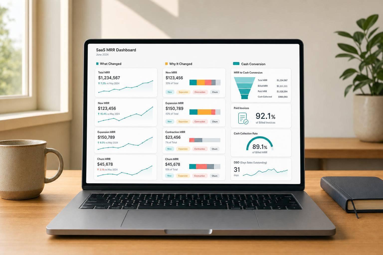
If I had to boil this down to one line, it’s this: a good SaaS MRR dashboard shows growth, retention, and cash on one page.
I’d use 12 metrics to do that: Starting MRR, New MRR, Expansion MRR, Contraction MRR, Churned MRR, Reactivation MRR, Net New MRR, Ending MRR, ARR, ARPU, Logo Churn, and Cash Collections.
Here’s the main rule that holds the whole dashboard together:
Starting MRR + New MRR + Expansion MRR + Reactivation MRR − Contraction MRR − Churned MRR = Ending MRR
That one line tells you if your numbers tie out or not.
A few takeaways stand out right away:
The big idea is simple: don’t just track revenue going up or down. Track why it moved, who stayed or left, and whether customers paid.
For example, if a company starts the month at $250,000 MRR and ends at $285,000 MRR, that means it added $35,000 in net new MRR and is now at $3,420,000 ARR. That gives leadership a fast read without digging through separate reports.
Here’s a quick view of the 12 metrics:
| Metric | What it tells me |
|---|---|
| Starting MRR | Revenue base at the start of the month |
| New MRR | Revenue from new customers |
| Expansion MRR | More revenue from existing customers |
| Contraction MRR | Lost revenue from downgrades |
| Churned MRR | Lost revenue from cancellations |
| Reactivation MRR | Revenue from returned customers |
| Net New MRR | Total monthly MRR change |
| Ending MRR | Revenue base at month-end |
| ARR | Annualized run rate |
| ARPU | Revenue per paying account |
| Logo Churn | Percent of accounts lost |
| Cash Collections | Cash received from customers |
If I were setting this up, I’d put headline MRR and ARR at the top, the MRR bridge in the middle, and ARPU, Logo Churn, and Cash Collections at the bottom or on the side. That layout makes the monthly story easy to read.
So the article is not just about definitions. It’s about building one dashboard that answers three plain questions: What changed? Why did it change? And did the cash come in?
A usable MRR dashboard should fit on one page and follow a clear top-to-bottom flow. Put the headline numbers at the top, the movement story in the middle, and the supporting context at the bottom or along the side.
The top band spans the full width of the page and includes four large KPI cards: Starting MRR, Ending MRR, Net New MRR, and ARR.
Each card shows:
This section gives leadership a fast read on month-over-month performance. You should be able to glance at it and know what changed.
The middle band shows how MRR moves from start to finish.
Right below the headline cards, add a waterfall chart, sometimes called an MRR bridge. This chart shows exactly how the business moved from Starting MRR to Ending MRR. Each movement type gets its own bar. New MRR, Expansion MRR, and Reactivation MRR push MRR up. Contraction MRR and Churned MRR pull it down.
The key point is simple: every movement bar must tie back mathematically to Ending MRR. If it doesn’t, something is off.
The bottom band or right-side column holds three smaller panels: ARPU, Logo Churn, and Cash Collections.
These metrics do not change MRR. They help explain revenue quality and cash conversion. Cash Collections belongs here as well, since it shows whether booked revenue is turning into collected cash.
Each panel works better with a short sparkline covering the last 6–12 months. That way, the trend is visible at a glance instead of buried in a table.
Every month, the dashboard must pass one non-negotiable check:
Starting MRR + New MRR + Expansion MRR + Reactivation MRR − Contraction MRR − Churned MRR = Ending MRR
No manual overrides. No unexplained variances. If the numbers don’t tie, fix the source data or the transformation logic. Don’t patch it by adjusting a cell in the dashboard.
That rule is what makes the dashboard dependable for board reporting, lender updates, and investor reviews.[5][9]
With the layout set, the next sections define each metric in the bridge.
The first metric in the bridge is Starting MRR. This is the recurring revenue a business has at the start of the month, before any MRR movement happens.
Starting MRR = prior month's Ending MRR. [10][7][11]
This metric helps you see where growth came from: new customer acquisition or your current customer base. The key is to keep it clean. Setup fees, implementation charges, full-value annual bookings, and inactive subscriptions should not inflate Starting MRR.[12][14][16][17]
Next comes New MRR, the first growth source for the month.
New MRR is the recurring revenue added in a month from new customers. More specifically, it only includes customers who had $0 MRR at the end of the prior month.[18][20]
Here’s the plain-English version: New MRR is the total MRR from customers who become active for the first time in the current month and had $0 MRR at the end of the prior period.[18][19][20] If you sell annual contracts, convert them into a monthly amount. So if a customer signs a $24,000/year deal in August, that counts as $2,000 in August New MRR, not $24,000.[23][8]
You’ll usually see New MRR in two places:
This metric matters because it shows whether customer acquisition is turning into recurring revenue. Sales and marketing teams track it to judge if go-to-market spend is paying off. Finance teams look at it alongside CAC and payback period when deciding whether to push harder on acquisition or ease off.[20][21]
One of the most common reporting errors is simple but costly: counting upgrades as New MRR instead of Expansion MRR.[20][24][25] The same thing can happen with reactivations.[27] When that happens, New MRR gets overstated, acquisition looks better than it is, and the MRR bridge stops tying out.
The rule is strict: New MRR only comes from customers who had $0 MRR at the prior month-end.
Next, Expansion MRR shows upsell from existing customers.
Expansion MRR is the extra recurring revenue you get from existing customers who spent more during the month.[27][32][33] That bump can come from plan upgrades, added seats, feature add-ons, or cross-sells that increase the subscription's recurring value. If the customer is brand new, that revenue goes into New MRR, not here. Once you split out acquisition, the next thing to look at is simple: how much more are current customers spending?
Expansion MRR = recurring revenue increases from customers active in both months[32][29]
In an MRR waterfall, Expansion MRR shows up as a positive bar along with New MRR, Contraction MRR, Churned MRR, and Reactivation MRR.[34]
Teams use this metric to see how well upsells are working. Put plainly, it shows whether your current customer base is growing in account value over time.[32][35] Finance teams also rely on it when they calculate net revenue retention (NRR), because expansion is the main positive input in that formula. Strong Expansion MRR usually points to solid upsell motion, pricing, and product usage. That said, if most of the increase comes from one or two accounts, the pattern is less dependable.
A common reporting problem is rolling expansion and contraction into one net expansion figure instead of showing them separately.[30][28][32] That can blur what's going on. You lose sight of how much revenue is slipping through downgrades, and downgrade risk gets harder to spot. Another mistake is tagging a new module bought by a newly acquired customer as Expansion MRR. It isn't.[26][31][33] Expansion only comes from customers who already had MRR before the period began.
Next, Contraction MRR shows where existing revenue is shrinking.
Contraction MRR is recurring revenue you lose when current customers downgrade.[39][40][41]
Put simply, this covers cases where an account stays active but pays less than before. That can happen because of:
The formula is straightforward:
Contraction MRR = Σ(prior MRR − current MRR) for active customers whose MRR decreased.
In the monthly MRR bridge, this number is subtracted before Ending MRR is calculated.[39][40][41]
Here’s a simple example. If two active accounts each drop $800 in monthly recurring revenue, Contraction MRR is $1,600.[39][40][41]
On the dashboard, Contraction MRR usually shows up in the waterfall between Expansion MRR and Churned MRR.[15][38][45] It drags down monthly MRR growth and also flows into Net Revenue Retention (NRR).[15][46]
Many teams also watch it as a percentage:
Contraction Rate (%) = Contraction MRR ÷ Starting MRR × 100
If that rate keeps coming in above 1–2% month over month, it’s a sign to dig deeper.[46][47]
This metric makes more sense when you look at it next to expansion. A business can post new upsell revenue and still feel stuck if downgrades keep eating into those gains.[41][42][43] That’s why teams use rising contraction as an early warning for downgrade risk, pricing issues, or packaging problems.[41][42][43]
One last point matters a lot: don’t mix up contraction and churn. If revenue drops but the customer stays, record it in Contraction MRR. If the customer cancels and goes to zero, record it in Churned MRR.[37][39][40][41] And if that same account cancels later, the revenue still left at that point moves into Churned MRR.
After contraction, the next bridge item is total customer loss. Churned MRR is the recurring revenue you lose when a customer cancels and their recurring revenue drops to $0. It does not include partial downgrades. Those belong in Contraction MRR. That’s what makes this metric pretty simple to work with.
Formula:
Churned MRR = Σ MRR of accounts that were active at the start of the period and fully canceled by the end of it.
Example: three customers at $800, $2,200, and $500 churn in August = $3,500 Churned MRR.
It also helps to track churn rate:
MRR Churn Rate (%) = Churned MRR ÷ Starting MRR × 100
Use starting MRR as the denominator, not month-end MRR.[50][48]
Outside the bridge, churn shows where retention is failing. You can use it to spot loss by segment and decide where customer success teams should focus their fixes.[49][51]
After churn, Reactivation MRR tracks revenue you win back from customers who come back.
Put simply: Reactivation MRR is recurring revenue from previously churned customers who return after hitting $0 MRR for at least one full billing period. If a customer never reached $0, don’t treat that return as reactivation. In that case, the change belongs under Contraction MRR and Expansion MRR.
Here’s the formula:
Reactivation MRR = Σ current MRR from previously paid customers who were at $0 MRR at prior month-end and positive at current month-end.
Example: Three returned customers at $100, $300, and $150 per month = $550 Reactivation MRR.
In your waterfall, show Reactivation MRR as its own positive bar next to New MRR and Expansion MRR. That split makes the story much clearer. You can see how much growth came from win-backs versus brand-new logos.
The most common reporting mistake is simple: teams count returning customers as New MRR. That muddies the picture. The fix is to use a lifecycle status field in your data model and track both first activation dates and latest reactivation dates, so returning customers land in the right bucket [12][3].
From an operating view, Reactivation MRR helps you tell whether churn is temporary or permanent. If reactivation is high compared with churn, customers may be leaving for a while and then coming back. That points to a very different issue than losing them for good [52][53].
Once you’ve mapped the bridge movements, Net New MRR shows the combined impact for the month. Net New MRR is the month's net change in recurring revenue after additions, expansions, reactivations, contractions, and churn. On the dashboard, it shows up as the final result of the bridge.
Formula:
Net New MRR = New MRR + Expansion MRR + Reactivation MRR − Contraction MRR − Churned MRR [44][38]
Net New MRR is a core monthly growth metric. It tells you where growth is coming from - new customers, account growth, or returning customers - and whether churn or contraction is eating into those gains.
That said, a positive Net New MRR number doesn’t always mean everything is healthy. If expansion is carrying most of the load, churn can still be a problem in the background. That’s why this metric works so well as the clean monthly output before moving on to Ending MRR and ARR.
This is the bridge total that rolls into Ending MRR.
Ending MRR is the waterfall’s finish line. It shows the recurring revenue left at month-end after every change has been applied. That means it is not billed revenue, cash collected, or bookings. It is the recurring revenue base that’s active at month-end.
Formula:
Ending MRR = Starting MRR + New MRR + Expansion MRR + Reactivation MRR − Contraction MRR − Churned MRR
That closing balance becomes the base for ARR. So it belongs in the top band with the other headline metrics. Teams use Ending MRR for forecasting, target-setting, and board reporting.
One thing matters a lot here: don’t treat Ending MRR as a plug. If the bridge doesn’t tie, stop and fix the source data or the transformation logic before you publish anything.
Next, ARR turns this month-end balance into an annualized figure.
Annual Recurring Revenue (ARR) is recurring subscription revenue normalized to a one-year period. Put more simply, it takes your month-end recurring revenue and shows it as a yearly number.
In an MRR-driven SaaS business, the formula is:
ARR = Ending MRR × 12
So if your Ending MRR for August 2026 is $290,000, your ARR is $3,480,000.
Show ARR as a headline tile next to Ending MRR.
ARR is the annualized output of Ending MRR. Finance teams and operators use it to track scale and staying power. It often sits at the center of headcount planning, go-to-market spend, infrastructure scaling, pricing and packaging decisions, and fundraising talks, because it reflects a full year of predictable subscription revenue.
That said, ARR only tells you how big the revenue base is. The metrics that follow help you judge whether that revenue is efficient and collectible.
Keep ARR clean. Do not include non-recurring revenue. That means excluding:
ARR should include only recurring subscription revenue.
ARR changes only when Ending MRR changes. A simple way to think about it: ARR is your clean 12x check on Ending MRR.
Next, use ARPU, logo churn, and cash collections to test revenue quality, not just scale.
Average Revenue Per User (ARPU) shows how much recurring revenue the business gets from each active paying account per month. ARR tells you about scale. ARPU tells you how dense that revenue is.
ARPU = Total MRR ÷ Number of active paying accounts
In B2B SaaS, teams often call this ARPA because billing usually happens at the account level.
ARPU belongs in the side-panel quality metrics, next to logo churn and cash collections. It shows how much recurring revenue each paying account brings in, which helps explain the quality of MRR. Put simply, ARPU gives context to the revenue mix sitting behind MRR.
Here’s why that matters:
ARPU also helps shape decisions about pricing, packaging, and segment mix. That makes it a stronger read on monetization quality than MRR by itself.
Use paying accounts in the denominator and recurring revenue in the numerator. Set the definition before launch, and if that definition changes, restate prior periods so the trend still makes sense.
Where churned MRR shows revenue that walked out the door, logo churn shows accounts that left. Logo churn is the percentage of customer accounts that fully cancel in a month. MRR churn looks at dollars lost, not customer count.
Logo Churn Rate = (Customers who fully canceled during the month ÷ Customers at the start of the month) × 100%
Here’s a simple example. If you start April with 400 active paying accounts and 12 cancel, your logo churn rate is 3%. If those 12 accounts made up only $3,000 of your $150,000 Starting MRR, your MRR churn rate is just 2%. That gap tells you something useful: smaller accounts are leaving.
Track logo churn in the side-panel with ARPU and cash collections. It works as a customer-health signal. If Net New MRR looks strong but logo churn is going up, growth may be coming from a small number of large accounts while smaller customers slip away. If logo churn is flat or down while ARPU rises, retention and expansion are in better shape. In plain English: don’t just look at revenue growth. Look at who is staying.
The reporting mistake that shows up most often is counting downgrades as lost logos. That’s a problem. When a customer moves from a higher plan to a lower one, that’s contraction MRR - not a churned logo. Mix those together, and your logo churn rate gets overstated. It also becomes much harder to reconcile your customer count from the start to the end of the month.
The fix is simple: logo churn should count full cancellations only, and your dashboard should keep it separate from contraction events.
Cash collections adds the cash view behind those customer losses.
Cash Collections is the total cash you actually receive from customers in a given month - customer payments, minus refunds and chargebacks. It answers a simple question: did the customer pay?
On the template, this is the cash reality check for your recurring revenue story. It sits next to MRR as the cash-side counterpart, not as part of the bridge.
Cash Collections = successful customer payments − refunds − chargebacks.
If you have invoiced customers, tie this back to A/R and the GL at month-end.
This metric belongs beside ARPU and Logo Churn because it tracks collection quality, not revenue movement. Put plainly, it shows whether booked recurring revenue is turning into cash.
A U.S.-based B2B SaaS company with $220,000 in August MRR and $180,000 in August Cash Collections shows the tension clearly: MRR can go up while cash falls behind.
Track both monthly cash collected and Cash Collection Rate. DSO adds timing context to the picture. A DSO under 30 days is a strong B2B SaaS benchmark [54][55][56].
Cash can get thrown off by a few common issues:
If you don't reconcile each month, those items can skew the cash view fast. Next, the dashboard logic connects this cash view to the MRR bridge and the other quality metrics.
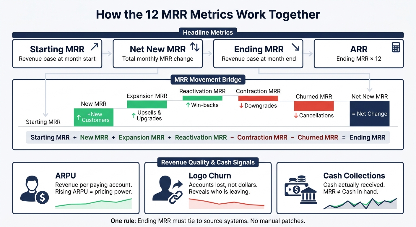
SaaS MRR Bridge: 12 Metrics That Build Your Monthly Dashboard
This dashboard pulls monthly MRR movement, revenue quality, and cash collection into one view. Each metric has a job. Put them together, and you get the full picture.
At the center of the dashboard, the MRR bridge shows how the headline numbers change over the month. Growth items push MRR up. Loss items pull it down. Then Ending MRR ties the whole thing together:
Starting MRR + New MRR + Expansion MRR + Reactivation MRR − Contraction MRR − Churned MRR = Ending MRR[57][36][1]
Net New MRR is what remains after all of those movements are combined.
Here’s what that looks like in practice: if a company starts August at $100,000 MRR, adds $20,000 New MRR, $8,000 Expansion MRR, and $2,000 Reactivation MRR, and then loses $4,000 to Contraction and $6,000 to Churn, it finishes the month at $120,000 MRR. That means Net New MRR for August is $20,000.
Once the bridge lands on Ending MRR, the top section converts that number into ARR. The formula is simple: ARR = Ending MRR × 12[13][59][60].
So if August ends at $120,000 MRR, ARR comes out to $1,440,000. One thing matters here: keep ARR tied only to active recurring subscription revenue.
Size is only part of the story. The side panel helps you judge the kind of growth you’re getting.
MRR and ARR show scale. ARPU and Logo Churn show account mix and retention. That distinction matters more than it may seem at first glance.
If MRR goes up while ARPU goes down, the business may be adding lower-value accounts instead of growing higher-value ones. And if logo churn rises while MRR churn stays under control, that usually means smaller customers are leaving while larger ones remain. Revenue totals by themselves won’t show that pattern.[11][61][62]
The last check is cash. Booked revenue and collected cash don’t always move in sync.
That’s why Cash Collections sits in the quality panel instead of the bridge. It acts as the cash check on the numbers above it.[58][6] If Ending MRR looks strong but collections fall for two straight months, the dashboard points to a billing or collections issue that revenue metrics alone would not show.
Once the dashboard is live, these tables help keep formulas, ownership, and placement aligned. That way, everyone works from the same definitions before anything gets shown to leadership.
| Metric | Formula | Primary Source System | Update Cadence | Owner | Dashboard Placement |
|---|---|---|---|---|---|
| Starting MRR | Prior month-end Ending MRR | Billing system | Monthly (locked at close) | FP&A | Top band |
| New MRR | MRR from customers with $0 prior-month MRR | Billing system | Daily (pre-close), Monthly (final) | RevOps | Middle band (waterfall) |
| Expansion MRR | MRR increase from customers active in prior period | Billing system | Daily (pre-close), Monthly (final) | RevOps | Middle band (waterfall) |
| Contraction MRR | MRR decrease from customers who remain active | Billing system | Daily (pre-close), Monthly (final) | RevOps | Middle band (waterfall) |
| Churned MRR | Prior-month MRR from customers that went inactive | Billing system | Daily (pre-close), Monthly (final) | Customer Success / RevOps | Middle band (waterfall) |
| Reactivation MRR | MRR from previously churned customers who return | Billing system | Daily (pre-close), Monthly (final) | Customer Success / RevOps | Middle band (waterfall) |
| Net New MRR | New MRR + Expansion MRR + Reactivation MRR − Contraction MRR − Churned MRR | Data warehouse (computed from billing) | Daily (pre-close), Monthly (final) | FP&A | Top band |
| Ending MRR | Starting MRR + New MRR + Expansion MRR + Reactivation MRR − Contraction MRR − Churned MRR | Billing system | Monthly (locked at close) | Finance / FP&A | Top band |
| ARR | Ending MRR × 12 | Data warehouse (computed) | Monthly (final) | FP&A | Top band |
| ARPU | Ending MRR ÷ active customer count at month-end | Data warehouse (billing + CRM) | Weekly (trend), Monthly (final) | FP&A | Side/bottom panel |
| Logo Churn | (Logos lost during the month ÷ starting logos) × 100% | CRM / Customer Success platform | Weekly (trend), Monthly (final) | Customer Success / RevOps | Side/bottom panel |
| Cash Collections | Cash received from subscription invoices, net of refunds and chargebacks | General ledger or payments processor | Daily (operations), Weekly (trend), Monthly (final) | Finance / Accounting | Side/bottom panel |
Mark daily and weekly numbers as pre-close. Only lock the numbers after the monthly close.
The next table covers the metric pairs people mix up most often in reporting.
| Pair | Unit of Measure | Primary Purpose | Common Misuse |
|---|---|---|---|
| Logo Churn | % of customer logos lost | Measures how many customers you lose; signals retention health and product-market fit | Using it as a revenue-impact proxy, which hides actual dollars at risk |
| Churned MRR | USD lost per month | Measures how much revenue you lose; highlights revenue risk and segment mix | Reporting without segmenting by plan or ACV, which masks whether losses come from many small accounts or a few large ones |
| ARPU | USD per customer per month | Pricing and growth quality - shows whether customers are moving to higher-value plans or adding seats | Citing it in investor conversations without tying it to ARR growth, making it unclear whether higher ARPU is driving total revenue |
| ARR | USD per year (total) | Scale and valuation - used by investors and lenders to gauge company size and funding needs | Using it to evaluate pricing experiments, where ARPU is the more relevant metric |
The difference matters more than it may seem at first glance.
Be explicit with units. A small label can prevent a messy reporting mistake.
If any row does not reconcile cleanly, finance and data support should step in before the dashboard goes live. For companies without internal resources, a fractional CFO can provide this oversight.
When spreadsheet reporting gets hard to manage, the one-page MRR dashboard starts to turn into a risk. Defining the 12 metrics is one part of the job. Keeping those metrics consistent at close is the next one.
The first trouble usually shows up during month-end close and in source data that doesn't line up.
If bridge variances keep showing up, or billing-to-GL mismatches become a pattern, the dashboard needs formal support.
Once those warning signs show up, the answer usually isn't more spreadsheet cleanup. It's governance.
Outside support often starts with locked metric definitions inside one governed data model. From there, the team builds a single source of truth across billing, CRM, and the GL. Then it puts monthly close checkpoints and exception handling in place before leadership sees the numbers.
When the dashboard starts feeding board decks and lender updates, that support helps keep the numbers consistent. Phoenix Strategy Group can help growth-stage SaaS teams define the metrics, build the data model, and line up finance and data workflows around one dashboard. That base helps the dashboard stay usable as reporting volume and system complexity grow.
A good SaaS MRR dashboard should answer three questions each month: what changed, why it changed, and whether growth is turning into retention, expansion, and cash. That simple frame is what makes the dashboard useful at a glance.
Taken together, the bridge shows movement. ARR, ARPU, Logo Churn, and Cash Collections show scale, quality, and cash conversion. One rule can’t be bent: Ending MRR must tie to the source systems.
Use this 12-metric template as your monthly operating view. Over time, it can become your single trusted view of recurring revenue and cash, instead of forcing teams to piece things together from scattered reports.
If the dashboard isn’t operationally reliable yet, build it in stages. Start by locking down the MRR bridge. Then add expansion and contraction. After that, layer in ARPU, Logo Churn, and Cash Collections as your data setup gets stronger. If reporting complexity starts to outgrow your team’s bandwidth, Phoenix Strategy Group can help build the metric definitions, data model, and reporting workflow.
Start with MRR as your main measure of business momentum. It gives you a clear read on where the business is headed and helps anchor your forecasts.
In the early stage, keep a close eye on cash burn, runway, and customer counts too. Those numbers tell you how much time you have and whether you're adding customers at a healthy pace.
As the company grows, widen the lens. Add retention and efficiency metrics like NRR, churn rates, and CAC payback period to get a better view of financial health and growth that can last.
Update your dashboard on a tiered schedule based on how fast each metric shapes decisions.
Use one source of record for each metric, then automate how that data moves.
That keeps your numbers clean and cuts down on the usual mess of spreadsheets, copy-paste work, and “which number is right?” debates.