Published on
September 4, 2026

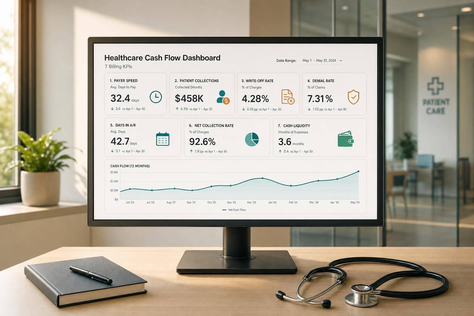
If I want a fast read on healthcare cash flow, I track seven numbers together: Days in A/R, Net Collection Rate, Denial Rate, Write-Offs, Reimbursement Lag, Patient Pay Yield, and Days Cash on Hand. One metric alone can mislead you. For example, A/R days can drop while collections get worse if more balances are being written off.
Here’s the short version: this dashboard shows how fast claims turn into cash, how much allowed revenue is collected, where payment gets delayed, and whether cash reserves are getting tighter. That matters more now because claim denials keep climbing. In 2025, 41% of providers said at least 10% of claims were denied, up from 38% in 2024 and 30% in 2022.
If I were building or reviewing this dashboard, I’d focus on these seven KPIs:
Quick Comparison
| KPI | What it tells me | Common warning sign |
|---|---|---|
| Days in A/R | How fast revenue turns into cash | Rising 60+ day balances |
| Net Collection Rate | How much allowed revenue I collect | Lower payments despite stable volume |
| Denial Rate | How much gets blocked before payment | More rework and delayed cash |
| Write-Offs | What revenue is lost | Higher bad debt or contract pressure |
| Reimbursement Lag | How long paid claims take to arrive | Slow payer posting cycles |
| Patient Pay Yield | How much patient balance turns into cash | Weak statement and payment-plan results |
| Days Cash on Hand | Whether liquidity is getting tight | Falling cash despite steady visits |
The main point is simple: billing quality, payer speed, patient collections, and liquidity move together. If I read these seven numbers as one story, I can spot cash problems before they hit the bank account.
Days in accounts receivable can improve while net collection rate gets worse if the change comes from write-offs instead of actual collections. That’s why a dashboard needs to connect payer behavior, claim quality, patient collection, and liquidity in one place.
What matters most isn’t a single metric on its own. It’s how the metrics work together. Payer payment timing shapes when cash shows up. Claim accuracy shapes whether it shows up at all. Patient responsibility affects how much money is brought in. Liquidity shows how long the organization can keep operating when cash is late. Final denials cut hospital annual net revenue by nearly 2% and add about 16.4 days to payment[4]. If you watch only one number, that kind of drag can slip right past you.
Contractual adjustments make the picture even trickier. Higher cash collections may look like a clear win. But if a new payer contract reduced allowed reimbursement amounts, that lift may come from higher volume, not better reimbursement. A dashboard that separates contractual write-offs from bad debt write-offs makes that difference easy to see and helps leadership avoid reading the trend the wrong way.
The right filters are what turn dashboard data into something useful. Filter by payer, location, provider, service line, and reporting period to spot slow payers, site-level collection gaps, provider-specific documentation problems, and short-term swings versus deeper shifts. That’s how the seven KPIs below become one clear cash flow view.
Days in Accounts Receivable (Days in A/R) shows how many days it takes, on average, to collect payment after services are billed.
Here’s the standard formula:
Days in A/R = Total Accounts Receivable ÷ (Net Patient Service Revenue for the Last 90 Days ÷ 90)
A simple example makes this easier to see. If a group practice has $1,200,000 in total A/R and brought in $2,700,000 in net patient service revenue over the last 90 days, its average daily net revenue is $30,000. Divide $1,200,000 by $30,000, and you get 40 days.
Using a 90-day revenue window helps smooth out seasonal swings and changes in claim volume. And one detail matters here: use net A/R only. That means charges minus contractual adjustments, while leaving out charity care and uncollectible write-offs.
Days in A/R gives you a quick read on payer behavior. When claims go out on time and insurers process them without much lag, the number stays lower. When it starts climbing, the aging report usually shows where things are getting stuck.
Balances rising in the 31–60 and 61–90 day buckets often point to claim submission delays or slower adjudication. Growth in 91+ day insurer A/R usually means claims are tied up in denials or appeals. If the jump shows up with just one payer, the issue is often that insurer’s adjudication cycle, a new authorization rule, or a billing setup problem on your side.
That’s why this metric matters so much: it can flag payer delay early, before the cash squeeze hits the bank account.
Patient balances also sit inside total A/R, so slow patient collections push Days in A/R up just like slow insurer payments do. In many practices, the drag starts showing up in the 60+ day aging buckets tied to self-pay and high-deductible accounts.
The causes are usually pretty plain:
When statements go out faster and patients can pay through digital channels, collection time tends to drop. That brings cash in sooner and keeps the same A/R pool from getting heavier.
A good dashboard shows Days in A/R in three layers: a primary KPI tile with the current number and a directional marker against the prior month, a 12-to-24-month trend line to spot slow drift, and an aging breakdown that shows how much of total A/R sits in each bucket.
Anything above 50 days overall usually points to collection risk that needs immediate attention.[6]
Days in A/R tells you how fast money is coming in, but it doesn’t tell you whether collections are complete.
If Days in A/R tells you how fast money moves, NCR tells you how much of that money you actually bring in.
Net Collection Rate (NCR) measures how much collectible revenue you actually collect. Calculate it as total payments received ÷ allowable charges × 100.
The key detail is allowable charges. That means charges after contractual adjustments are taken out. In plain English, NCR looks at what you were entitled to collect under the contract, not the sticker price on the claim.
Net Collection Rate (%) = (Total Payments Received ÷ Total Allowable Charges) × 100[15][16][17][18][19]
Here’s a simple example. If a practice has $1,000,000 in allowable charges for the month and receives $920,000 in total payments, its NCR is 92%.
Most practices aim for 95%+. Top performers usually land between 97% and 99%.[7][8][9]
Because NCR shows how much allowed revenue turns into cash, a drop often points to denials, underpayments, payer delays, or filing mistakes. If NCR falls for one payer while patient collections hold steady, the problem is probably tied to that payer’s adjudication process or the contract itself.
When NCR drops at the same time denial rate goes up and Days in A/R gets longer, that’s a strong sign of payer-side revenue cycle friction. And this is where denial follow-up matters. Strong denial management can recover 60% to 75% of denied claims through timely work.[14] That makes NCR a direct way to check how payers are performing.
NCR also includes patient payments. So co-pays, deductibles, coinsurance, and self-pay balances all shape the number. As high-deductible health plans push more of the bill to patients, weak patient collections can drag NCR down even when insurer payments stay flat.[11][12][20]
That pattern tends to leave fingerprints. A falling NCR often shows up alongside growing patient A/R and usually points to issues like:
Small changes in NCR can mean a lot of cash. At $5,000,000 in allowable charges, moving from 86% to 91% NCR adds $250,000 in annual cash.
On a dashboard, NCR works best as a headline percentage paired with a month-over-month trend line. It also helps to break it out by payer category, service line, or location so you can see where performance slips - and where money may be getting stuck.[10][13][19]
If net collection rate tells you how much cash actually comes in, denial rate tells you what’s getting in the way.
Denial rate is the share of claims sent to payers that get denied instead of paid.[21][23][29] You can measure it by claim volume or by dollar amount.[22][27]
Denial Rate (by volume) = (Total Denied Claims ÷ Total Claims Submitted) × 100 [21][22][25][30]
Denial Rate (by dollars) = (Total Denied Charges ÷ Total Billed Charges) × 100 [22][27]
Here’s a simple example: if a practice submits 10,000 claims in a month and gets 1,200 denials, its initial denial rate is 12%. Most targets sit below 5%, and top performers tend to land around 2% to 3%.[27]
It helps to watch both initial and final denial rates. Initial denial rate points to claim quality at the front end. Final denial rate shows what still gets lost after rework.
The dollar-based view matters too. Sometimes the problem isn’t a high number of denials. It’s a small set of large-dollar denials tying up a lot of cash.[27][28]
When a claim is denied, payment doesn’t just pause on its own. Staff have to fix it, appeal it, or submit it again before cash can come through. Common reasons include eligibility issues, coding mistakes, documentation gaps, missing authorization, and medical-necessity errors.[25][29][30] That extra work slows receipts and adds pressure to A/R.
The cost can get ugly fast. U.S. hospitals take on about $262 billion in denied claims each year, and the average hospital loses around $5 million annually, or about 5% of net patient revenue.[1][26] On top of that, industry data show that 65% of denied claims are never resubmitted.[26] At that point, what started as a delay turns into lost revenue.
Rework isn’t cheap either. One model puts the cost at about $44 per denial. So if an organization handles 100,000 annual encounters and runs a 12% denial rate, that can add up to about $528,000 a year just to work those denials.[25]
Denials don’t only slow payer cash. They also hold up patient billing because the patient balance often can’t be finalized until the payer finishes adjudication.[33][34][35]
Some denials, such as non-covered services or missing authorizations, can push the balance over to the patient. That often leads to surprise bills, disputes, and missed payments. Cut an initial denial rate from 15% to 7%, and patient statements can go out about 10–15 days sooner on average, along with a measurable lift in on-time patient payments.[33][34][35]
Take a mid-size group practice with $50,000,000 in annual claims. At a 12% denial rate, that means $6,000,000 in denied value. Bring the rate down to 5%, and $3,500,000 moves out of denial queues and back into the normal payment cycle.[27] That shortens reimbursement lag and helps net collection rate at the same time.
On a dashboard, denial rate works best as a main KPI tile that shows the current rate against target and against the prior period. It also helps to pair it with a cash-at-risk card that translates the rate into actual dollars on the line. Add a 12-month trend next to net collection rate, and you can see whether denials are dragging cash performance down. Break it out by payer, site, and service line to spot where cash is getting stuck. For organizations struggling to manage these complexities, a fractional CFO can provide the necessary oversight to stabilize cash flow.[24][31]
That’s why denial rate is more than a billing-quality metric. It gives you an early read on slower reimbursement.
Denial rate tells you what got blocked. Write-offs tell you what’s gone for good.
A write-off is a balance removed from accounts receivable because it can no longer be collected. In the healthcare revenue cycle, write-offs usually fall into two buckets: contractual write-offs and bad debt write-offs.
Contractual write-offs are the gap between what you billed and what a payer contract allows. Bad debt write-offs are patient balances that stay unpaid after reasonable collection efforts and are then marked uncollectible.
Use these formulas:
Write-Off Rate = (Total Write-Offs ÷ Gross Charges) × 100
Contractual Write-Off Rate = (Contractual Write-Offs ÷ Gross Charges for Contracted Payers) × 100
Bad Debt Write-Off Rate = (Bad Debt Write-Offs ÷ Gross Self-Pay and Patient Responsibility Charges) × 100
For example, a multi-specialty clinic with $5,000,000 in monthly gross charges, $1,900,000 in contractual write-offs, and $150,000 in bad debt would show a 38% contractual write-off rate and a 3% bad debt write-off rate. That split matters. It tells you whether the loss comes from payer contract terms or from weak patient collection results.
Unlike denials, write-offs do not return to A/R.
Contractual write-offs are built into payer contracts. When a payer processes a claim, it applies contracted rates, bundling rules, and medical necessity criteria. The difference between the billed charge and the allowed amount is written off during payment posting.[36][38][40]
Payers write off the gap between billed charges and allowed amounts when claims are adjudicated. That money is permanently lost.
And here’s the painful part: unresolved denials can turn a delay into a write-off.
Patient write-offs show where collection efforts broke down after billing.
They come from two main sources: payer contract terms and patient nonpayment.
Bad debt write-offs are the final stop for unpaid deductibles, coinsurance, and copays. In many cases, the trouble starts much earlier, with weak point-of-service collections, hard-to-read statements, or slow follow-up.[37][39]
Track write-offs by type so you can see whether cash leakage comes from payer contracts or patient collections.
When write-offs climb, the revenue base gets smaller. That puts pressure on cash flow, budgets, hiring, and capital investment.[37]
On the dashboard, separate contractual and bad debt write-offs so the picture is easy to read. They come from different problems, so they need different fixes.
A few views tend to work well:
That setup makes it easier to spot a shift in the mix, and it can flag a bad debt trend before it turns into a cash crunch. As a reference point, the national average for bad debt expense is about 2.02% of gross patient revenue.[41]
Unlike denials or write-offs, reimbursement lag looks at claims that do get paid but take too long to turn into cash. It measures the time between clean-claim submission and payment posting. In plain English, it's the gap between billed revenue and money you can actually use.
Reimbursement lag is the average number of days between the date a clean claim is submitted and the date payment is posted. Denied and pended claims should be left out so they don't distort the average.
Reimbursement Lag (days) = Sum of (Payment Date − Claim Submission Date) ÷ Number of Paid Claims in Period
Track this metric by payer, payer group, and submission method. That makes it much easier to spot where delays start.
Payer rules and internal workflow have a direct effect on reimbursement lag. Clean electronic claims often pay in about 14–30 days, while paper claims can take 30–45 days or more.[43][44]
Lag gets longer when claims trigger coordination of benefits, medical necessity review, prior authorization, or added documentation. In HFMA's summary of Crowe data, claims caught in RFI processes took 158 days to pay, compared with 41 days for clean claims across the same insurers.[49]
That distinction matters. It shows whether cash is moving slowly because of payer processing, not because the revenue disappeared.
Reimbursement lag also shapes patient billing because many patient balances aren't final until the insurer sends an Explanation of Benefits (EOB). When adjudication slows down, EOBs go out later, which means patient statements and collections get pushed back too.[42][43]
Teams can shorten part of that delay by using real-time eligibility tools and point-of-service estimates to collect some of the patient balance before the EOB arrives.
Reimbursement lag affects how fast earned revenue becomes usable cash. When lag stays steady, forecasting is easier. When it jumps, cash planning and working capital get tighter.[47][48]
A dashboard should show monthly lag by payer, along with 30/60/90-day exception buckets.[45][46] It's also smart to pair reimbursement lag with denial rate and Days in A/R. That helps separate slow pay from broken pay.
An upward trend usually points to payer or coding friction. It can also delay patient responsibility tracking, which sets up the next metric - patient pay yield.
Patient pay yield shows how much of the patient-responsible balance you actually collect. That makes it different from net collection rate, which looks at total collectible revenue. This metric focuses on the patient portion only, after the payer has finished adjudication.
Patient pay yield is the percentage of patient-responsible balances collected during a given period. That includes deductibles, copays, coinsurance, and self-pay balances after adjudication.
Patient Pay Yield = Total patient-responsible payments collected ÷ Total patient-responsible balances billed × 100%
Here’s a simple example. If a clinic bills $500,000 in patient-responsible balances in March and collects $225,000, its patient pay yield for that month is 45%.
Some organizations remove charity care or confirmed uncollectible accounts from the denominator. That gives a cleaner view of actual collection performance.
This metric starts to matter after reimbursement lag, because it shows whether the patient portion turns into cash. Payer adjudication creates the balance, but it doesn’t collect it.
Say a payer pays $700 on a $1,000 allowed amount. The remaining $300 becomes the patient balance. Patient pay yield tells you how much of that $300 is later collected.
There’s also a timing issue here. When payer payment is slow, patient billing goes out later. And when billing starts later, yield usually drops with it.
Unlike payer reimbursement metrics, patient pay yield tracks the last step: turning the patient share into cash.
Point-of-service collections usually do better than post-visit statements. Organizations using real-time eligibility tools and point-of-service estimators often see yield improve by 10–20 percentage points for targeted service lines.[51]
Collection method also has a big effect:
That gap is hard to ignore. The way you ask for payment can matter almost as much as the balance itself.
The dollar impact is large. Across a large multi-provider dataset, patient collection rates fell from 54.8% in 2021 to about 47.8% in 2022–2023.[50][52]
For an organization billing $20 million a year in patient-responsible balances, moving yield from 35% to 50% adds $3 million in cash collections annually. That can improve days cash on hand and cut reliance on credit lines.
On the dashboard, this metric should sit next to patient A/R aging and collection channel. Show patient pay yield as a primary KPI tile with a target comparison and a 12- to 24-month trend line so seasonality is easy to spot. Break it down by collection channel, such as POS, portal, and paper statements. When you pair that view with patient A/R aging, it becomes much easier to see where low yield is turning into write-offs.
Cash on hand is the last liquidity check in the revenue cycle. It shows whether billing, insurer payments, and patient collections are turning into cash you can actually use. Put simply, it’s the clearest downstream check on the first six KPIs.
Cash on hand is the liquid cash available to cover operating expenses. That includes checking, savings, cash equivalents, and short-term investments. Most healthcare finance teams track days cash on hand (DCOH) because it converts cash into operating days. That makes it a clean way to compare liquidity across time periods.
Days Cash on Hand = (Cash + Cash Equivalents + Short-Term Investments) ÷ ((Total Operating Expenses − Depreciation and Amortization) ÷ 365)[53][55][56][60][62]
A DCOH of 90 means about three months of runway. A DCOH of 5 points to severe liquidity strain.[2]
Insurer payments are the main driver of cash on hand. Reimbursement lag and days in A/R flow straight into DCOH. When payer processing slows, remittances show up later and liquidity drops. If A/R is climbing or reimbursement is slowing, cash on hand usually falls next.
Patient collections also shape cash on hand in a big way, especially in ambulatory, specialty, and high-deductible populations. Point-of-service payments, digital tools, and payment plans help cash come in sooner. When patient pay yield is weak, it puts steady pressure on cash balances and that drag builds over time. Bad debt and charity care cut cash before it ever reaches the balance sheet. That’s why patient collections belong next to liquidity on the same dashboard.
Cash on hand is a downstream liquidity measure, so you need to read its trend alongside the upstream revenue cycle KPIs behind it. For not-for-profit hospitals, 90–180 days is a common liquidity range. Highly rated systems often sit above 200 days.[57][58][59]
On the dashboard, show DCOH as a primary gauge with clear risk zones:
Pair that gauge with a 90- to 180-day trend line and a cash-inflow split by source. When you view it next to the other six KPIs, DCOH shows whether revenue cycle performance is protecting liquidity.
These seven KPIs work like a chain, not a set of separate gauges. If something goes wrong early in the revenue cycle, you usually won’t feel it in cash right away. It shows up later, often weeks down the line. That’s why the dashboard only helps if you read the KPIs together instead of checking each one on its own.
The flow is pretty straightforward: billing quality → payer speed → patient payment → write-offs → liquidity. When denials go up and payers take longer to adjudicate, dollars get stuck in A/R. In practice, that usually means a higher denial rate shows up first as longer Days in A/R.
Once payer adjudication is done, net collection rate and patient pay yield decide how much allowed revenue actually turns into cash. If patient collections are weak, those missed dollars often end up as write-offs. And once that happens, they’re out of the collectible pool for good.
That leads to the downstream result: lower cash on hand. When denials stay high, payment lag stretches out, collections slip, and write-offs keep climbing, cash on hand gets tighter - even if patient volume stays flat or keeps growing. Cash on hand is the final test of how the other six KPIs are doing. That’s also why the dashboard should show both trend and aging together, not just one monthly number.
One organization cut denial rate from 23% to 9.7%, reduced Days in A/R from 52 to 34, and freed $6.2 million in A/R over nine months.[32] That’s the kind of pattern worth tracking in dashboard views by payer, location, and service line.
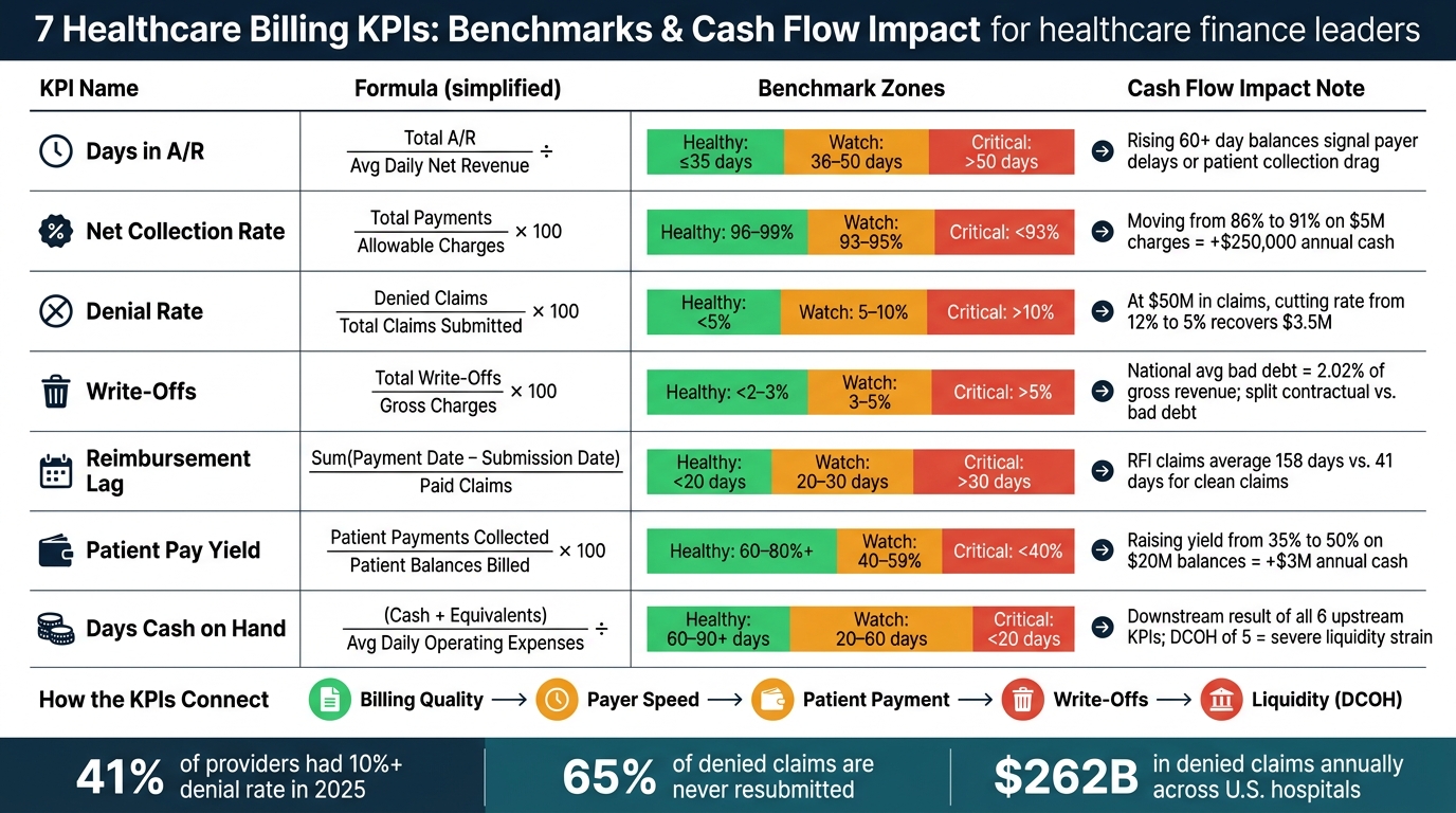
7 Healthcare Billing KPIs: Benchmarks & Cash Flow Impact Dashboard
After the metric definitions above, this view turns those numbers into one operating dashboard.
Use the table below to compare all seven KPIs in one place.
| KPI | Definition | Formula | Patient Billing Touchpoint | Insurer Reimbursement Touchpoint | Benchmark |
|---|---|---|---|---|---|
| Days in A/R | Average number of days it takes to collect payments from insurers and patients on outstanding receivables | Total A/R ÷ Average Daily Net Charges | Time from statement generation to patient payment or payment plan enrollment | Time from claim submission to payment posting | Healthy: ≤35 days; Watch: 36–50 days; Critical: >50 days |
| Net Collection Rate | Percentage of collectible net revenue actually collected, after contractual adjustments and approved charity care | Total Payments ÷ Net Collectible Charges × 100% | Accuracy of patient estimates and point-of-service collections | Clean claims, correct coding, and minimized underpayments | Healthy: 96–99%; Watch: 93–95%; Critical: <93% |
| Denial Rate | Percentage of claims, or charge dollars, denied by payers at least once | Number of Denied Claims ÷ Total Claims Submitted × 100% | Registration accuracy, insurance capture, and prior authorization at the encounter | Payer adjudication rules, medical necessity reviews, and appeals | Healthy: <5%; Watch: 5–10%; Critical: >10% |
| Write-Offs | Balances removed from A/R after they are no longer collectible, including bad debt and other non-contractual write-offs | Total Write-Offs ÷ Gross Charges × 100% | Self-pay collections workflow and propensity-to-pay scoring | Missed filing limits, payer errors, or unresolved underpayments | Healthy: <2–3%; Watch: 3–5%; Critical: >5% |
| Reimbursement Lag | Average number of days between claim submission and insurer payment posting | Sum(Payment Date − Claim Submission Date) ÷ Number of Paid Claims | Timeliness of charge capture and coding after the visit | Payer processing speed from clean claim receipt to EFT/ERA delivery | Healthy: <20 days; Watch: 20–30 days; Critical: >30 days |
| Patient Pay Yield | Percentage of patient-responsibility dollars that are ultimately collected | Patient Payments Collected ÷ Patient-Responsibility Amount Billed × 100% | Financial counseling, digital statements, reminders, and payment plans | Clarity of EOBs and insurer member communications | Healthy: 60–80%+; Watch: 40–59%; Critical: <40% |
| Days Cash on Hand | Days the organization can cover operating expenses using available cash and cash equivalents | (Cash + Cash Equivalents) ÷ Average Daily Operating Expenses | Volume and timing of patient payments, especially high-deductible plan members | Predictability and timing of payer reimbursement cycles | Healthy: 60–90+ days; Watch: 20–60 days; Critical: <20 days |
Read the table as a summary view. The point is not to stare at seven separate metrics in isolation. The point is to see how payer speed, patient collections, and write-offs shift together.
These ranges are directional, not hard rules. Put each KPI next to your baseline and peer group, then read the trend over 12 to 24 months instead of reacting to one monthly result.[63][3]
One cash flow summary page should pull the whole picture together. Monthly trend lines, payer drilldowns, aging buckets, denial reasons, and patient collection channels help leaders spot where cash is getting stuck. Payer-level bar charts should break out Days in A/R, Net Collection Rate, Denial Rate, and Reimbursement Lag. That matters because some Medicare clean claims pay in about 14 days, while some HMOs take up to 45.[5][43]
A/R aging buckets should show dollar amounts in a stacked bar across:
The share over 90 days should stand out as a risk flag. High performers keep that figure under 10%.[3][64] A denial breakdown by reason - eligibility, authorization, coding, medical necessity, and timely filing - paired with overturn rates on appeal makes the next move pretty clear. You can see where staff time will pay off instead of guessing.
For patient collections, use a split view for point-of-service payments, statements, payment plans, and agency placements. Add a trend line for digital payment adoption too. That gives you a plain way to measure whether patient-facing tech is improving Patient Pay Yield over time. That’s how seven KPIs start to read less like a spreadsheet and more like one cash flow story.
When these seven KPIs sit in different systems, the dashboard turns into a data integration issue, not just a reporting task. That’s where many internal teams get stuck. Keeping billing, reimbursement, and accounting data lined up in one executive view takes a steady pipeline, and a lot of healthcare teams don’t have the time or setup to keep that pipeline clean.
That’s why outsourcing is common. Healthcare leaders often need help turning scattered billing and payment data into a live view of cash.
The clearest warning signs usually aren’t missing metrics. It’s when the metrics stop matching across finance and revenue cycle reports. Outside help may make sense when teams run into:
These gaps tend to show up faster when an organization adds locations, takes on acquisitions, or opens new service lines.
Fractional CFO support can also help surface cash that’s still sitting on the table by tightening denials and collections. For a practice with $5,000,000 in annual charges, denial rework alone - recovering 40%–60% of denied amounts - can return $200,000–$300,000 per year.[65]
For teams at this point, outside advisory support can cut down the time between raw data and a cash view the business can actually use. Phoenix Strategy Group works with growth-stage healthcare organizations to connect billing, accounting, and forecasting data through fractional CFO, FP&A, and data engineering support, with a governed dashboard that finance teams can keep running.
Put together, these KPIs turn scattered billing reports into one clear operating view. A healthcare cash flow dashboard only does its job when it shows how billing, collections, and liquidity affect each other. These seven KPIs work best as one cash-flow system, not seven stand-alone reports.
That matters because a shift in one metric usually shows up later in the others. The numbers move together: a spike in denial rate can delay reimbursement, stretch Days in A/R, and tighten cash on hand while patient pay yield slips in the background. That kind of visibility makes the dashboard an action tool. It helps teams spot delays, leakage, and liquidity pressure sooner.
From there, the team needs a simple operating rhythm. Use one KPI definition, one data source, and one review cadence. Set internal targets, use the benchmark table as a reference point, and make deviations easy to see so the team can respond to trends before they turn into shortfalls. Better visibility protects liquidity and helps teams move faster.
When cash gets tight, start with near-real-time revenue cycle metrics that can help clear bottlenecks fast:
Then turn to days in A/R and the net collection rate to steady cash coming in. Looking at these metrics together makes it easier to tell the difference between short-term timing delays and deeper revenue leakage.
Review it on a steady, tiered schedule based on how fast decisions need to happen.
That rhythm makes it easier to spot trends early and keep your finances in good shape over time.
You need data from the core systems that track patient billing, claims, payments, and cash.
Key sources usually include:
If you use forecasting models, pull those in too.
The big goal here is simple: get as much of this data flowing in through automated integrations as you can. Manual exports might work for a while, but they often turn into a mess. Files get missed, numbers drift, and people end up arguing over which report is right.
It also helps to reconcile subledgers with the general ledger on a regular basis. That step keeps your numbers lined up and makes data quality a lot better.