Published on
August 26, 2026

If you only look at one venture fund return metric, you can miss the point. I’d read J-curve to see where a fund is in its life and IRR to see how fast returns are coming back. On their own, each can mislead.
Here’s the short version:
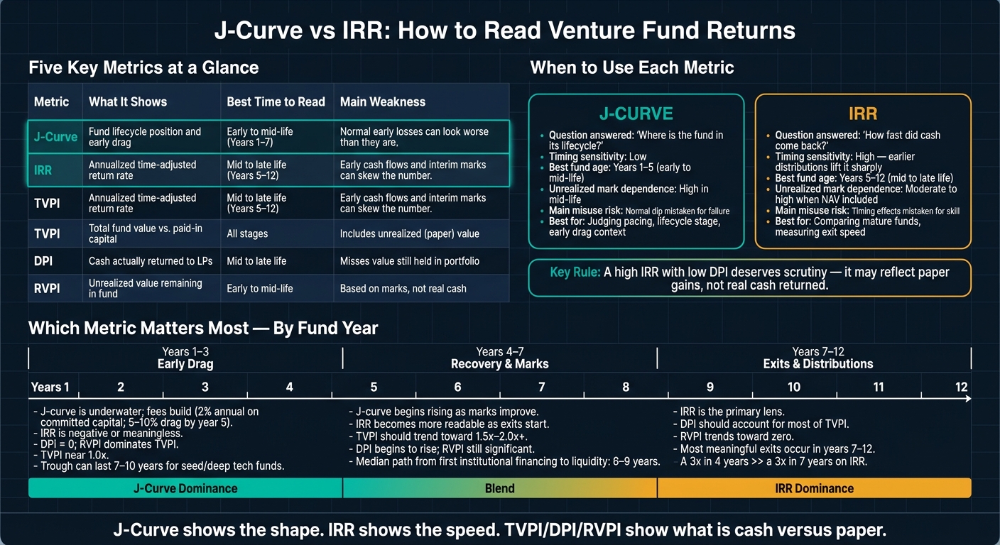
J-Curve vs IRR: Venture Fund Metrics Compared
| Measure | What I use it for | Best time to read it | Main weakness |
|---|---|---|---|
| J-curve | See fund lifecycle and early drag | Early to mid-life | Can make normal early losses look worse than they are |
| IRR | Measure time-based return rate | Mid to late life | Early cash flows and marks can skew the number |
| TVPI | Check total fund value vs. paid-in capital | All stages | Includes unrealized value |
| DPI | Check cash returned to LPs | Mid to late life | Misses value still held in the portfolio |
| RVPI | Check unrealized value left in the fund | Early to mid-life | Based on marks, not cash |
Put simply: J-curve shows the shape, IRR shows the speed, and TVPI/DPI/RVPI show what is cash versus paper. That’s the cleanest way I’d read venture fund returns.
The J-curve shows how a fund moves from capital calls to distributions over its life cycle. And that timing is exactly why the J-curve and IRR can paint very different pictures of the same fund.
Early losses usually come down to timing, fees, and marks, not failed exits. In years 1–3, LPs are sending money in while exits are still far off. A standard 2% annual management fee on committed capital starts right away and keeps building. By year five, fee drag alone can eat up 5%–10% of committed capital.[4][9] Add early write-downs on weaker companies plus cautious marks on the rest, and reported results can look rough long before the portfolio has had time to mature.
Exits also take a while. For many tech companies, the median path from first institutional financing to liquidity runs 6–9 years or more. That means meaningful distributions usually don't show up before year 4 or 5.[10] So the curve often stays underwater until portfolio companies hit milestones that support higher marks and, later, produce actual cash. Venture J-curve troughs can last as long as 7–10 years, versus the 3–5 years that are more common for buyout funds.[1]
Stage and vintage also shape the dip. A seed fund investing early will usually show a deeper, longer trough than a late-stage growth fund investing closer to a liquidity event. Funds launched just before a market downturn can get hit with down rounds and write-downs that make the curve look worse, even if those funds later invest at attractive prices and post strong returns. So a deep early trough doesn't automatically point to a weak fund. Sometimes it just reflects longer-duration bets or a shut exit window for a period of time.[5][9]
Once a fund gets past the trough, the main question shifts: what does the curve say about realized versus unrealized value?
This is where the J-curve works best alongside TVPI, DPI, and RVPI. Early on, TVPI tends to stay near 1.0x, DPI sits at zero, and RVPI makes up almost all reported value. In plain English, most of the value is still on paper. As the fund moves into years 4–7, TVPI should start moving toward 1.5x–2.0x or more as marks improve and DPI starts to move up. By years 7–10, DPI should account for most of TVPI, while RVPI should move down toward zero as assets turn into cash.[8][10]
Pacing matters as well. If deployment is too fast, that can hint at overpaying in a hot market. If it's too slow, the fund can pile up fee drag on uninvested capital and miss good deals.[6][7]
The same curve can also fool you if you don't have the right context. A shallow early curve doesn't guarantee a strong fund. It may reflect aggressive valuation marks, frequent up-rounds in a frothy market, or fast partial exits. If DPI stays low while TVPI looks strong, most of that value is still unrealized and can still reverse.
On the flip side, a steep early dip shouldn't set off alarm bells by itself. Seed funds, along with deep tech and biotech funds, often show long, flat, or sharply negative curves because their development cycles take more time. The better test is to compare the fund with peers in the same stage, sector, and vintage.[1][5][10]
IRR is the annualized return rate that finds the discount rate that makes a fund's cash flows add up to zero in present-value terms. Every capital call counts as a negative cash flow. Every distribution counts as a positive one. IRR balances those flows across time.
Put simply, IRR gives you the rate-based view of the same cash-flow path that the J-curve shows as a pattern over time.
That time factor is what separates IRR from a simple multiple. Two funds can both post 2.0x TVPI, but the fund that gets cash back to investors by year 7 will post a higher IRR than the one that doesn't make meaningful distributions until year 13. Earlier cash lifts the rate. Later cash pulls it down.[3][21]
IRR becomes more useful once a fund has realized enough exits that it depends less on interim marks. At that point, the cash flows behind the number reflect actual outcomes, not just paper valuations. That's when IRR becomes cleaner to read and more useful for comparison.[3][16][20]
In practice, IRR works best when you compare funds from the same vintage year and the same strategy. Why? Because funds launched in different market periods can deploy capital at different speeds and face very different exit windows. Holding vintage and stage constant makes IRR a better relative benchmark than looking at one number in isolation.[3][16][20]
For LPs, one detail matters more than most people realize: which IRR are you looking at? Gross IRR leaves out fees, expenses, and carry. Net IRR reflects the LP outcome, and that's the number that counts.[11][12][13]
IRR's sensitivity to timing is also where things can get slippery. Small early distributions can inflate the headline IRR without changing the total value returned in any major way. If a fund returns 10% to 20% of paid-in capital in year 3 through a quick secondary or an early exit, that one early cash flow can push reported IRR much higher than the rest of the portfolio would imply. TVPI or DPI may hardly budge, but IRR can leap.[19][16][18]
Interim valuations add another source of distortion. In mid-life venture funds, IRR is often based on a mix of realized distributions and unrealized NAV. If those marks are too high, IRR can look strong even when little or no cash has come back. Then a down round or write-down hits, and the number falls back to earth. That's when it becomes clear the earlier IRR overstated performance.[15][17][19]
There's also a simpler issue: IRR says nothing about scale. A smaller fund can post a higher IRR while producing less total dollar value. That's why IRR works best alongside DPI, TVPI, and RVPI. Those metrics show how much value has been realized and how much still sits in the portfolio. IRR is a rate lens, not a full lifecycle lens.[21][20]
The next section compares when each lens is most useful.
J-curve shows a fund’s position in its lifecycle. IRR shows how fast money came back. Put them side by side, and you can tell the difference between normal early drag and actual outperformance. The simplest way to compare them is to look at the question each one answers.
| Dimension | J-Curve | IRR |
|---|---|---|
| Question answered | Where is the fund in its lifecycle? | How fast did cash come back? |
| Sensitivity to timing | Low; driven by calls, fees, and delayed exits | High; earlier distributions lift it sharply |
| Dependence on unrealized marks | High in mid-life | Moderate to high when NAV is included |
| Best fund age for interpretation | Early to mid-life | Mid to late life |
| Main risk of misuse | Normal dip mistaken for failure | Timing effects mistaken for skill |
In the first one to five years of a venture fund, IRR is often noisy and hard to trust. Benchmark data shows that nearly every fund posts a negative IRR and a TVPI below 1.0x in its first two to four years because fees are drawn before portfolio markups arrive.[22] That’s why the J-curve helps more at this stage. It shows whether the dip looks like normal early fund drag or an actual warning sign.
J-curve is also better for judging pacing. A shallow early dip can point to slower deployment. A steeper dip can mean faster capital calls or heavier early write-downs. If a year-2 fund is down on paper but still has a solid pipeline of maturing companies, the J-curve puts that in context. It says, in plain terms, this may be expected. IRR at the same point can be deeply negative and tell you far less about what’s going on. That matters most before exits start shaping the return profile.
Once a fund has posted meaningful exits, IRR becomes the sharper tool. It measures speed, and speed matters once exits are real. A 3x in 4 years produces a much higher IRR than a 3x in 7 years.[23] The J-curve can’t show that gap. It tracks the shape of the ride, not how efficiently the result was delivered.
IRR is especially useful when comparing mature funds across vintages or strategies because it adjusts for time. Two funds can have the same TVPI and still look very different on IRR if one returned capital three years earlier than the other. That’s the kind of comparison J-curve was never built to handle. Once cash starts coming back, IRR becomes the cleaner tool for side-by-side analysis.
The safest move is to pair both metrics with TVPI, DPI, and RVPI. The split between DPI and RVPI shows how much value has been realized and how much still sits on paper. A high IRR with low DPI deserves close scrutiny. It may reflect unrealized gains, early distributions, or timing effects rather than steady fund performance.[2][14] In the same way, a J-curve that still leans heavily on RVPI later in a fund’s life should prompt a fair question: how much of that early dip is actually going to recover?
Each metric can also nudge managers toward different decisions. J-curve helps with pacing and lifecycle reads. IRR helps with timing and exit discipline. Use J-curve to place the fund in its life. Use IRR to measure return speed. Then use TVPI, DPI, and RVPI to check whether gains are realized or still on paper. For founders, that split shapes how investors read pacing, exits, and pressure to show progress.
Once you understand what J-curve and IRR say about fund returns, the next step is seeing how those signals affect investor behavior.
A fund’s age changes how hard it leans into follow-ons, reserves, and exits. Early on, managers are often focused on backing growth. Later, the focus usually shifts toward getting cash back to LPs. And that change can alter how they act.
The early questions are pretty simple:
When LPs want distributions, fund managers tend to push harder for exits.[24]
That’s why return analysis belongs at the board level, not only in the finance model.
These signals matter most when you’re modeling follow-ons, reserves, and exit timing. Phoenix Strategy Group helps growth-stage companies tie operating data to investor outcomes through FP&A, cash-flow forecasting, data engineering, fractional CFO support, and exit planning.
Use J-curve to understand lifecycle. Use IRR to understand speed. Then use TVPI, DPI, and RVPI to separate realized returns from paper gains.
Use both metrics together. Shape plus rate gives you the full picture.
IRR can look strong early on because it’s highly sensitive to when cash flows happen. A single early exit can push IRR up fast, even if most of the portfolio still hasn’t returned much cash.
It can also look better when capital calls are delayed. That shortens the measured investment period, which can make returns seem more efficient than they may be in practice.
Trust the J-curve when you want to understand how a venture fund tends to play out over time, not when you're trying to use it as an early warning sign.
During the first 4 to 6 years, fees and early capital deployment often push returns into negative territory. That can make IRR look low - or even negative - in a way that doesn't tell the whole story. At that stage, the J-curve does a better job of showing the fund’s long-term path.
DPI shows realized returns, which makes it the only cash-in-hand metric for investors. RVPI shows unrealized, on-paper value, while TVPI combines both to show the fund’s total value.
Taken together, these metrics help show a fund’s stage of maturity. Early in a fund’s life, TVPI tends to lean more on RVPI. Later on, DPI starts to grow as the fund moves into its harvesting phase.