Published on
July 25, 2026


If your KPI dashboard updates all day but your team still waits until month-end to act, the setup is off. I’d keep live reporting focused on decision timing: SaaS teams usually need daily views into MRR movement, failed payments, bookings, and runway, while healthcare teams need close tracking of charge lag, claims status, denial rate, first-pass resolution, and days in A/R.
Here’s the short version:
I’d boil the article down to this: use live reporting for metrics that support action today, not for every number you can pipe into a chart. For SaaS, that usually means customer payment and subscription movement. For healthcare, it means revenue-cycle stage data and care-delivery flow. Metrics like LTV:CAC above 3:1, CAC payback under 12 months, first-pass resolution above 90%, days in A/R at 30–45 days, denial rate below 5%, and net collection rate above 95% still matter, but many of them make more sense after data settles.
| Area | SaaS | Healthcare |
|---|---|---|
| Main live focus | MRR drivers, payment failures, bookings, runway | Charge lag, claims status, denial rate, first-pass resolution, LOS |
| Revenue timing | Subscriptions, usage, annual prepay; revenue recognized over time | Charges move through coding, claims, payer review, and collections |
| Data sources | Billing, payment tools, CRM, product analytics, accounting | EHR, practice management, billing, clearinghouse, payer remittance |
| Best live use | Customer billing events and short-term cash watch | Revenue-cycle workflow and care-flow watch |
| Better for monthly close | CAC, LTV, CAC payback, gross margin, churn rate | Net collection rate, write-offs, cost to collect, cost per case |
| Main reporting risk | Mixing cash, billings, MRR, and GAAP revenue | Mixing charges, accepted claims, and cash posted |
Bottom line: I’d treat live KPI reporting as a control system, not a wall of moving numbers. The article shows how to pick the right metrics, set the right timing, avoid bad labels, and keep data clean enough for hiring, cash, lender, and board decisions.
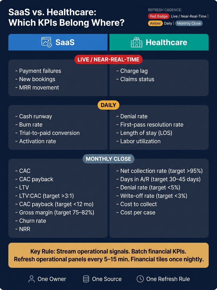
SaaS vs. Healthcare KPI Dashboard: Live, Daily & Monthly Metrics
SaaS and healthcare both need live KPIs for one simple reason: to spot trouble before it hits cash. But the trouble looks different in each sector, and it shows up on different timelines.
In SaaS, the main financial signal is MRR and the four drivers behind it: new, expansion, contraction, and churn. Don’t just watch the total. Watch the drivers every day.
Some SaaS metrics are worth seeing close to real time because they can change fast and give teams something they can act on right away. That includes payment failures, trial-to-paid conversion, and new bookings. These are customer-level events. If failed card payments spike, the team can step in at once, trigger a recovery flow, or fix a billing issue before it spreads.
Other metrics are better left to the monthly close. CAC, CAC payback, LTV, and gross margin fall into that bucket. Common targets are LTV:CAC above 3:1 and CAC payback under 12 months.[4][5] Those numbers matter a lot, but they make more sense in a monthly financial review than on a live dashboard.
Cash runway should update daily. It’s calculated as cash on hand divided by net burn rate, and it tells founders how much room they have left. If burn jumps without warning, they need to see that within 24 hours, not at month-end.[3][6]
Healthcare works differently because revenue comes in later and with more friction.
Healthcare revenue has to move through coding, claims, adjudication, and remittance, and that process can take weeks. Because of that lag, live healthcare dashboards should focus less on final revenue numbers and more on workflow signals.
The metrics that gain the most from near-real-time visibility are charge lag, denial rate, first-pass resolution rate, claims status, labor utilization, and length of stay (LOS). These are the control points. If charge lag starts climbing, a billing bottleneck is building right now. If denial rate jumps, the coding team has a chance to step in before the backlog gets ugly.
Many high-performing organizations aim for a first-pass resolution rate above 90%, and a lot of them target days in A/R between 30 and 45 days, depending on payer mix.[1][2]
By contrast, net collection rate, cost to collect, write-offs, and cost per case fit month-end close better. Treating them like live metrics can push teams to react to half-finished data.
The best way to decide dashboard cadence isn’t just by asking, “How much does this metric matter?” It’s also, “How fast does it change, and when is the data complete?”
| Metric Category | SaaS KPI | Healthcare KPI | Refresh Cadence |
|---|---|---|---|
| Revenue activity | Payment failures, new bookings, MRR movement | Charge lag, claims status | Live / near-real-time |
| Operational efficiency | Trial-to-paid conversion, activation rate | Denial rate, first-pass resolution rate, LOS, labor utilization | Daily / near-real-time |
| Cash conversion | Cash runway, burn rate | Days in A/R | Daily for SaaS / monthly close for healthcare |
| Unit economics | CAC, CAC payback, LTV, ARPU | Cost to collect, cost per case | Monthly |
| Retention / collections | Churn rate, NRR | Net collection rate, write-offs | Monthly |
| Margin | Gross margin | Denial recovery, write-offs | Monthly (post-close) |
Live dashboards are built for speed. Monthly reporting is built for accuracy. Both matter. But cadence only helps if the source data shows up on time and the team trusts it.
SaaS and healthcare split apart in three big areas: when revenue shows up, where the data lives, and what pushes margin up or down. The hard part isn’t just speed. It’s knowing whether a metric comes from a source that’s complete enough to trust.
| SaaS | Healthcare | |
|---|---|---|
| Revenue model | Subscription (MRR/ARR), usage-based, annual prepayments | Fee-for-service, capitation, bundled payments |
| Main source systems | Billing/subscription, payment processor, CRM, product analytics, accounting, FP&A/BI | EHR, practice management, scheduling, billing, clearinghouse, payer remittance |
| Typical data latency | Seconds to minutes for billing and usage; several days to weeks for GAAP close | Near-real-time for encounters; days to weeks for remittance |
| Key margin drivers | Hosting, support/success labor, third-party tools, payment processor fees | Payer mix, reimbursement rates, labor utilization, denial leakage, supply costs |
Billing platforms like Stripe Billing, Chargebee, or Recurly track plans, upgrades, cancellations, and renewals. That makes them the best live source for MRR and churn. Payment processors show successful charges, failed payments, and refunds. CRM platforms like Salesforce or HubSpot track pipeline, closed-won deals, and contract values. Product analytics tools like Mixpanel or Amplitude show usage, activation, and engagement. Accounting systems like NetSuite or QuickBooks Online provide GAAP-compliant actuals, but they come later.
This is where teams get tripped up: the systems move on different clocks.
Under ASC 606, a customer who pays $120,000 upfront for a 12-month contract brings in $120,000 in cash in July, but only $10,000 per month counts as recognized revenue.[7][8] If a dashboard treats that billing event as revenue, July gets overstated by 11x. The same issue shows up with trials, ramps, discounts, and refunds. Billings, cash, MRR, and GAAP recognized revenue need to stay separate. And if a chart is based on billings, don’t call it revenue unless the label makes that crystal clear.[9][10]
That’s why billing, cash, MRR, and GAAP revenue can’t be lumped together.
In healthcare, clinical systems, billing systems, and payer systems each own a different part of the revenue cycle. An EHR records the clinical encounter, but documentation and coding may change after the visit. A practice management system handles registration, eligibility, and scheduling. That makes it useful for early operating signals, but not final revenue. Billing software creates claims and tracks aging. A clearinghouse sends claims to payers and returns status updates, but not final payment. Payer remittance files are the strongest source for what actually gets paid, and they may arrive days to weeks after the date of service.[12]
At each step, the numbers can change. Coding edits, denials, appeals, and payment plans all shift what looked like revenue earlier in the cycle. So healthcare dashboards should label metrics by stage, not mash everything into one revenue line.
For example, it helps to separate:
Those stage labels tie straight to the operating signals that matter most: charge lag, denial rate, claims status, and days in A/R. Add HIPAA plus old HL7, FHIR, and X12 workflows, and integration becomes custom and heavy to maintain.[12]
Because each source updates at a different point in the cycle, stage labels matter more than one top-line revenue number.
In SaaS, gross margin mostly comes down to delivery cost at scale. The main drivers are cloud hosting and infrastructure, customer support and success labor, implementation and onboarding services, and third-party licensing or data costs. Strong SaaS performers often land in the 75%–82% gross margin range.[11]
A good dashboard breaks COGS into pieces so teams can see what changed and why. Hosting and support costs usually show up daily through vendor bills and headcount data. Onboarding and third-party costs often don’t settle until monthly close.
Healthcare runs on a different set of margin pressures. Payer mix is a big one. A shift toward Medicaid or self-pay patients can squeeze margin fast. Negotiated reimbursement rates, labor utilization measured in RVUs, supply and drug costs per procedure, and denial leakage all shape what the organization gets to keep.
Benchmarks worth watching include:
Payer mix trends and denial recovery rates can be tracked daily. Net collection rate and write-offs usually settle at month-end close. So the dashboard should show payer mix, denial recovery, and provider productivity - not just net revenue.
Those differences affect dashboard design and reporting controls. They also decide what belongs on a live dashboard and what has to wait for close.
Once you've picked the right KPIs, the next job is showing them in a way that helps people act on them, not misread them.
Dashboard design should match how fast each KPI becomes dependable. In SaaS, the first question is simple: is the recurring revenue engine healthy? That’s why the top row should show MRR/ARR split by new, expansion, contraction, and churn, along with net dollar retention, logo churn, and CAC payback. Leadership should see those first.
From there, trend charts for cohort retention and expansion revenue fit in the middle of the page. Segmentation cuts by plan, acquisition channel, or region can sit lower down. The key idea is simple: every tile should lead to a decision.
Healthcare needs a different setup because the business runs on two separate operating layers: revenue cycle and clinical operations. That lines up with the earlier split between revenue-cycle metrics and clinical operations. Finance teams need net collections, denial rates, A/R aging, and payer mix. Operations teams need patient throughput, provider utilization, no-show rates, and staffing ratios. Putting all of that into one screen muddies the picture for both groups.
A better setup is separate pages for revenue cycle and clinical operations, with color-coded thresholds instead of unlabeled numbers. That way, people don’t have to guess what’s fine, what’s drifting, and what needs attention now.
This only holds up if every tile has a clear owner and refresh rule. In both sectors, dashboard experts regularly recommend no more than 6–8 visualizations per page to reduce cognitive overload.[13][14] If a tile doesn’t support a clear decision, it probably doesn’t belong there.
The biggest risk in dashboards usually isn’t downtime. It’s bad data sitting there quietly, looking correct.
| Risk | Sector | Likely Cause | Governance Control |
|---|---|---|---|
| Stale data displayed as current | Both | ETL job failure or delayed refresh | Visible "Last updated" timestamp on every tile; automated alerts if refresh fails |
| Mismatched metric definitions | Both | Different formulas across teams, systems, or board decks | Metric dictionary with named owner, formula, and data source for each KPI |
| Overreaction to short-term swings | Both | Financial metrics refreshing too frequently | Weekly/monthly cadence for financial KPIs; moving averages to smooth volatility |
| Subscription config errors | SaaS | Mis-tagged discounts, missing upgrades/downgrades, incorrect billing cycles | Reconciliation checks between the billing platform and GL; exception queue for anomalies |
| Coding and claims errors | Healthcare | Incorrect CPT/ICD codes, missing modifiers | Denial tracking by reason code; pre-submission claim edits; exception audit reports |
| Misapplied payments | Healthcare | Posting errors in practice management system | Daily payment reconciliation; A/R aging review tied to reconciled data only |
A named metric owner, a metric dictionary, and an approval process help keep dashboards dependable as teams grow.
The same rule applies to refresh speed: only stream data when teams can do something with it right away. If the decision doesn’t happen in real time, the dashboard usually shouldn’t either.
In SaaS, product reliability metrics like API error rates, latency, and active user counts make sense for near-real-time refresh because engineering teams may need to react within minutes. Sales counters such as demos booked or opportunities created can refresh hourly if they’re being used to manage SDR output. In short, stream operational signals and batch financial KPIs.
MRR, ARR, and other closed financial metrics should update only after source-system close. Cash runway can refresh daily. LTV/CAC should stay monthly. If you refresh financial metrics nonstop from partly closed data, you create false precision.[14]
Healthcare follows the same pattern. ED capacity, wait times, and staffing levels are good fits for near-real-time feeds because bed management decisions happen on the spot. Again: stream operational signals and batch financial KPIs. Denial rates, net collection percentages, and contractual adjustment rates should come from nightly or weekly extracts from the practice management and billing systems. If these numbers are shown before claims are adjudicated and payments are reconciled, they won’t hold up under lender or board review.
A practical setup is to refresh operational panels every 5–15 minutes and financial tiles once nightly.[14] Each tile should also show its real data window, such as "Last 24 hours" or "Month-to-date through the latest close", instead of a generic "real-time" label that suggests more accuracy than the source data can support.
Once KPI cadence is set, the next step is build order. Founders shouldn't try to build everything at once.
Phase one is about discipline, not tech. Choose 5–7 KPIs that people actually use to make decisions. Then tie each one to:
That sounds simple because it is. And that's the point.
Phase two is where the plumbing gets cleaned up. Add reconciliation checks, deduplication rules, timestamps, and validation logic. This is the layer that keeps the numbers from drifting or clashing across teams.
Phase three adds the dashboard itself: role-based views for finance, operations, and leadership, plus automated alerts when thresholds get hit, like runway falling below 9 months or churn jumping above 3%[15].
For founders dealing with tight cash or lender covenants, this order helps protect trust. A slick dashboard built on messy, unreconciled data can do more harm than a plain spreadsheet.
The right system is simple: a small set of metrics, clean definitions, and refresh rules people trust.
SaaS and healthcare need different KPI sets because their revenue models, data sources, and margin drivers are different at the core. Put them into one generic dashboard and you don't get clarity. You get noise.
Revenue timing needs close attention in both sectors. Bookings, recognized revenue, billed charges, and cash collected each tell you something different, so they should not be lumped together. The same goes for margin tracking. Context matters, and the drivers vary enough that one margin line can point leaders in the wrong direction.
Just as important, governance matters as much as speed. A fast dashboard built on weak definitions and unreconciled data is more dangerous than a slow one. Named metric owners, a metric dictionary, clear refresh SLAs, and data-quality alerts are what separate a reporting system people can rely on from one that just looks polished.
The strongest setups start with a small handful of metrics, test the foundation, and only expand when the data stands up to scrutiny.
Match KPI review frequency to the speed of the decisions you need to make.
Track liquidity daily. Check high-volume operating metrics weekly, including MRR, churn alerts, cash collections, and margin tracking. Use monthly reporting for more stable core metrics like ARR, logo retention, gross margin, and ledger reconciliation. Save quarterly reviews for longer-term measures such as unit economics, NRR, GRR, and CAC analysis.
Because the two sectors run on completely different economics.
SaaS dashboards usually track metrics like MRR, NRR, and CAC. Those numbers help teams measure subscription growth, retention, and scale.
Healthcare dashboards need a different lens. They track operational and clinical metrics like patient acquisition cost, payer mix, visit volume, reimbursement lag, and denial rates. If you use the same dashboard style for both, you miss the numbers that matter most.
Standardize data definitions across systems so metrics like revenue and churn are calculated the same way everywhere. If one team defines churn one way and another team defines it differently, your dashboard turns into a mess fast.
Replace manual entry with automated integrations between source systems to cut human error. People make typos. Systems do too, but a clean integration usually makes far fewer mistakes than copy-pasting data across tools.
Add automated validation rules, reconcile data daily or in real time at the transaction level, and set alerts plus regular audits to catch breaks before they hit the dashboard. That way, you’re not finding out about a data issue after someone in a meeting points at the wrong number.