Published on
July 28, 2026

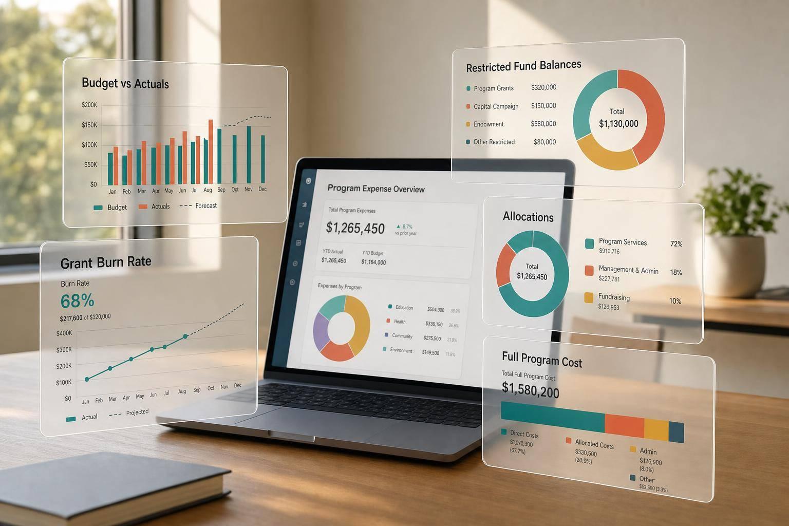
If I want a nonprofit program expense dashboard to work, I need four things on one screen: budget vs. actuals, restricted fund balances, grant spend pace, and full program cost.
That’s the short answer. A useful dashboard helps me see where money went, which grant or fund paid for it, and whether a program is heading toward overspend before month-end problems turn into audit or board problems. It also helps me tie finance data to service data, such as cost per beneficiary or cost per outcome.
Here’s what matters most:
A few numbers stand out. In many nonprofits, personnel and benefits make up 50% to 60% of total expense. That means payroll coding and allocation shape much of the dashboard. And if grant periods run across fiscal years, I need a grant-period view too, not just a yearly budget view.
What I take from this article is simple: a program expense dashboard is not just a finance report. It is a day-to-day management tool for close, reforecasting, board packets, grant review, and Form 990 support.
Before I build one, I make sure the dashboard answers these questions fast:
That focus keeps the dashboard useful instead of turning it into another long report no one uses.
A useful dashboard usually starts with three views: spend control, restricted-fund status, and program cost.
The main view is budget-to-actuals (BvA) by month, quarter-to-date, and fiscal year-to-date. Each row should show the budgeted amount, actual spending, and both dollar and percentage variance side by side.
A lot of dashboards leave out encumbrances. That’s a mistake. Encumbrances show committed spend before invoices post, which gives you a more honest picture of what’s still available to spend. Without them, a program can look looser than it is.
Grant periods also rarely match the fiscal year. So the dashboard should support grant-lifecycle tracking as a separate view. Track multiyear grants by grant period, not only by fiscal year.
That view should sit next to restricted-fund balances.
Each restricted fund should show spend to date, remaining capacity, and burn rate. That way, leaders can see whether the grant is on pace.
Next to individual balances, show the funding mix for each program. This makes it easy to see how much support comes from restricted funds versus unrestricted support. It also helps flag programs that lean heavily on grant funding and could be exposed if a renewal doesn’t come through.
From there, the dashboard should show what each program actually costs.
Show functional expenses by program services, management and general, and fundraising. Track the program expense ratio as a standing metric [1].
Below the functional view, break costs down by category:
Personnel and benefits typically represent 50% to 60% of total nonprofit expenses [1]. Use predefined drivers to allocate shared costs so each program’s full cost stays in view.
If operational data exists, show cost per beneficiary or cost per outcome. That helps connect spending to mission results instead of treating finance and impact as separate conversations.
| Metric Type | Key Measures | Decision Use |
|---|---|---|
| Financial Metrics | Budget variance, program expense ratio, grant burn rate, operating reserve months | Monitors spend control, fiscal health, and grant compliance |
| Impact Metrics | Cost per beneficiary, cost per outcome, grant renewal rate | Measures service delivery efficiency and mission impact |
These metrics should support both financial control and impact review.
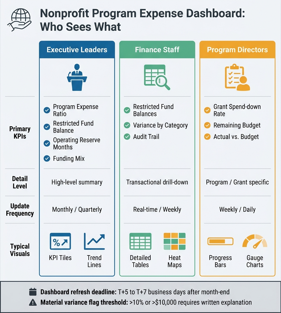
Nonprofit Program Expense Dashboard: User Views & Key Metrics
Once the core metrics are set, the next step is linking the systems behind them.
The main source is the general ledger (GL). It provides actual spending by account, fund, and period. Budget files supply the targets those actuals are compared against. A grant tracking system adds funder-specific timelines, award amounts, and allowable cost categories that the GL alone doesn’t show.
Other systems matter too. Payroll and HRIS data are key for assigning salary and benefits by program. CRM or donor management records provide restricted gift details. Bank and credit card feeds add near real-time transaction visibility.
Each transaction should be tagged with program codes, grant IDs, and donor-restriction status under ASC 958 [2]. Shared indirect costs - rent, utilities, and administrative salaries - should be allocated across programs using fixed allocation drivers.
Once the data is clean and moving into one place, the dashboard should show different views for different users.
Different users need different levels of detail.
At the top, KPI tiles should display program expense ratio, restricted fund balance, operating reserve months, and funding mix. These should be visible to anyone who opens the dashboard. Below that, the main dashboard area can show program budget-to-actual charts and restricted fund balances. Deeper in the view, trend lines and drill-down tables by grant or expense category give finance and program teams more detail when they need it.
The table below shows how each dashboard layer can be shaped by user type:
| User Type | Primary KPIs | Detail Level | Update Frequency | Typical Visuals |
|---|---|---|---|---|
| Executive Leaders | Program Expense Ratio, Restricted Fund Balance, Operating Reserve, Funding Mix | High-level summary | Monthly/Quarterly | KPI Tiles, Trend Lines |
| Finance Staff | Restricted Fund Balances, Variance by Category, Audit Trail | Transactional drill-down | Real-time/Weekly | Detailed Tables, Heat Maps |
| Program Directors | Grant Spend-down Rate, Remaining Budget, Actual vs. Budget | Program/Grant specific | Weekly/Daily | Progress Bars, Gauge Charts |
Program directors should have read-only access to their grant balances. That gives them visibility without creating extra risk.
A lot of nonprofits know what they want to track but don’t have enough internal capacity to connect every system cleanly. Bringing together a GL, payroll platform, grant tracker, and CRM into one reporting pipeline takes accounting knowledge and data engineering skill.
FP&A and data engineering support can help connect the GL, payroll, grant, and CRM data into one reporting pipeline.
After that pipeline is in place, finance teams can shift their attention to governance, validation, and monthly reporting.
Once the data pipeline is set up, lock down ownership before anyone starts building charts and visuals. That step sounds simple, but it prevents a lot of confusion later. Give one person clear ownership of the dashboard, assign a data steward, and make program leads responsible for definitions, refreshes, and allocation rules.
Put those rules into a short Dashboard Charter. It should spell out which programs and fund types are in scope, how KPIs are defined, and how changes are approved. For shared costs like rent, leadership salaries, and software subscriptions, use allocation bases that line up with actual cost drivers, such as FTEs, square footage, and usage. [10][11][12] Review those allocation bases with program leaders at least once a year so the dashboard stays trusted and usable. [14]
Start with the decisions the dashboard needs to support. Then work backward to the metrics and source data needed to support those decisions. [13][15]
The table below shows a practical rollout sequence finance teams can use:
| Implementation Stage | Primary Owner | Typical Timeline | Key Risks |
|---|---|---|---|
| Define decision needs & KPI requirements | CFO / Director of Finance | 2–4 weeks | Unclear objectives; metrics that don't match real decisions |
| Align source data across systems | Finance + IT/Data | 4–8 weeks | Inconsistent program IDs; dirty or incomplete data |
| Build data model and allocation logic | FP&A / Data Engineer | 4–10 weeks | Over-complex model; undocumented allocation rules |
| Design and develop dashboard visuals | Finance Analyst | 3–6 weeks | Cluttered layout; visuals not tailored to executives vs. program managers |
| Pilot with one program and refine | Finance + Program Lead | 4–8 weeks (2–3 cycles) | Low engagement from pilot program; misinterpretation of metrics |
| Validate against GL, grant, and legacy reports | Finance | 2–4 weeks | Unexplained variances; changes not documented |
| Organization-wide rollout and training | Finance + Executive Team | 4–12 weeks | Insufficient training; no integration into monthly close or board processes |
| Ongoing governance and maintenance | Dashboard Owner (Finance) | Continuous (monthly/annual) | Scope creep; failure to update for new programs or grants |
Before going live, reconcile dashboard totals to the trial balance. Then trace sample transactions through the allocation logic. That extra check helps catch mismatches before people start relying on the numbers in production. [5][9]
After the dashboard goes live, make it part of monthly close, reforecasting, and board reporting - not a side tool people check when they have time. Set a refresh deadline of T+5 to T+7 business days after month-end, and list that refresh as a named step in the close checklist. [5][7]
Once the data is refreshed, finance should run a structured monthly variance review. Focus on the biggest budget-to-actual gaps by program, grant burn rate, and cash runway for the next 60–90 days. [3][4] Any material variance - more than 10% or $10,000 - should include a written explanation stored with the dashboard or in a companion variance log. [3][4]
For board reporting, the dashboard should highlight summary KPIs, restricted fund balances, dependence on one or a few grants, and programs that may need early attention. Boards usually need three things:
Between board meetings, use that same dashboard data to update rolling forecasts. Swap projected revenue for actuals, refresh expense timing, and update grant run-out projections. [6][8] This gives finance teams a clearer view of grant overspend or program underfunding while there is still time to respond.
Once the dashboard is built and folded into the monthly close, the last test is simple: does it lead to better decisions?
A useful program expense dashboard depends on four core parts: reliable program coding, budget-to-actual tracking, restricted fund visibility, and cost-by-program analysis. These controls matter because personnel and benefits usually make up most nonprofit spending. That means accurate payroll allocation and program-level reporting have a direct effect on compliance and mission oversight.
The best dashboards are simple enough for board review, current enough for reforecasting, and specific enough to prompt action. If people can’t read it and use it fast, it’s not useful.
Program expense ratio, grant-level budget-to-actuals, restricted fund tracking, and functional expense categories each serve a different group, from finance teams to boards.
When these parts are coded at the transaction level, refreshed on schedule, and reviewed against clear variance thresholds, the dashboard becomes a management tool, not just a report. That’s what turns reporting into day-to-day management.
Start by clearly defining each program and its direct and indirect costs.
Then use one consistent method for shared expenses. For example:
Use transaction tagging to assign each expense a program code. Map categories the same way across systems. And document the allocation process, then review it on a regular basis.
Track budget-to-actual performance for the grant period, not your fiscal year.
Set up a grant-specific budget when the grant begins. Then post expenses to that grant as they happen.
That way, your dashboard can show variance and remaining balance across the full life of the grant. It also cuts out manual spreadsheet work if you use a system that supports grant periods alongside standard fiscal reporting.
Update frequency should line up with how often people need to make decisions.
For finance teams and department heads who need close budget-to-actuals tracking or variance details, daily or weekly updates usually make the most sense. They need a near-current view so they can spot issues early and act before small gaps turn into bigger ones.
For executive and board-level dashboards, the focus is usually broader: overall financial health and progress against strategic goals. In those cases, monthly or quarterly refreshes are often enough.
Automating refreshes helps keep reporting accurate and relevant as needs change.