Published on
September 21, 2026

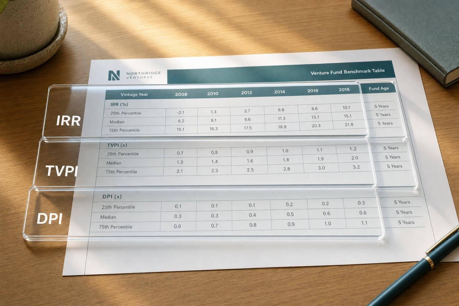
If you compare a 2022 VC fund to a 2012 VC fund, you can get the story wrong. I’d read venture return tables in this order: match the vintage year, check fund age, compare IRR, TVPI, and DPI together, and stick to one data source.
Here’s the short version:
A few fast rules shape almost every table in the article:
The article also shows why maturity changes the meaning of returns. For example, a sample 2019 vintage posts 22.5% net IRR and 1.7x TVPI, but only 0.4x DPI. A sample 2012 vintage shows a lower 13.0% IRR, yet a much higher 1.5x DPI. Same asset class. Very different level of proof.
My takeaway: when I read a VC benchmark table, I don’t ask only, “What’s the return?” I ask, “How old is the fund, how much is cash, how big is the peer set, and who built the benchmark?”
| What to check | What it tells me | Common mistake |
|---|---|---|
| Vintage year | Whether the fund is being compared to the right market cycle | Comparing funds from different cycles |
| Net IRR | Speed of return | Treating early IRR as final |
| TVPI | Total current value | Assuming all value is realized |
| DPI | Cash back to LPs | Ignoring low payout in young funds |
| RVPI | Unrealized value left | Treating marks like cash |
| Quartiles | Peer rank within a vintage | Mixing quartiles from different providers |
| Fund count | How stable the benchmark may be | Trusting thin cohorts too much |
| Benchmark source | Method used to define peers and returns | Using Cambridge medians with Preqin cutoffs |
And if I need one simple rule, it’s this: compare like with like, then weight cash returns more heavily as the fund gets older.
Cambridge Associates reports four net-to-LP metrics by vintage year: net IRR, TVPI, DPI, and RVPI.[3][1][5]
Each table also shows pooled return, average, median, and upper and lower quartiles.[5][8] Here’s the simple way to read that:
Pooled return is a fund-size-weighted IRR across all cash flows, so larger funds can pull it away from the median.[6] That matters because a vintage can look strong on a pooled basis even if the middle fund looks more ordinary.
Cambridge has used different vintage-date rules over time, including legal formation date and first cash flow or LP contribution.[4][11][12] That can move a fund into a different cohort, so it’s worth checking the footnotes before comparing one table with another. A different vintage date means a different peer group, and that can shift a fund’s rank.
The quartile cutoffs rank each fund within a vintage by the metric being measured, marking the 75th and 25th percentile thresholds. These cutoffs are calculated separately for each metric.[3][1] So a fund can land in the top quartile on TVPI but only around the median on IRR.
The same thing happens with funds that have built a lot of paper value but haven’t yet returned much cash. A fund with strong unrealized gains may look average on DPI while sitting well above the median on RVPI and TVPI. In plain English, each metric looks at a different phase of value creation, so the same fund can wear very different labels depending on which number you use.
Cambridge says quartile rankings tend to settle after about six years.[9][10][2] More recent vintages are still provisional, and a dash means the sample is too small to support reliable stats.
Next, compare these Cambridge conventions with other benchmark tables that define vintage cohorts differently.
Preqin takes a tighter benchmark view than Cambridge Associates. Its tables usually center on Q1, median, and Q3, and they screen out early IRR figures. Preqin defines a fund’s vintage year as the year of its first investment or first capital drawdown.[14] In plain English, that links the fund to the point when it starts putting capital to work.
The main figures Preqin usually includes are net IRR, TVPI, DPI, RVPI, called capital, and distributions.[18][20][15] Called capital and distributions help show the money flow: how much went in, and how much cash has come back. The catch is simple: one metric on its own can mislead.
Take this example. A 3.0x TVPI can look strong at first glance. But if DPI is only 0.5x, a big share of that value is still unrealized. That means the result can move around before the fund completes its exits.
Preqin’s quartile tables show the cutoff points for each vintage peer group using Q1, median, and Q3.[19][21] That matters because a fund might look strong on one metric and average on another. A top-quartile TVPI doesn’t automatically mean top-quartile DPI or IRR.
For early vintages, Preqin says net IRR during the first three years of a fund’s life is not meaningful, so it usually leaves those figures out of quartile rankings and league tables.[16] That’s why younger vintages often show n/m or blank IRR fields, while older vintages are more likely to have quartiles you can actually use.
There’s one more thing to watch: peer group size. If a vintage-strategy-geography segment has too few funds, Preqin may compare it with the broader private equity or venture market instead of publishing thin, vintage-specific quartiles.[17] Before you lean on a quartile rank, check the fund count. A small peer set can still point you in a direction, but it shouldn’t settle the debate.
Next, PitchBook-NVCA looks at the same vintage-year issue through a different benchmark lens.
PitchBook-NVCA looks at venture results through the same vintage-year frame, but its table rules lean more on reported investment dates and how much data is on hand. It defines a fund’s vintage year by the first investment in a portfolio company. If that date isn’t available, it falls back to the final close date.[24][22]
In Venture Monitor, the benchmark tables report net IRR - both pooled and equal-weighted pooled - along with TVPI and DPI.[23][24] The rows usually show cutoff points for:
You’ll also usually see the number of funds in each row and, in some cases, standard deviation.[23][27]
When you read a PitchBook table, start with the vintage median and quartiles. Then look at DPI. If DPI is still low, that can be a sign early marks are doing most of the work.[24][25]
PitchBook also screens out thin data with two main rules. First, funds need performance data in at least 45% of their reporting periods to make it into pooled calculations. Second, PitchBook won’t publish a pooled IRR unless there are at least five funds with cash flow data.[26][28]
For older funds that stop reporting, PitchBook carries forward prior-quarter values using age-based rules. That helps smooth noise in mature-vintage metrics.[29][30] One more thing matters here: always check the fund count beside the vintage row. If a row is only a bit above the minimum of eight funds, one outlier can move the cutoffs more than you’d like, so treat those figures as directional, not absolute.[30]
Use these rules when you read the sample fund vintage-year table in the next section.
This sample table shows how vintage year, returns, quartile cutoffs, and fund maturity line up in practice. The figures are illustrative.
Read each row from left to right: start with the vintage year, then the return metrics, then the cohort cutoffs.
| Vintage Year | Net IRR | Net TVPI | Net DPI | Quartile Rank | TVPI Top Quartile Cutoff | TVPI Median | Funds in Cohort | Years Since Vintage | Maturity Category | Realization Profile |
|---|---|---|---|---|---|---|---|---|---|---|
| 2012 | 13.0% | 1.9x | 1.5x | 2nd | ≥ 2.5x | 1.6x | 185 | 13 | Late | Mostly Realized |
| 2013 | 15.2% | 2.1x | 1.3x | 2nd | ≥ 2.5x | 1.7x | 220 | 12 | Late | Mostly Realized |
| 2015 | 17.0% | 2.0x | 0.9x | 2nd | ≥ 2.3x | 1.6x | 198 | 10 | Mid-to-Late | Mixed |
| 2019 | 22.5% | 1.7x | 0.4x | 2nd | ≥ 2.1x | 1.4x | 142 | 6 | Mid | Mostly Unrealized |
| 2021 | 8.3% | 1.4x | 0.2x | 3rd | ≥ 1.8x | 1.2x | 97 | 4 | Early | Mostly Unrealized |
As of 12/31/2025. IRR is shown as a percentage with one decimal place; TVPI and DPI are shown as multiples (x). Currency context is USD. Quartile cutoffs are illustrative and based on a Cambridge Associates-style VC benchmark structure.
The maturity and realization columns help you judge whether one row is actually comparable to another. That check matters more than it may seem at first glance. If the vintage maturity and benchmark source don't match, the comparison can point you in the wrong direction.
The 2019 and 2012 rows make this clear. The 2019 fund shows a higher Net IRR at 22.5%, while the 2012 fund shows 13.0%. But the older fund has delivered much more in cash back to investors: 1.5x DPI versus 0.4x. So yes, a fund can post a higher IRR and still have a lower realized payout.
That’s why the maturity and realization columns matter. They show how much of the value has actually been distributed and how much is still based on marks. When DPI is low, TVPI and IRR should be read as provisional, not final. The 2021 row is the clearest case of that.
If you're assessing a specific fund, match it to the row for its vintage year and then compare its metrics with the quartile cutoffs. For example, a 2015 vintage fund with 2.0x TVPI and 17.0% net IRR lands in the second quartile. It sits above the 1.6x median, but below the 2.3x top-quartile cutoff. That tells you a lot more than a loose label like “above average.”
One last point: always match the cutoff source before comparing quartile ranks.
Next, break down how to read IRR, TVPI, DPI, and quartile cutoffs on their own.
Vintage-year tables usually revolve around four core metrics: TVPI, DPI, RVPI, and net IRR.
Here’s the quick version:
Once you know what each metric means, the next step is to read those numbers against the right vintage cohort. That’s where people often get tripped up.
Fund vintage is not deal vintage. Fund vintage refers to the year a fund starts investing or makes its first capital call. Deal vintage refers to the year a portfolio company gets backed. They are not the same thing, and treating them as interchangeable can skew comparisons across cohorts.
Quartiles split a vintage cohort into four equal bands. The top quartile represents the best 25%, and the median is the midpoint. In practice, vintage-year tables often show upper quartile, median, lower quartile, standard deviation, DPI, RVPI, TVPI, and the number of funds. That gives you both the center of the data and the spread around it.
That spread matters more than many people think. In venture, wide gaps between quartiles are normal. One vintage can produce very different outcomes even among funds launched in the same year. So a 15% net IRR might look elite in a weak exit market, but only average in a strong one. Top quartile is relative, not a fixed bar. And those quartile cutoffs only mean much when a fund has matured enough for the numbers to carry weight.
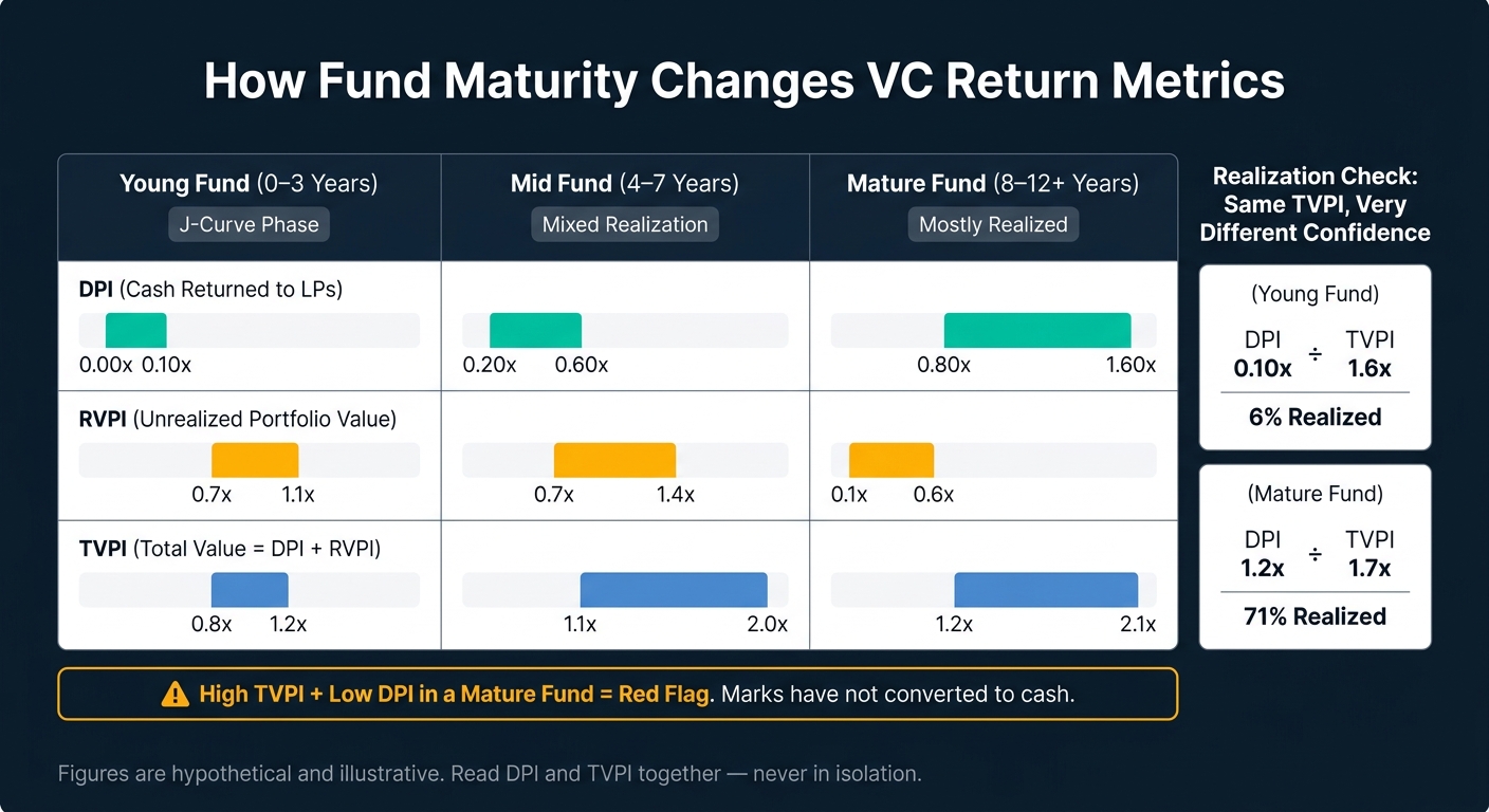
VC Fund Maturity vs. Return Metrics: How Fund Age Changes What the Numbers Mean
A 3-year-old fund and a 12-year-old fund should not be judged the same way. Vintage-year benchmarks only make sense when you adjust for fund age. So before you trust any vintage-year cutoff, start with maturity.
Early in a fund’s life, money goes out, fees build up, and exits usually take time. That keeps DPI low even when the fund is on track. That’s the J-curve effect. In this stage, TVPI is heavily mark-dependent. Put simply, a lot of the reported value comes from recent funding rounds, not from exits that have turned paper value into cash.
That matters because interim TVPI can end up lower or higher than final DPI, depending on the market. So young-fund marks can look cleaner than they are. One quick gut check is the DPI/TVPI ratio. For example, a young fund with DPI of 0.10x and TVPI of 1.6x has realized only about 6% of its reported value. A mature fund with DPI of 1.2x and TVPI of 1.7x has realized roughly 71%. Same headline TVPI ballpark. Very different confidence level.
A simple age split makes the pattern easier to read:
| Vintage Maturity | Hypothetical DPI Range | Hypothetical RVPI Range | Hypothetical TVPI Range | What It Means |
|---|---|---|---|---|
| Young (0–3 years) | 0.00x–0.10x | 0.7x–1.1x | 0.8x–1.2x | J-curve phase; exits are rare |
| Mid (4–7 years) | 0.20x–0.60x | 0.7x–1.4x | 1.1x–2.0x | Mix of early exits and large unrealized positions |
| Mature (8–12+ years) | 0.80x–1.60x | 0.1x–0.6x | 1.2x–2.1x | Most value is realized |
Here’s the big watchout: a high TVPI with low DPI in a mature fund is a red flag. The marks have not turned into cash, which makes the headline return less convincing. In an older fund, high TVPI without distributions often means the marks are running ahead of what the market will actually pay. That’s why age mismatch is one of the easiest ways to misread a vintage-year table.
Even if you adjust for fund age, vintage-year tables can still mislead you in a few big ways.
First, separate paper gains from cash returned. A fund showing 2.5x TVPI in year 7 may look strong at first glance. But if most of that comes from RVPI instead of DPI, you’re still looking at paper value, not money back in investors’ pockets. That matters. A fund can post a high TVPI and still land below the median on realized value if DPI is weak. The DPI/RVPI split shows how much of that headline multiple is cash versus marked-up value.
Second, compare only funds with similar strategies. Seed funds and late-stage funds do not behave the same way. Their pacing, risk, and return patterns are different. So the right move is to compare like-for-like cohorts by stage, geography, and fund size. A quartile rank means little if the peer group is off.
Third, stick with one benchmark source for each comparison. Don’t pull quartile cutoffs from one provider and medians from another. Providers use different vintage definitions, inclusion rules, and weighting methods. That means the same-looking group of funds can end up with different medians and quartiles. Putting one provider’s top quartile next to another provider’s median is not a clean comparison.
The SEC has noted that inconsistent definitions of vintage year and metrics like MOIC and DPI "inhibit true apples-to-apples comparisons" across advisers.[32]
Fourth, pay close attention to cohort size and reporting lag. Cambridge Associates requires at least 8 funds before it publishes upper and lower quartile thresholds for a vintage.[13][31] Under that level, one outlier can swing the cutoff by a lot. Newer vintages can also lean toward managers who report earlier, which may shift quartile lines before the full cohort has had time to mature.
Once you know how to read the table, the next step is simpler: pick the source that fits the decision you're making. That choice matters more than it may seem. Each provider uses its own vintage rules and inclusion cutoffs, and those differences can shift a fund's percentile rank.
If you're doing institutional quartile benchmarking for mature vintages, Cambridge Associates is usually the better fit. The catch? Data can be thin or missing for young or niche cohorts, and quartiles may move around in smaller peer groups [7][35].
If you need broad peer screening across strategy, geography, and fund size, Preqin is often the better tool. But there's a tradeoff here too: thin cohorts may roll up into broader fallback benchmarks, and different vintage rules can change the rank [33].
PitchBook–NVCA plays a different role. It's more useful for market-cycle context by vintage than for formal quartile ranking. In some vintages, cohorts can also be thin, which makes it less suited for rank-based benchmarking [23][34].
The summary below shows the main tradeoff for each source.
| Source | Best Use | Key Limitation |
|---|---|---|
| Cambridge Associates | Institutional quartile benchmarking; mature vintages | Thin or missing data for young or niche cohorts; quartiles can be unstable in small peer sets [7][35] |
| Preqin | Broad peer screening across strategy, geography, and fund size | Thin cohorts may use broader fallback benchmarks; different vintage rules can change the rank [33] |
| PitchBook–NVCA | Market-cycle context by vintage | Thin cohorts in some vintages; less suited for formal quartile ranking [23][34] |
Use the source that matches the question: rank, screen, or context.
Reading a VC return table the right way comes down to one rule: compare like with like. Use the same vintage year, the same strategy, and the same maturity band. A fund should be judged against peers that went through similar market conditions, not against funds that are earlier or later in their realization cycle. That lens changes how the rest of the table should be read.
Use TVPI to judge total value, DPI to see cash returned, and net IRR to measure speed. Then compare all three against the same-vintage quartile cutoffs.
Fund age matters too. Younger vintages usually call for more attention on TVPI and net IRR. Mature vintages call for more attention on DPI and final TVPI.
Even benchmark vintages can show a wide spread in returns, which means a median rank can blur big gaps between managers. That's the tell: manager selection can matter more than vintage timing. A fund sitting just above the median in a wide-dispersion vintage is not in the same spot as one sitting just above the median in a tighter cohort.
Across Cambridge, Preqin, and PitchBook-NVCA, the reading order stays the same: start with same-vintage quartiles, then add maturity, cohort size, and market context.
A VC fund is usually too young to judge with much confidence in its first four to six years. Early management fees and the first wave of capital deployment often create a J-curve, which can make IRR noisy and easy to misread.
Because venture funds are illiquid, quartile rankings also tend to need at least six years before they settle into something you can trust. For younger funds, pay attention to the J-curve and put more weight on TVPI and RVPI than on early IRR.
No single metric tells the whole story. You need IRR, TVPI, and DPI together.
When you look at all three side by side, it becomes much easier to separate paper value from real cash and get a read on a fund’s maturity.
A fund can rank one way today and look very different later. That’s because venture capital returns can swing a lot over a fund’s life. In many cases, a small number of big wins do most of the heavy lifting, which means quartile rankings can shift quite a bit before they settle down.
The benchmark table also plays a big part. Rankings can change based on market conditions, geographic focus, fund size tiers, and how mature a given vintage year is. In practice, it often takes about six years for a fund’s quartile ranking to stabilize.